
Mastering design heat transfer: Print Like a Pro
Before your design ever makes it to the heat press, its fate is sealed on your computer. Getting the digital file right is the absolute key to a professional, vibrant final product. It's the difference between a crisp, sellable garment and a blurry, disappointing mess.
Let's walk through the essential specs to nail your artwork from the get-go.
Vector vs. Raster: Choosing the Right Tool for the Job
The first big choice you'll make is between a vector and a raster file. They behave very differently, and picking the right one is crucial.
Think of vector files (like those from Adobe Illustrator with extensions like .AI, .EPS, or .SVG) as being built from mathematical formulas. This is why you can scale a vector logo from the size of a chest print to a massive banner without it ever losing quality. It’s always perfectly sharp. For logos, text, and graphics with clean lines and solid colors, vector is your best friend.
Raster files (like .PNG, .JPG, or .PSD from Adobe Photoshop) are the opposite. They're built from a grid of tiny colored squares called pixels. This makes them perfect for photographs and designs with complex color blending and gradients. The catch? They are locked to a specific resolution. If you try to blow up a low-quality raster image, it'll turn into a pixelated nightmare.
The Non-Negotiables: Resolution and Color Mode
Once you've picked your format, two technical settings are absolutely critical: resolution and color mode. Get these wrong, and nothing else matters.
For anything destined for print, the gold standard for resolution is 300 DPI (dots per inch). Web images are often 72 DPI, which looks fine on a screen but will come out fuzzy and unprofessional on a shirt. Always, always start your project at 300 DPI.
Next is color mode. Your screen uses RGB (Red, Green, Blue) light to display colors, but printers use CMYK (Cyan, Magenta, Yellow, Black) ink. If you design in RGB and convert later, you're in for a surprise—your bright, vibrant colors might look dull and muddy in print. To see a more accurate preview and avoid nasty surprises, set your document to the CMYK color profile from the very beginning.
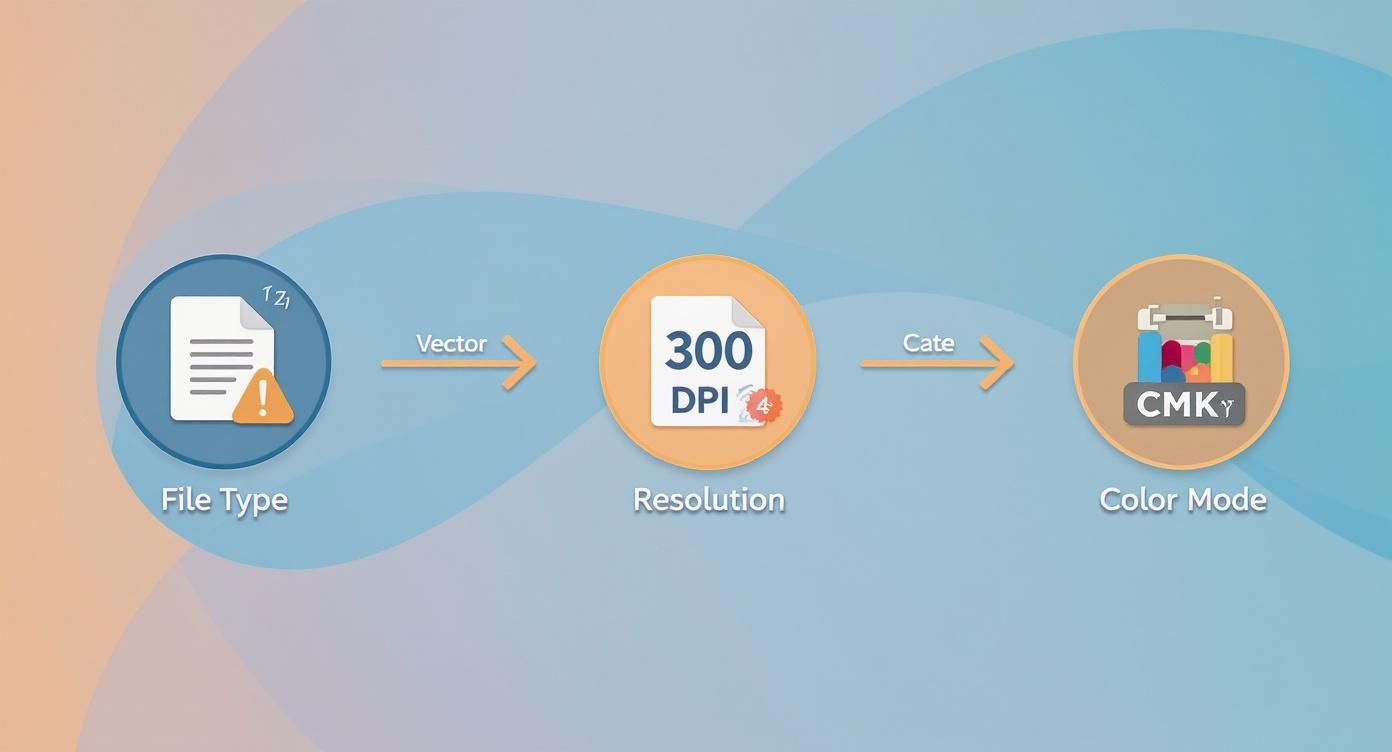
This quick infographic sums it up perfectly. Nail these three specs—file type, resolution, and color mode—and you've built a solid foundation for a great print.
To make it even simpler, here's a quick-glance guide to keep handy for your heat transfer projects.
File Format Quick Reference for Heat Transfer Design
| Specification | Recommended Setting | Why It Matters |
|---|---|---|
| File Type | Vector (.AI, .EPS, .SVG) for most graphics; Raster (.PNG, .PSD) for photos. | Vector scales perfectly without quality loss. Raster is needed for complex images but must be high-res. |
| Resolution | 300 DPI | Ensures your final print is sharp and clear, not pixelated or blurry. |
| Color Mode | CMYK | Matches the color space used by printers, preventing unexpected color shifts from screen to fabric. |
Following this table is the fastest way to avoid the most common file-prep headaches.
Sizing Your Artwork for the Real World
Finally, don't forget about physical size. A design that looks amazing on your 27-inch monitor might look tiny on an XL hoodie or completely overwhelm a youth-sized t-shirt.
Before you start designing, set your artboard or canvas to the exact dimensions you want the final print to be. If you're unsure where to begin, our guide on standard graphic sizes for t-shirts is a great resource. Getting the scale right from the start ensures your design looks intentional and well-placed on the final garment.
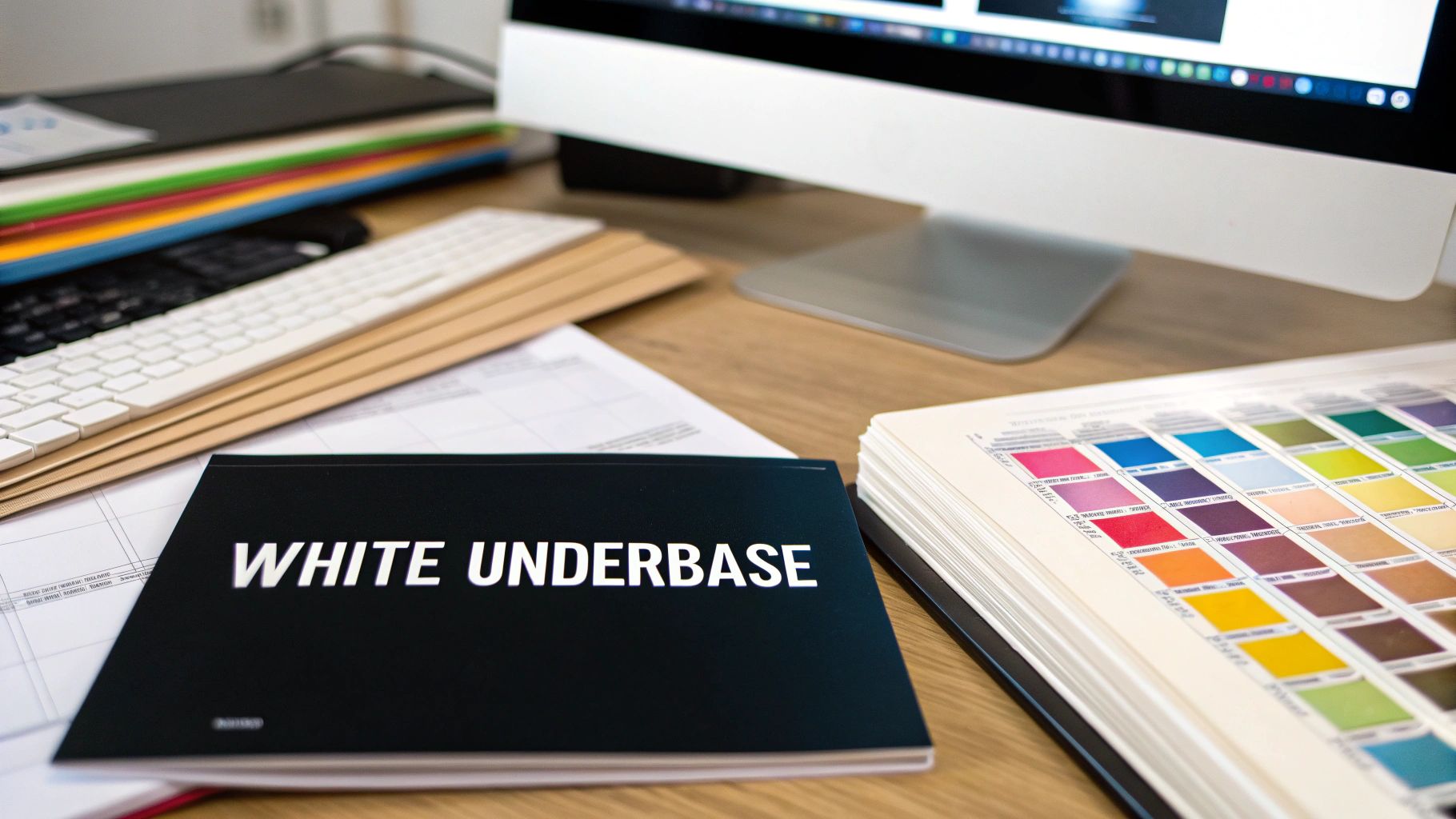
Mastering the White Underbase for Vibrant Colors
If you're printing a heat transfer for any colored garment—black, red, blue, you name it—the white underbase isn't just another layer. It's the absolute foundation that makes your design pop. Without it, the ink just sinks into the fabric, leaving you with a dull, muddy graphic that looks faded from the get-go.
Think of it like painting a dark wall. You wouldn't just throw a coat of yellow paint on a navy blue surface and hope for the best, right? You'd start with a solid white primer. That's exactly what the white underbase does for a DTF transfer; it creates a bright, opaque canvas on the shirt so your CMYK colors show up looking true and vibrant.
This underbase is actually a separate layer of white ink that gets printed onto the transfer film before any of the colors. When the transfer is pressed, this white layer sits against the fabric, and your colorful design sits right on top of it, looking brilliant and bold.
Setting Up Your White Layer Correctly
Getting this layer right is a non-negotiable step in your design process. In professional software like Adobe Illustrator, the standard practice is to create a dedicated spot color just for the white ink. This is how you tell the printer precisely where to lay down that white foundation.
The workflow usually involves duplicating your entire CMYK artwork onto a new layer and placing it underneath the original. Then, you'll assign a unique spot color to everything on this new layer—I usually pick a loud magenta or cyan so it's impossible to miss—and name it something obvious like "White" or "Underbase." This layer essentially becomes the map for the white ink.
Key Takeaway: A proper underbase is a separate, solid layer that sits directly behind every colored part of your design. Never, ever merge it with your CMYK artwork. It has to be its own distinct element in your file.
Most print shops will want this dedicated layer at the very bottom of your layer stack. This ensures it prints first and provides a true base for the colors that follow. The final file you send to print will contain both your CMYK data and this separate spot color channel for the white ink. It's also good to know how color management affects your final print; for a deeper dive, you can learn more about how an ICC file helps manage color profiles for consistent results.
The Pro Technique of Choking the Underbase
One of the most common rookie mistakes is getting a tiny, distracting white halo peeking out from behind the edges of your finished transfer. This happens when the white layer and the color layer are exactly the same size. Even the slightest misregistration during printing can expose that white edge.
To avoid this, we use a technique called "choking" the underbase.
It sounds dramatic, but choking just means making the white layer slightly smaller than the color layer sitting on top of it. By pulling the edges of the white layer inward by a tiny amount, typically 0.5pt to 1pt, you create a buffer. This guarantees the CMYK colors will completely cover the white foundation.
- For simple shapes: Applying a negative offset path or an inside stroke is the quickest way to do it.
- For complex artwork: Look for your software's trapping or choke functions to pull the underbase in uniformly.
This tiny adjustment is practically invisible to the naked eye but makes a huge difference in the final quality, giving your design crisp, clean edges without any of those ugly white outlines.
Handling Gradients and Fine Details
So, what happens when your design isn't just solid blocks of color? This is where real skill comes into play. You can't just slap a solid white block behind a soft, fading gradient—it would create a harsh, unnatural edge on the shirt.
For elements like these, your white underbase needs to mirror the artwork's opacity. Instead of a solid shape, the underbase for a gradient should also be a gradient, transitioning from 100% white to 0% white right along with your colors. This keeps the fade looking smooth and natural on the garment.
The same goes for designs with fine lines or detailed textures. A poorly made underbase might fill in the negative space between tiny lines, turning your delicate artwork into a clunky blob. Creating a high-fidelity underbase that matches every detail of your design is what separates an amateur file from a professional, print-ready one. It’s that final check that preserves the integrity and intended look of your hard work.
Squeezing More Profit Out of Every Print with Gang Sheets
If you're printing your designs one at a time, you might be throwing money away. Every time you print a single chest logo on a big sheet of transfer film, all that empty space around it is wasted material and lost profit. This is where learning to build a gang sheet will completely change your workflow for the better.
A gang sheet isn't complicated—it's just a single, large transfer sheet loaded up with multiple designs. Instead of printing that one logo, you can fill an entire sheet with all kinds of graphics. Think front logos, sleeve hits, neck tags, and even designs for totally different jobs, all printed in one go. This simple shift in thinking helps you use every last square inch of film, which cuts down on waste and seriously lowers your cost per print.
How much can you save? A lot. By smartly "nesting" your designs together, it’s not unusual to slash your material costs by 30-50% or even more. For any print shop, but especially for small businesses and hobbyists, that's a massive win.
The Art of a Well-Packed Sheet
Putting together a good gang sheet feels a bit like a game of Tetris. The goal is simple: fit as many designs as possible onto the film, leaving just enough space to cut them apart later. Just randomly tossing your files onto the sheet won't cut it; you'll still end up with a ton of wasted space.
I've found the best approach is to place your biggest designs on the sheet first. Once they're down, use your smaller graphics—think pocket logos, neck tags, and other little elements—to fill in all the weird gaps and empty corners. Don't be afraid to rotate designs to see how they fit. You'd be surprised how much room you can save by interlocking two t-shirt graphics or turning one upside down.
Pro Tip: Make sure you leave at least 0.25 inches (about 6mm) of space between every design on the sheet. This gives you a safe buffer zone to cut the transfers apart with scissors or a rotary cutter without nicking the artwork next to it.
Trust me, that little bit of empty space makes the cutting process way less stressful. If you really want to become a pro at this, we've got a complete guide on how to properly build DTF gang sheets that covers more advanced strategies.
Tools That Make Ganging Easy
Manually arranging dozens of little designs can get old fast, especially when you're busy. Thankfully, you don't have to do it all by hand. There are some great software tools out there that can help you build an optimized design heat transfer gang sheet in no time.
- Adobe Illustrator & CorelDRAW: If you like having full control, these classic vector programs are your best bet. Just create an artboard that matches your film dimensions and start placing, rotating, and nesting your graphics exactly where you want them.
- RIP Software (Raster Image Processor): Most professional DTF printers come bundled with RIP software, and many of these have built-in nesting or ganging features. This software can take a whole folder of designs and automatically figure out the most efficient layout for you. It's a huge time-saver.
- Online Gang Sheet Builders: A lot of transfer companies, including us here at Raccoon Transfers, have easy-to-use online tools. You just upload your individual design files, and the builder lets you drag and drop them onto a virtual sheet. It's a great way to see exactly what you're getting and how much it will cost.
The right tool really just depends on your workflow and how comfortable you are with design software. For anyone just starting out, an online builder is probably the easiest way to go. But as your business grows, investing in dedicated software can save you hundreds of hours in the long run. No matter which method you choose, getting the hang of gang sheets is one of the most important skills for running a profitable print business.
From Digital File to Finished Fabric
You’ve nailed the design file, but right now, it's just pixels on a screen. The heat press is where the magic happens—where your art becomes a real, wearable product. This is the critical moment where a precise blend of heat, pressure, and time turns a simple film transfer into a durable, vibrant piece of apparel.
Getting this application process right is just as important as setting up your initial design heat transfer file. Even tiny miscalculations here can ruin a perfectly good print on anything from custom apparel to professional name printing on football shirts.
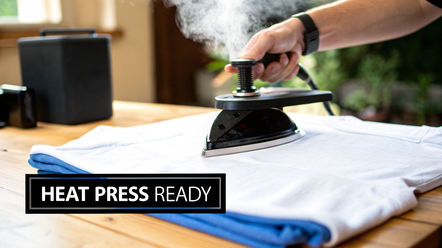
Dialing in Your Press Settings
There's no single "magic number" that works for every fabric. The settings that produce a beautiful print on a 100% cotton tee will scorch a polyester blend in seconds. Your transfer supplier should always give you a recommended starting point, but you have to be ready to test and tweak from there.
The three variables you'll constantly adjust are:
- Temperature: This is the heat needed to activate the transfer's adhesive, bonding it to the garment. Too low, and it won't stick. Too high, and you'll burn the fabric or damage the ink.
- Time: This is simply how long you apply the heat. Heat-sensitive fabrics need less time, while thicker items like sweatshirts might need a few extra seconds to fully adhere.
- Pressure: This is key for ensuring the transfer makes full, even contact with the garment. Not enough pressure (or uneven pressure) is the number one cause of transfers peeling up around the edges.
To give you a head start, here are some typical settings for common fabrics. But please, always do a test press on a scrap piece or an inconspicuous area first!
Common Heat Press Settings for Different Fabrics
This table provides a great starting point for dialing in your press. Think of these as guidelines, not unbreakable rules.
| Fabric Type | Temperature Range (°F/°C) | Press Time (Seconds) | Pressure Level |
|---|---|---|---|
| 100% Cotton | 300-320°F / 149-160°C | 10-15 seconds | Medium to Firm |
| 50/50 Cotton/Poly Blend | 280-300°F / 138-149°C | 10-12 seconds | Medium |
| 100% Polyester | 260-280°F / 127-138°C | 8-10 seconds | Light to Medium |
| Tri-Blends | 260-275°F / 127-135°C | 8-10 seconds | Light to Medium |
Remember that your specific heat press, the humidity in your shop, and even the color of the garment can shift these numbers slightly. Always be prepared to make small adjustments.
Hot Peel vs. Cold Peel: What’s the Difference?
After pressing, you’ve got to remove that clear carrier film. The method you use—hot peel or cold peel—can totally change the final look and feel of the print.
Hot Peel means you peel the film off immediately after the press opens. It's fast, efficient, and usually leaves a softer, more matte finish because the ink has a chance to sink into the fabric's weave.
Cold Peel, on the other hand, requires you to wait until the garment and transfer are completely cool to the touch. This process gives you a glossier, smoother finish, as the ink solidifies on top of the fabric fibers.
My Two Cents: I almost always use a hot peel for standard t-shirts. It creates that soft-hand feel that people love, making the design feel like part of the shirt. But for athletic gear or jobs that need a shinier, more pronounced look, cold peel is definitely the way to go.
Prepping for a Perfect Application
Don't skip these two steps—they make a world of difference.
First, always pre-press the garment for 3-5 seconds. This smooths out any wrinkles and—more importantly—removes any hidden moisture in the fabric. Moisture is the enemy of a good transfer; it turns into steam under the press and can ruin the adhesion.
Second, once you've peeled the carrier film away, do a final post-press for another 3-5 seconds. Just place a Teflon sheet or a piece of parchment paper over the design and give it one last quick press. This simple action helps lock the design into the fibers, which makes a huge difference in durability and washability. It’s the secret to a professional, long-lasting print.
Tackling Common Heat Transfer Headaches
Even when you’ve nailed the digital file, things can still go sideways at the press. Don't sweat it—it happens to the best of us. The good news is that most heat transfer problems are easy to diagnose and fix once you know what to look for. Think of this as your go-to troubleshooting guide.
From peeling edges to colors that just don’t pop, nearly every issue comes down to a few usual suspects. Getting a handle on these will save you time, materials, and a ton of frustration. Let's walk through the most common issues and get your production back on track.
What to Do When Your Transfer Is Peeling or Cracking
This is hands-down the most common problem, especially when you're just starting out. If your transfer is lifting at the edges or cracking after a single wash, the culprit is almost always your application process. It simply means the adhesive didn't form a strong enough bond with the fabric.
Before you start blaming the transfers themselves, take a hard look at your heat press.
- Not Enough Pressure: This is the #1 cause, bar none. Too little pressure prevents the adhesive from truly embedding into the fabric's fibers. You need to make sure your press is set to firm, even pressure.
- Temperature Is Too Low: If your press isn't hot enough, the adhesive won't fully melt and activate. Always double-check the recommended temperature for your specific transfers and the fabric you're working with.
- Hidden Moisture: Garments can hold a surprising amount of moisture, which turns to steam during pressing. Steam is the mortal enemy of a good bond. Always pre-press your garment for 3-5 seconds to zap any moisture before applying the transfer.
For a quick fix, try a post-press for a few seconds using a sheet of parchment paper. This can often help lock in a design that's being stubborn.
A Quick Note on Durability: The relationship between heat, pressure, and time is everything in creating a permanent bond. This isn't a new idea, either. The science of thermal transfer has been around for centuries, with early industrial heat exchangers in the 1700s requiring precise control over these same principles. If you're curious about the history, you can read more about the evolution of heat exchangers at Heat Exchanger World.
Fixing Dull or Discolored Prints
You press a beautifully vibrant design onto a black shirt, peel it back, and... it looks flat and muddy. The colors have none of the life they had on your screen. Nine times out of ten, this points to an issue with your white underbase or the original file setup.
A weak or missing underbase is like trying to paint on a dark wall without a coat of primer. The shirt color bleeds right through and kills your vibrancy. When you're designing, you absolutely must have a solid, opaque white layer that sits behind every single colored element of your graphic.
Also, go back and check your color profile. If you designed in RGB but the file was printed in CMYK, a color shift is guaranteed. Always start your design heat transfer projects in the CMYK color space to get a much more accurate preview of how the final colors will look.
Getting Rid of That Annoying Adhesive Halo
Ever notice a faint, glossy outline around the edge of your design after pressing? That's what we call an "adhesive halo" or "adhesive window." It happens when the adhesive powder layer is just a fraction larger than the ink layer itself.
While it can be tough to avoid completely with super-fine details, you can definitely minimize it.
- Check Your Choke: Make sure your white underbase is properly "choked"—meaning it's pulled in and made slightly smaller than your color layer.
- Supplier Quality Matters: High-quality transfers have much tighter registration between the ink and adhesive layers, which significantly reduces this problem.
- Try a Post-Press Trick: A quick press with a matte finishing sheet after the initial application can sometimes knock back the shine of the halo, making it much less noticeable.
Your Heat Transfer Design Questions, Answered
Once you get past the basics, you'll start running into the little things that trip up even seasoned designers. These are the practical, in-the-weeds questions that pop up when you're on a deadline. I've been there. Here are some straightforward answers to the most common issues you'll face.
Getting these details right is what separates an okay print from a fantastic one. Let's dig in.
Can I Just Use a PNG with a Transparent Background?
You can, but you're rolling the dice. While a transparent PNG is technically usable, letting the printer’s software automatically generate the white underbase often leads to trouble. You might get dull colors, and any semi-transparent effects in your design (like smoke or gradients) will likely print as a solid, chunky mess.
It’s a shortcut, but you give up all the control.
For a truly professional result, you need to manually create your own white underbase as a separate layer or spot color. This is the only way to guarantee your colors pop and every fine detail comes out exactly how you envisioned it, especially on dark-colored apparel.
How Small Can My Text Get Before It's Unprintable?
This is a big one. While it can vary a bit depending on the specific printer and film, a solid rule of thumb is to keep your text above 7pt for serif fonts. For clean sans-serif fonts, you can sometimes get away with 6pt.
Go any smaller, and you're asking for trouble. The fine lines and serifs become too thin for the adhesive powder to stick to properly. When you press the transfer, you'll find parts of your letters are missing.
Pro Tip I Can't Stress Enough: Always, always convert your text to outlines (or "curves" in some programs) before sending the file to print. This turns the text into a fixed shape, so you don't have to worry about the print shop having the right font installed. It’s a simple step that prevents a major headache.
Why Does My Finished Transfer Feel So Stiff and Plasticky?
That heavy, "bulletproof" feel almost always comes down to one thing: too much ink. Specifically, it's usually caused by a solid, oversized block of a white underbase that doesn't let the fabric breathe.
The fix is to "choke" the underbase—make it just a tiny bit smaller than your color layer so it doesn't peek out. For an even better feel, sophisticated RIP software can create a "rasterized" underbase, which is essentially your white layer printed with tiny holes or lines through it. This technique breaks up that solid sheet of ink, making the final transfer feel much softer and more flexible on the shirt without losing color vibrancy.
My Colors Look Great on Screen, but Muted on the Shirt. What's Wrong?
Welcome to the classic battle of screen vs. print. Getting a perfect color match is the holy grail, but you can get remarkably close if you know what you’re doing.
First off, always design your heat transfer files in a CMYK color profile. Your monitor creates color with glowing RGB light, which will always look more vibrant than CMYK ink on a physical product. Designing in CMYK from the start gives you a more realistic preview.
The absolute best way to nail your colors is to use a physical reference. Get a Pantone swatch book or, even better, a printed color chart from your transfer supplier. This lets you pick colors based on how they actually print, not just how they look on your backlit screen. It completely closes the gap between your digital file and the final shirt.
Ready to see how your perfectly prepped designs look on professional-grade transfers? At Raccoon Transfers, we make it simple to upload your art and get beautiful, long-lasting DTF prints shipped out the next day.
Build your custom gang sheet and start your order!