
Graphic Size for T Shirt Design Made Simple
Getting the size of your t-shirt graphic right is one of those things that can make or break a design. For a standard adult tee, a good rule of thumb for the main front graphic is anywhere from 9 to 14 inches wide. Think of this as your starting block—the final size will always depend on the specific shirt and the effect you're going for.
Your Quick Guide to Standard T-Shirt Graphic Sizes
Think of standard graphic sizes as a trusted recipe. Just like a chef wouldn't guess the amount of flour for a cake, a designer shouldn't guess the dimensions for a t-shirt print. Getting it wrong can make a great design look amateurish—either too small and lost on the shirt, or so big it wraps uncomfortably around the body.
Mastering these fundamentals is more important than ever. The graphic tee market is huge, valued at roughly USD 7.5 billion in 2023, and customers are looking for apparel that looks polished and professional. If you want to dive deeper, you can explore the full report on graphic tee market trends for more insights.
Common Placements and Dimensions
The "perfect" size for a graphic isn't a single number; it's a moving target that depends entirely on where the design is placed and the size of the shirt itself. A killer design for a Men's XL will need to be scaled down significantly to look good on a Youth Small.
The relationship is pretty straightforward: as the shirt gets bigger, so does the sweet spot for your print area.
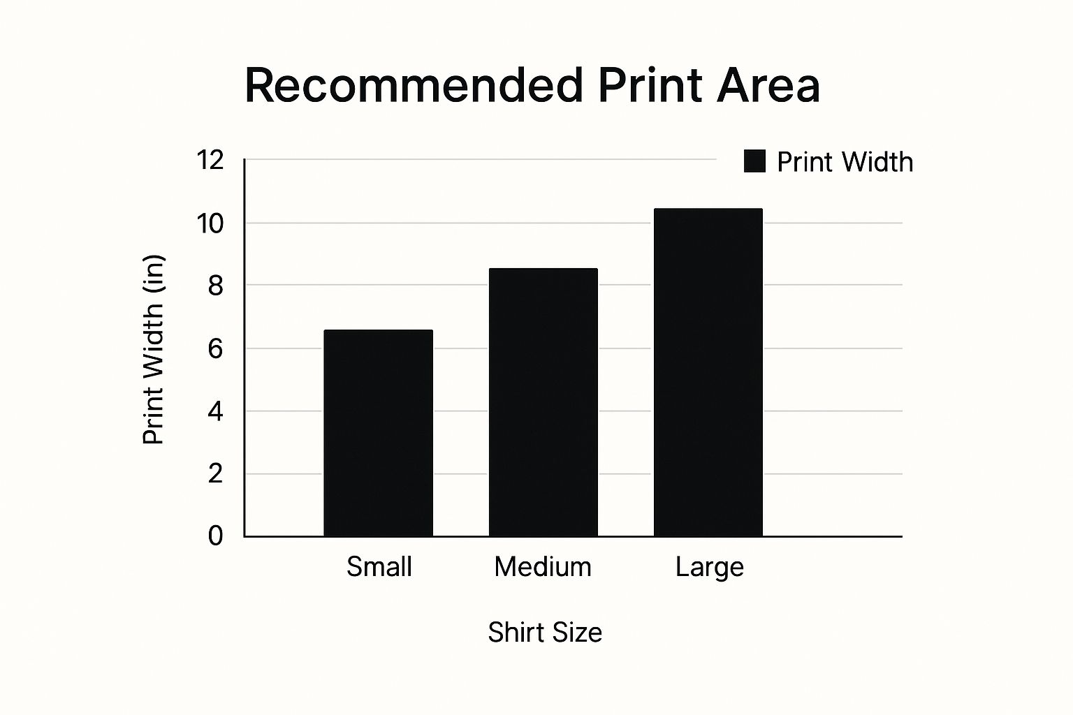
This image really drives home how a balanced design grows in proportion to the garment's size.
To give you a practical starting point, I've put together a quick reference table with the most common industry-standard dimensions.
Standard T-Shirt Graphic Sizes at a Glance
This table breaks down the typical print sizes you'll encounter for different placements on both adult and youth t-shirts. Keep these numbers handy as a guide when setting up your next print file.
| Print Location | Adult T-Shirt Size (Width x Height) | Youth T-Shirt Size (Width x Height) | Notes & Best For |
|---|---|---|---|
| Full Front | 10–12″ x 11–14″ | 8–10″ x 9–11″ | Large artwork, band tees, and statement graphics. |
| Center Chest | 6–8″ x 6–8″ | 5–6″ x 5–6″ | Company logos and minimalist, focused designs. |
| Left Chest | 3–4″ x 3–4″ | 2.5–3″ x 2.5–3″ | Pocket logos, branding, and uniform emblems. |
| Oversized | 12–15″ x 14–16″ | N/A | Trendy, full-coverage designs for a bold look. |
Remember, these are established starting points, not rigid rules. The best designers know when to follow them and when to bend them for creative effect.
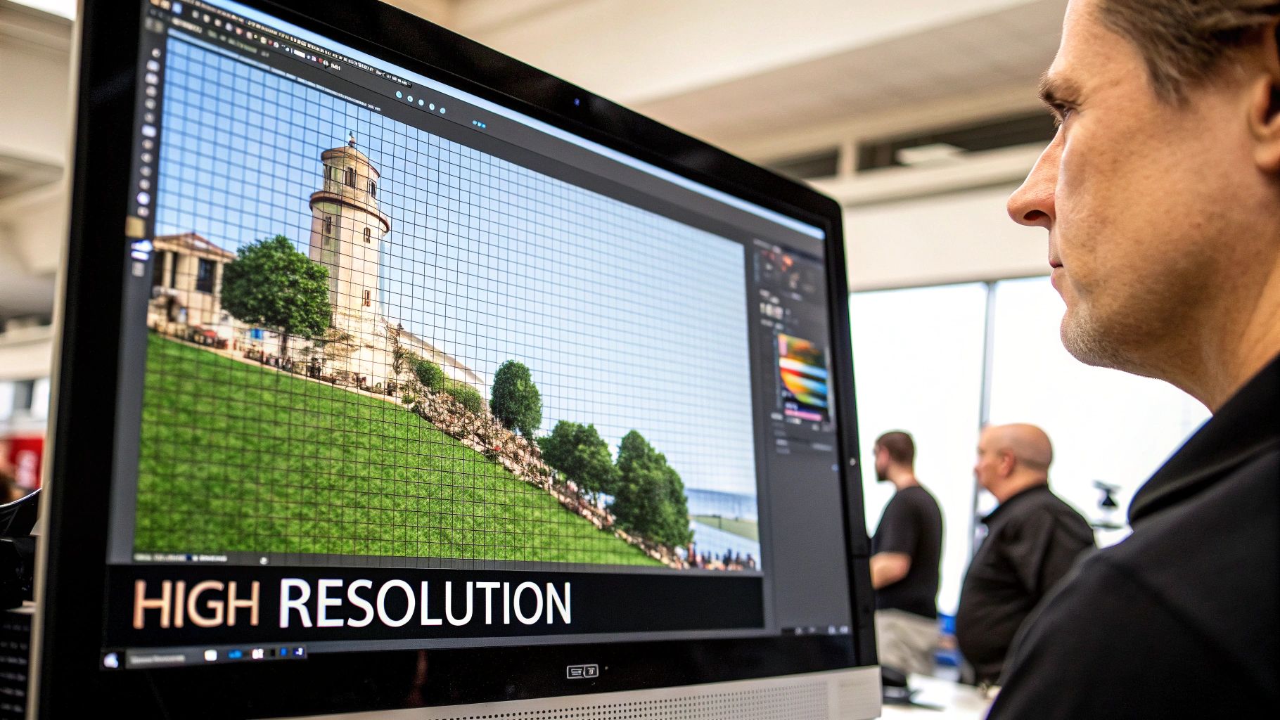
Why Resolution Is More Important Than Dimensions
While knowing the physical size of your graphic is a great starting point, there’s another factor that truly makes or breaks a print: resolution. It's the one thing that separates a sharp, professional-looking shirt from a blurry, amateurish one.
Think of it like this: a massive, wall-sized digital photo is worthless if it's blurry and you can see all the individual pixels. The exact same rule applies to your t-shirt artwork. Focusing only on physical inches without considering the quality of the image data inside that space is one of the most common—and costly—mistakes in printing.
The secret to a crisp, stunning print lies in your design's resolution, which we measure in DPI (Dots Per Inch).
Understanding DPI The Simple Way
DPI is simply a set of instructions for the printer. It dictates how many tiny dots of ink it should place within every single inch of your design. The more dots, the sharper and more detailed the final image will be. A low DPI file has fewer dots, which results in that fuzzy, blocky look everyone wants to avoid.
Here’s an analogy: imagine you're creating a mosaic. If you use thousands of tiny little tiles to make your picture, the result will be incredibly detailed and defined. But if you try to make the same picture with just a handful of large, chunky tiles, it’s going to look abstract and undefined. DPI works the same way; it's the density of your "digital tiles."
For any professional t-shirt printing, 300 DPI is the industry-standard magic number. This resolution gives the printer more than enough data to work with, ensuring your design looks sharp and vibrant on fabric. It's the key to avoiding that pixelated mess you see on low-quality prints.
So, how do you actually use this information? When you create your new art file in a program like Adobe Photoshop or Affinity Designer, you need to set both the physical dimensions and the resolution right from the start.
For a standard 12-inch wide chest design, your document setup should look like this:
- Width: 12 inches
- Height: 14 inches (or whatever fits your design)
- Resolution: 300 DPI
Setting your file to 300 DPI from the get-go is the single most important thing you can do to guarantee a high-quality print. This gives the printer all the information it needs to reproduce your design with crisp lines and smooth colors, creating a shirt you can be proud of.
Choosing the Right File Format for Your Design
So, you've nailed down the perfect size for your t-shirt graphic. The next hurdle is saving it in the right file format. This step is more important than you might think—sending the wrong file type can undo all your hard work on sizing and resolution, leading to a disappointing print.
You'll mainly be dealing with two kinds of files: vector and raster. They look similar on your screen, but they are built in fundamentally different ways.
Think of a vector file (like an AI, EPS, or SVG) as a blueprint made from mathematical formulas. It's not made of pixels. This is its superpower. Because it's based on paths and points, you can stretch a vector graphic from the size of a tiny chest logo to a full-back design without losing an ounce of quality. The edges will stay perfectly sharp every time.
A raster file (like a PNG, JPG, or GIF), however, is a different beast. It's more like a photograph or a detailed painting made up of a grid of tiny colored squares called pixels. This makes them fantastic for rich, colorful images, but they have a critical limitation: they have a fixed size. If you try to blow up a raster image beyond its original dimensions, the printer just makes the pixels bigger, and you get that dreaded blurry, blocky look.
Vector vs. Raster: When to Use Each
So, which one should you choose? It really comes down to your specific design and how you plan to print it. There’s no single "best" format, only the right one for the job at hand.
-
Choose Vector (AI, SVG, EPS) for:
- Logos, typography, or simple graphics that need to be clean and scalable for different shirt sizes.
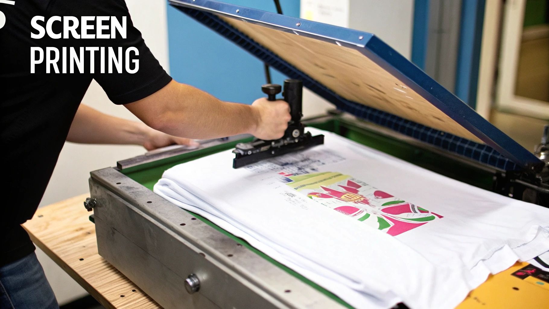
- Screen printing, a method that often relies on separate color layers which are a breeze to handle in vector programs.
- Any design where crisp, clean lines are non-negotiable, no matter the final size.
-
Choose Raster (PNG) for:
- Complex illustrations with lots of colors, gradients, and fine details, like photorealistic art.
- Direct-to-Garment (DTG) printing, which is basically a high-end inkjet printer for fabric and loves detailed raster files.
- Any design that needs a transparent background. For this, PNG is always the answer over JPG, since JPGs can't handle transparency.
For most t-shirt printers, a high-resolution PNG file with a transparent background is the go-to choice. It's the most flexible and widely accepted format. The key is to make sure it’s saved at 300 DPI at the exact size you want it to be printed.
The growing popularity of printing methods that work beautifully with high-quality raster files has helped the custom t-shirt market explode, valued at USD 4.9 billion in 2024. Techniques like DTG and dye-sublimation are making it easier than ever to bring complex digital art to life on fabric.
If you're interested in other printing methods, you can check out our guide on how to use heat transfer paper.
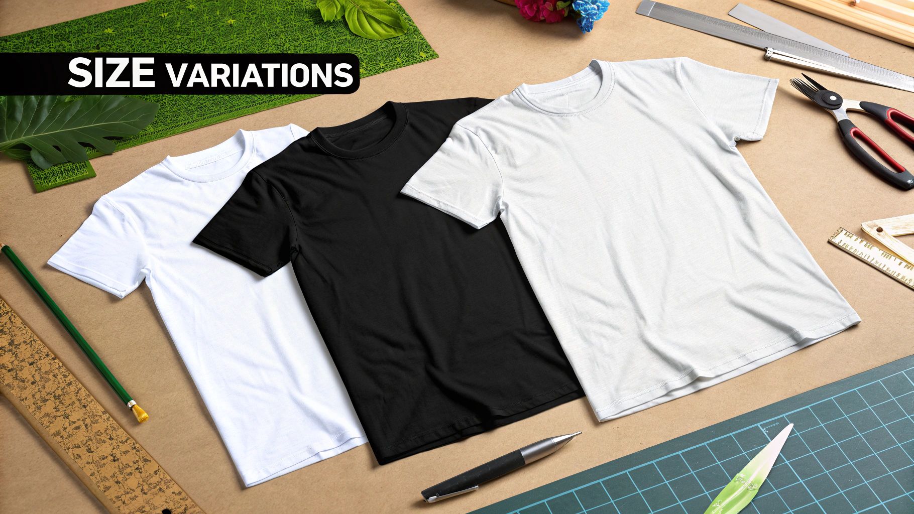
How Garment Size and Placement Affect Your Graphic
A killer design for a size Large shirt can look oversized and clumsy on a size Small. This is a classic rookie mistake, but it's one that’s easy to avoid. You simply can't expect a single graphic size to look good across an entire run of t-shirts.
This reality presents a choice. Do you create one "good enough" design that scales okay for most sizes, or do you create multiple versions of your graphic, each tailored for specific size ranges (like S-M, L-XL, and 2XL+)? If you're aiming for a professional look, creating at least two different graphic sizes is the way to go. It ensures the design feels intentional and well-balanced on every single shirt.
Respecting the Printable Area
Beyond the shirt's physical dimensions, you also have to work within the printable area. Think of this as the actual space the printing equipment can reach. You can’t just print right up to the edge or run your design over seams and collars.
The available space is always smaller than the shirt itself. This is a physical limitation of the printing process, no matter if you're using heat transfers or another technique. To get a better feel for how the equipment works, check out our guide on understanding DTF printing for beginners. Ignoring the printable area is a fast track to common placement errors.
A core principle of great apparel design is proportionality. The goal is for your graphic to take up the same relative visual space on every shirt, making it feel like it truly belongs there, whether it's on a Small or a 3XL.
This isn't just a niche detail; it's what customers are coming to expect. The global market for graphic-designed t-shirts was valued at around USD 2.5 billion in 2023, and a huge part of its growth comes from consumers wanting more personalized and better-fitting options. This demand has pushed the industry toward more flexible graphic sizing that caters to all body types and style preferences. You can discover more insights about the graphic t-shirt market on virtuemarketresearch.com.
Common Graphic Sizing Mistakes to Avoid
Getting the graphic size right is a huge step, but even a perfectly sized design can be ruined by a few simple, avoidable mistakes. Think of this as your pre-flight checklist. Catching these issues before you send your art to the printer will save you a ton of time, money, and the headache of a botched order.
One of the most frequent slip-ups is designing in the wrong color mode. Your computer screen uses RGB (Red, Green, Blue) light to create brilliant, glowing colors. Printers, on the other hand, use CMYK (Cyan, Magenta, Yellow, Black) ink to replicate those colors on physical materials like fabric.
If you send an RGB file for a print job that requires CMYK, you're in for a surprise. That vibrant red on your screen might come out looking dull and flat. It's always best to confirm the required color mode with your print provider first. While many modern methods like DTF are built to work with RGB files, you should never assume.
Tiny Fonts and Thin Lines
Here’s a classic pitfall: using fonts and lines that are just too small. A design element that looks crisp and clean on your high-resolution monitor can easily become a blurry, unreadable mess once it’s printed on fabric. The ink naturally bleeds a tiny bit into the shirt's threads, which can cause fine details to get lost.
As a rule of thumb, stick to these minimums to be safe:
- Fonts: Avoid going smaller than 18-24 points for most standard designs.
- Lines: Keep strokes at a minimum thickness of 1-2 points to ensure they print clearly without breaking up.
The goal is readability from a normal viewing distance. If you have to squint to read your design on the screen, that's a major red flag. It will be even harder to make out on the finished shirt.
Ignoring the Shirt Color
Designing on a blank white canvas when you plan to print on a black t-shirt is a recipe for disappointment. The color of the shirt itself can completely change how the colors in your graphic look. A bright yellow that pops on a white background might turn into a muddy, dull shade on a royal blue shirt.
Always, always place your design on a background layer that matches your actual shirt color. This simple step gives you a far more accurate preview of the final product and allows you to tweak your design's colors for the best possible result. This is especially critical for methods like DTF and DTG. If you're weighing your options, our guide on DTF vs DTG printing can help you decide what's best for your specific project.
Frequently Asked Questions About T-Shirt Graphics
Even with the best guides, sometimes you just have a specific question that pops up right in the middle of a project. I've been there. This section is all about tackling those common, practical questions we get from designers every day.
Think of this as your quick-reference cheat sheet for solving those real-world problems that can make or break a great t-shirt design.
What Is the Best Graphic Size for a Pocket Logo?
A classic pocket logo is all about subtlety and precision. Because you're working with such a small space, you have to get the dimensions just right. I always recommend aiming for a width between 3.5 and 4.5 inches. This range gives you a design that looks intentionally placed—not too big that it spills over the edges, and not so small it gets lost.
Here's the critical part: even though the final print is tiny, you absolutely must create the original artwork at 300 DPI. That high resolution is what keeps every line sharp and every detail crisp, ensuring a professional look.
The secret to a great pocket logo isn't just its size, but its balance. It needs to look like it belongs there, not like a sticker slapped on as an afterthought. It’s a small detail that makes a huge impact.
Should I Design in RGB or CMYK for T-Shirts?
This is the big one, and the answer isn't as simple as you might think. It completely depends on your printer’s technology. It's a common misconception that all printing uses CMYK.
Many modern Direct-to-Garment (DTG) printers are actually optimized for RGB (Red, Green, Blue) files. Their advanced software is specifically designed to translate on-screen RGB colors to fabric dyes with surprising accuracy. On the other hand, old-school screen printing is built around the CMYK (Cyan, Magenta, Yellow, Black) model, where a separate screen is created for each ink color.
So, what's the takeaway? Always, always check with your print provider for their file specs before you start designing. A quick email or a look at their FAQ page can save you a world of color-matching headaches down the road.
Can I Use a JPG File for My T-Shirt Design?
Technically, yes, you can. But should you? Almost never. JPGs are a poor choice for professional apparel, and here's why. They use what’s called "lossy" compression, which means every time you save the file, it discards a little bit of data to keep the file size small. This process slowly degrades your image, leading to blurriness and weird-looking artifacts.
The even bigger issue is that JPGs don't support transparency. Your design will end up printed inside a solid box (usually white), which looks incredibly amateur on any colored shirt. For a clean, professional print, a high-resolution PNG file with a transparent background is the industry standard and the only way to go. It preserves quality and isolates your design beautifully.
Ready to turn your perfectly prepared graphics into stunning reality? At Raccoon Transfers, we live and breathe vibrant, durable DTF prints that make your designs pop. Upload your artwork today and get professional-quality transfers shipped out by the next day.