
How to Prepare Artwork for Printing
You've approved the artwork, checked it on your monitor, and uploaded it with confidence. Then the transfer arrives and the dark areas look heavier, a soft shadow has turned into a hard halo, or a fine line has disappeared under the white ink. The design wasn't necessarily bad. The file described only a screen image instead of a production-ready print.
Learning how to prepare artwork for printing means treating the file as a set of instructions for a RIP, ink system, film, adhesive, cutter, and final substrate. DTF and UV-DTF make that translation especially important. Apparel DTF must flex with fabric, while UV-DTF must bond cleanly to a hard surface. A reliable workflow anticipates those physical demands before the file reaches production.
The Reality of Modern Prepress Workflows
A designer can spend hours refining a bright RGB illustration, view it against a backlit display, and still miss the problem that appears at the heat press. The monitor creates light. A transfer reflects light from deposited ink, film, and the garment or object beneath it. The RIP may also create a white underbase, interpret transparency, and separate artwork into printable layers that weren't obvious in the design application.
That gap is the central prepress problem. Artwork preparation is a translation exercise, not a final cosmetic step.
Why old prepress principles still matter
Modern digital prepress grew from technologies that made digital page output practical. Raster image processors and raster-based imagesetters enabled high-quality output directly on film in the late 1970s, while the Apple Macintosh, page makeup software, and Adobe PostScript helped establish practical digital page production by the mid-1980s. The tools have changed, but the production expectations remain familiar: preserve clean vector information, set type correctly, and give the output device a file it can interpret without guesswork. SignLink's overview of print-ready artwork places those expectations in the broader history of digital prepress.
A logo drawn as vector paths remains sharp when resized. A logo pasted into a low-resolution raster layer does not. A font that exists only on your computer may substitute or reflow when another workstation opens the file. A transparent effect may look harmless in Illustrator but produce an unexpected white edge when the RIP builds its underbase.
Production rule: If a correction depends on the printer guessing what you intended, the file isn't finished.
What the RIP needs from your design
Think of the RIP as a translator with strict limits. It needs to determine where ink belongs, what should remain transparent, how colors should be separated, and how artwork should be rendered at the requested physical size. Effects such as glows, feathered masks, blend modes, and opacity groups can make that interpretation less predictable.
Keep logos, lettering, icons, and line illustrations in their native vector form whenever possible. Vector art is resolution-independent, so it can scale without the quality loss associated with raster pixels. Use raster artwork for photographs, textured paintings, and pixel-based effects, but build those images at their final output size rather than enlarging them later.
Type deserves its own check. Before delivery, outline fonts or embed them according to the supplier's instructions. If you're using a decorative face or a commercial type family, review usage rights as well as technical behavior. A practical resource for designers who need to check font licenses with Font Checker Pro can help separate licensing questions from file-preparation questions.
The best prepress file isn't the one with the most editable layers. It's the one that preserves the intended appearance while giving production a predictable, inspectable result.
Setting Up Your Canvas and Color Space
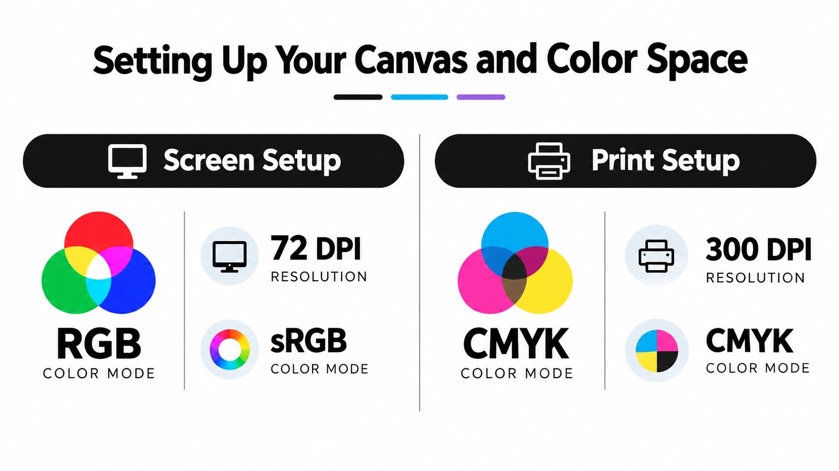
Set the document to the physical result before drawing. Enter the finished width and height, decide whether the artwork will be printed as a single transfer or arranged in a gang sheet, and keep a clear record of the intended application size. Scaling a design after effects, strokes, and raster textures have been added can change their appearance.
Use vector objects for marks that need crisp edges, including type, logos, borders, and simple illustrations. Raster images need more discipline. The widely used baseline for print imagery is 300 DPI at final output size, and a supplier may specify a different target for a particular workflow. Slade Print's file preparation guide also identifies 0.125 inch, or 3 mm, bleed on every edge as a common baseline and recommends keeping critical text at least 5 mm inside the trim.
Build the file around the application
A transfer intended for a shirt needs a different visual test from one intended for a rigid object. For apparel, inspect the design at its actual garment size and consider how fine details will look after film removal and pressing. For hard surfaces, inspect the outer contour carefully because a small edge defect can remain visible on glass, acrylic, or metal.
Use these setup decisions:
- Canvas size: Work at the requested finished dimensions, not an arbitrary large document that will later be reduced.
- Raster resolution: Keep placed images at 300 DPI at final size unless the printer supplies a different specification.
- Vector structure: Keep type, logos, and linework as vectors until the final export or flattening step.
- Bleed and safe area: Extend background artwork through the trim and keep important content away from the cut boundary.
- Color profile: Follow the print provider's requested CMYK profile or RIP workflow rather than assuming one profile suits every device.
RGB-first design isn't automatically wrong for DTF. RGB tools can preserve a broad working gamut while you design, but the final conversion must be controlled. Blindly switching a document to CMYK can shift saturated colors without showing you which areas changed or why. Use a soft proof where possible, compare critical brand colors, and ask the printer which profile or conversion method their workflow expects. Guidance on how to convert RGB to CMYK is useful when the conversion needs to happen before upload.
Color management also affects product previews and online listings. If your screen, browser, and production profile disagree, the same design can appear inconsistent during approval. A controlled conversion workflow can help you solve color shifts in listings, but no screen preview replaces the supplier's press specification.
If you're preparing multiple designs for one order, Upload Your DTF Gang Sheet is one way to submit a consolidated layout. Keep each design at its intended application size and confirm the provider's requirements before building the sheet.
Managing Transparency and Flattening Artwork
Transparency is where attractive screen effects often become production problems. A drop shadow may contain partially transparent pixels. A glow may fade through several opacity levels. A blend mode can combine colors with the background in a way that has no direct equivalent when the RIP separates ink and white underbase information.
The failure usually isn't caused by transparency itself. It comes from unexamined transparency.
What flattening actually changes
Flattening combines layered effects into a rendered result. Depending on the application and export settings, it can preserve the visible appearance, rasterize part of the artwork, alter edge anti-aliasing, or create a boundary between transparent and opaque regions. If you flatten too early, you lose editability and may reduce the quality of small text or linework. If you leave complicated effects live without testing the export, the receiving RIP may interpret them differently.
A dependable approach separates structural elements from effects:
- Keep type, logos, and important vector contours on their own layers.
- Duplicate the working file before flattening.
- Convert complex shadows, glows, and blend groups into a controlled composite.
- Inspect the composite against both a light and dark background.
- Export a test PDF or PNG and view it at actual size, not only zoomed in.
- Recheck the white underbase preview if the printer or software provides one.
In Illustrator, transparency flattening can be controlled through the export or PDF workflow. Avoid treating the default preset as proof that the file is safe. In Photoshop, use a duplicate document, retain the original layered file, and merge effects only after checking masks, feathered edges, and color transitions.
Preserve soft edges without creating a muddy underbase
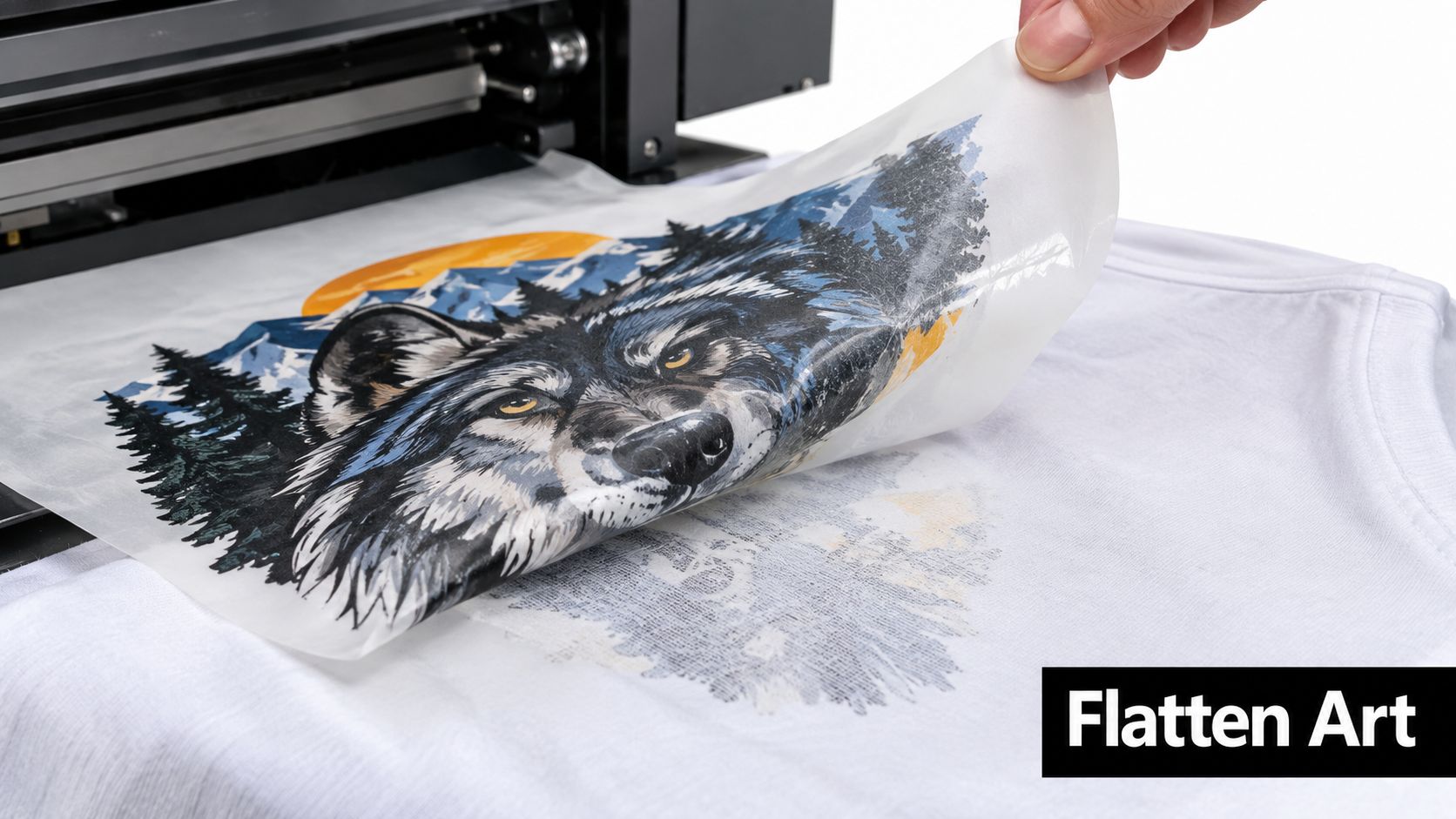
A semi-transparent edge can create a weak or uneven white layer beneath a colored element. On a dark shirt, that may appear as a gray fringe or a halo. On a light shirt, the same edge may seem acceptable on screen but print with more visible buildup than expected.
Hard-edged graphics need the opposite treatment. A thin outline, small counter, or narrow gap can disappear if it is rendered below the practical detail limit of the workflow. Zooming in helps you find technical defects, but checking at 100% and at final size tells you whether the design will remain legible.
Don't add a white background to “solve” transparency unless the production method calls for it. A white rectangle removes the transparency problem by changing the design. For DTF, the printer's white ink layer is part of the transfer process, so the file should communicate which regions are transparent and which contain visible artwork.
The raster and vector artwork guide can help you decide which parts of a design should remain scalable and which effects are better treated as pixels. The practical test is simple: export the file, place it over the intended substrate color, and look for unexpected boxes, light fringes, jagged masks, or missing shadows.
Check before upload: Hide every non-printing layer, remove stray objects, and inspect the exported file independently from the source document.
Building Efficient Gang Sheet Layouts
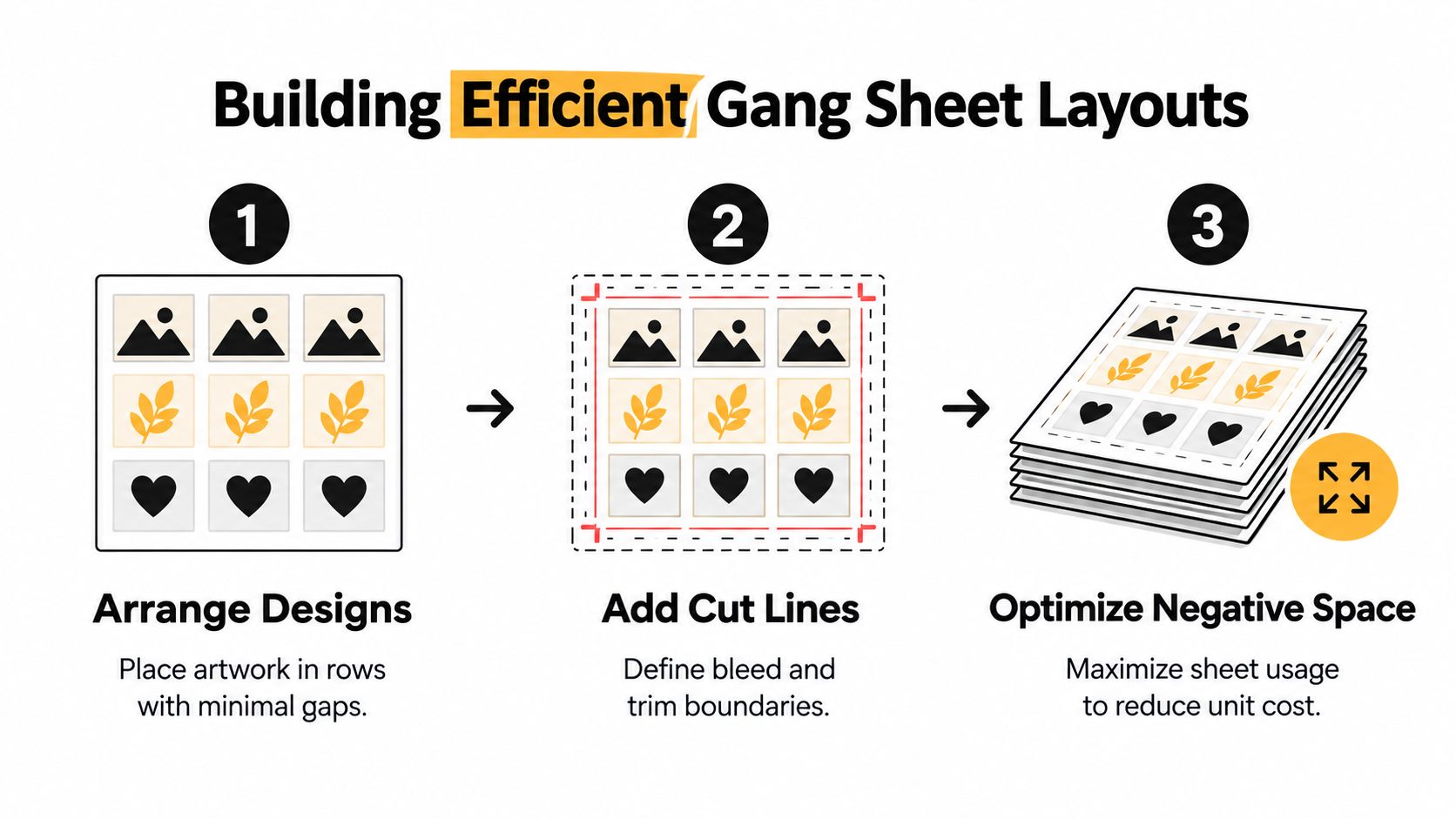
A gang sheet succeeds when the layout supports the next production step. Film utilization matters, but so do RIP white-underbase behavior, cutter clearance, peeling, and sorting. A dense arrangement can waste less film while creating fused edges, difficult cuts, or transfers that are hard to identify.
Use the printer's output dimensions and supplier instructions as fixed constraints, then place each design at its actual finished size. The layout should preserve the intended use of every piece, from a small chest mark to a large back graphic. Do not resize artwork just to fill a gap.
A practical nesting sequence
Arrange artwork with the transfer method in mind:
- Place large pieces first: Keep broad designs aligned where possible, then use smaller pieces to fill practical gaps.
- Separate white-underbase risk areas: Fine light details and dense color transitions need enough surrounding film for the RIP to generate and hold the underbase cleanly.
- Group repeated sizes: Similar pieces are easier to count, cut, and match to garments or products.
- Allow cutter clearance: Leave the supplier's required separation between cut lines and neighboring artwork. If the specification is missing, ask before export.
- Protect fragile contours: Keep narrow strokes, small counters, and delicate edges away from adjacent designs and sheet boundaries.
- Rotate with purpose: Rotation can improve yield, but directional text and orientation-sensitive artwork must remain upright.
- Keep labels off the artwork: Use a separate layout map or production note so identification marks cannot become part of the transfer.
For example, a 10 by 12 inch back print may fit beside two 4 by 6 inch chest prints, but only if the spaces between them support trimming and peeling. Saving a narrow strip of film is not worthwhile if the chest prints share a cut edge or their adhesive layers become difficult to separate.
UV-DTF adds another constraint. Hard-surface decals need clean outer boundaries and reliable handling after the carrier is removed. Pack pieces tightly enough to use the film efficiently, while leaving room for a cutter or hand-trim pass that will not nick a rounded corner or transparent edge. A guide to DTF gang sheets can help confirm spacing and nesting specifications before the file reaches production.
Keep a layout record
Before export, create a reference image listing each design, finished dimensions, orientation, and quantity. Compare it against the order, especially when several colors or sizes look alike. This catches missing variations before they become a full-sheet reprint.
Export in the provider's accepted format. Add registration marks, cut paths, or mirrored artwork only when the supplier requests them. Confirm whether the supplier's system handles orientation and separation automatically, since apparel DTF and UV-DTF workflows may process the sheet differently.
The target is usable yield. A slightly more open layout can reduce trimming errors, protect transfer edges, and make every piece easier to identify and apply.
Adapting Files for DTF and UV-DTF Applications
DTF and UV-DTF share a transfer-based workflow, but they don't share the same final surface. Apparel DTF is built for fabric applications, where the transfer must bond to fibers and tolerate handling. UV-DTF is intended for hard, smooth surfaces such as glass, acrylic, plastic, metal, and ceramics, where edge definition and surface preparation become more visible.
The file should reflect that difference before production begins. A soft feathered edge that blends naturally into a dark shirt may be unsuitable for a rigid object because the transparent boundary can reveal adhesive or create a vulnerable edge. Likewise, a very fine apparel detail may be acceptable as part of a flexible print but difficult to transfer cleanly as a small hard-surface decal.
DTF vs UV-DTF File Requirements
| Feature | Apparel DTF | UV-DTF (Hard Surfaces) |
|---|---|---|
| Typical substrate | Cotton, polyester, blends, leather, and other compatible apparel materials | Glass, metal, plastic, acrylic, ceramics, and other smooth hard surfaces |
| White layer | Supports color visibility over the garment and follows the printable artwork shape | Supports the decal's visual opacity and must remain controlled around rigid outer edges |
| Transparency | Soft shadows and gradients can work when the exported result and underbase are checked | Use caution with soft outer fades, since boundaries can remain visible on a hard surface |
| Edge behavior | The transfer must flex with fabric and survive application without fragile protrusions | Clean, well-defined contours help reduce visible lifting or peeling at the perimeter |
| Orientation | Follow the apparel provider's mirroring and upload instructions | Don't mirror unless the supplier specifically requests it. Raccoon Transfers' UV-DTF catalog guidance says its system prepares the file and asks customers not to mirror uploads |
| Artwork formats | Use the provider's accepted formats and preserve vector elements where possible | Raccoon Transfers lists PNG, PDF, and AI as accepted upload formats for its UV-DTF gang sheets |
| Application planning | Design around garment placement, press area, and fabric texture | Design around the object's curvature, cleaning conditions, and available smooth surface |
Apparel DTF decisions
For a shirt, check the design at its actual placement size and consider the garment color. A transparent region may reveal the fabric rather than print as white. A colored area over a dark garment depends on the underbase and the provider's RIP interpretation, so don't assume a screen preview shows the final ink stack.
Keep very small details connected where possible. Isolated specks and hairline strokes may be harder to handle than a continuous shape, especially after the transfer is peeled. Artwork with gradients should be inspected for banding and unexpected opacity changes after export.
UV-DTF decisions
For UV-DTF, prioritize clean silhouettes and deliberate negative space. Hard surfaces expose uneven edges, trapped debris, and small gaps more readily than fabric. Avoid placing critical detail directly on a sharp bend or near an area that will receive frequent rubbing.
Raccoon Transfers describes its UV-DTF gang-sheet product as intended for hard surfaces and lists waterproof, weather-resistant behavior, while also recommending hand washing for applied items. Those are application considerations, not reasons to ignore artwork preparation. A clean file still needs a clean, compatible surface and careful placement.
When the destination is uncertain, ask whether the design is being produced as apparel DTF or UV-DTF before exporting. The same source artwork may need different transparency treatment, edge cleanup, and layout decisions for each method.
The Final Preflight Verification Checklist
A final preflight should be boring, repeatable, and independent of memory. Most avoidable failures happen when the designer checks the visible composition but skips the production details hidden in layers, effects, color modes, and document dimensions. A provider's audit data shows why this step deserves time: one packaging prepress provider reported that over 60% of first-submission artwork packages needed at least one correction before plate or CTP release, with color-mode errors and missing overprint settings accounting for roughly half of holds. The reported packaging prepress findings also identify incorrect foil setup, wrong size, and missing or incorrect bleed as recurring artwork problems.
Those findings concern broader print production, not every DTF order, but the lesson transfers directly. Check the file before production has to check it for you.
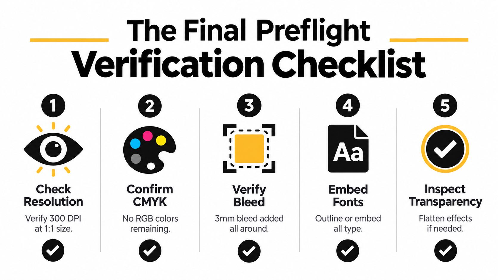
Run the audit in a fixed order
- Confirm the physical size. Check the document dimensions and every placed design at 1:1 scale. A file can have excellent resolution and still be the wrong size.
- Inspect raster content. Verify that photographs and textured elements meet the requested resolution at final output size. Don't judge sharpness only while zoomed in.
- Check color handling. Confirm the document and exported artwork follow the supplier's CMYK or RIP instructions. Look for leftover RGB objects, unmanaged profiles, and colors that changed during conversion.
- Review transparency. Toggle backgrounds on and off. Search for hidden rectangles, clipped masks, stray opacity, blend modes, and effects that were not included in the export.
- Prepare type and vectors. Outline or embed fonts as required. Inspect strokes, compound paths, clipping masks, and very small counters.
- Verify bleed and safe zones. Extend backgrounds through the trim and keep important type and logos inside the safe area. Check all edges, not just the top and left.
- Clean the file. Remove unused swatches, hidden layers, stray anchor points, guides, notes, and non-printing objects. Save an editable source file separately from the delivery file.
- Open the export independently. Close the design application, reopen the PDF or PNG, and inspect it at actual size over a representative substrate color. If the exported file differs from the source, the export is the file production will receive.
Use the supplier's requested PDF standard when PDF is required. Common press-ready guidance calls for PDF/X-1a or PDF/X-4, with fonts outlined or embedded and raster images placed at 300 DPI at final size, but supplier-specific instructions override generic defaults. Don't mirror apparel or UV-DTF artwork unless the provider explicitly requests it.
The final question is not “does the file look good on my screen?” It is “can production interpret this file without deciding what I meant?” If the answer is yes, you've removed the most expensive kind of uncertainty before the first press.
Raccoon Transfers accepts artwork for DTF and UV-DTF gang-sheet workflows, supporting apparel transfers for materials such as cotton, polyester, blends, and leather, plus UV-DTF applications on smooth hard surfaces. Review your prepared file, choose the appropriate transfer type, and visit Raccoon Transfers to upload artwork or build a gang sheet for your next production run.