
Custom Shirts Design: A Complete Guide to DTF Success
A design can look perfect on your monitor and still arrive as a disappointing shirt. The colors may appear flatter, the artwork may sit awkwardly across the chest, or the edges may start lifting after laundering. That gap between a digital mockup and a wearable product is where many new designers lose time, money, and client trust.
Successful custom shirts design depends on more than attractive artwork. You need to match the composition to the garment, prepare the file for the decoration method, select a compatible fabric, and verify the finished transfer under real production conditions. DTF makes full-color, detailed work accessible, but it doesn't remove the need for sound print judgment.
Understanding the Custom Shirt Design Journey
A new freelancer often begins with a familiar scene. The artwork is open in Illustrator or Photoshop, the colors look rich, and the mockup suggests a polished streetwear piece. Then the design is printed onto a shirt and the large back graphic feels too low, the fine lettering disappears into the texture, or the chosen orange looks dull against the fabric.
That result doesn't mean the artwork was bad. It means the design was treated as a flat image instead of a physical decoration. A shirt bends, stretches, folds, and moves with the wearer. The fabric has its own color, texture, weight, and drape. The transfer method adds another layer of technical behavior.
Start with the garment, not just the graphic
Before refining the artwork, answer four practical questions:
- Who will wear it? A relaxed lifestyle shirt needs a different visual balance from a team uniform or event tee.
- Where will the design sit? Chest, back, sleeve, and pocket areas each create different limits for scale and movement.
- What is the fabric? Cotton, polyester, and blends can change the appearance, feel, and bonding behavior of a transfer.
- How will it be decorated? DTF, screen printing, DTG, and other methods don't interpret every design in the same way.
The custom apparel category has moved well beyond one-off novelty merchandise. One industry forecast projects the broader custom apparel market will expand by USD 2.87 billion from 2025 to 2030 at a 9.0% CAGR, driven in part by on-demand design, AI-assisted creative tools, and flexible production models, as reported in this custom apparel market forecast. A separate outlook estimates the global custom t-shirt printing market at USD 7.14 billion in 2025, rising to USD 17.67 billion by 2034 at a 10.59% CAGR, according to the same market reference.
Those figures matter because buyers now expect custom shirts to function as products, not disposable souvenirs. Small brands, event organizers, and ecommerce sellers need garments that look intentional, feel wearable, and hold up after repeated use.
Shop-floor rule: If you can't explain why the artwork belongs on that specific garment, the design isn't ready for production.
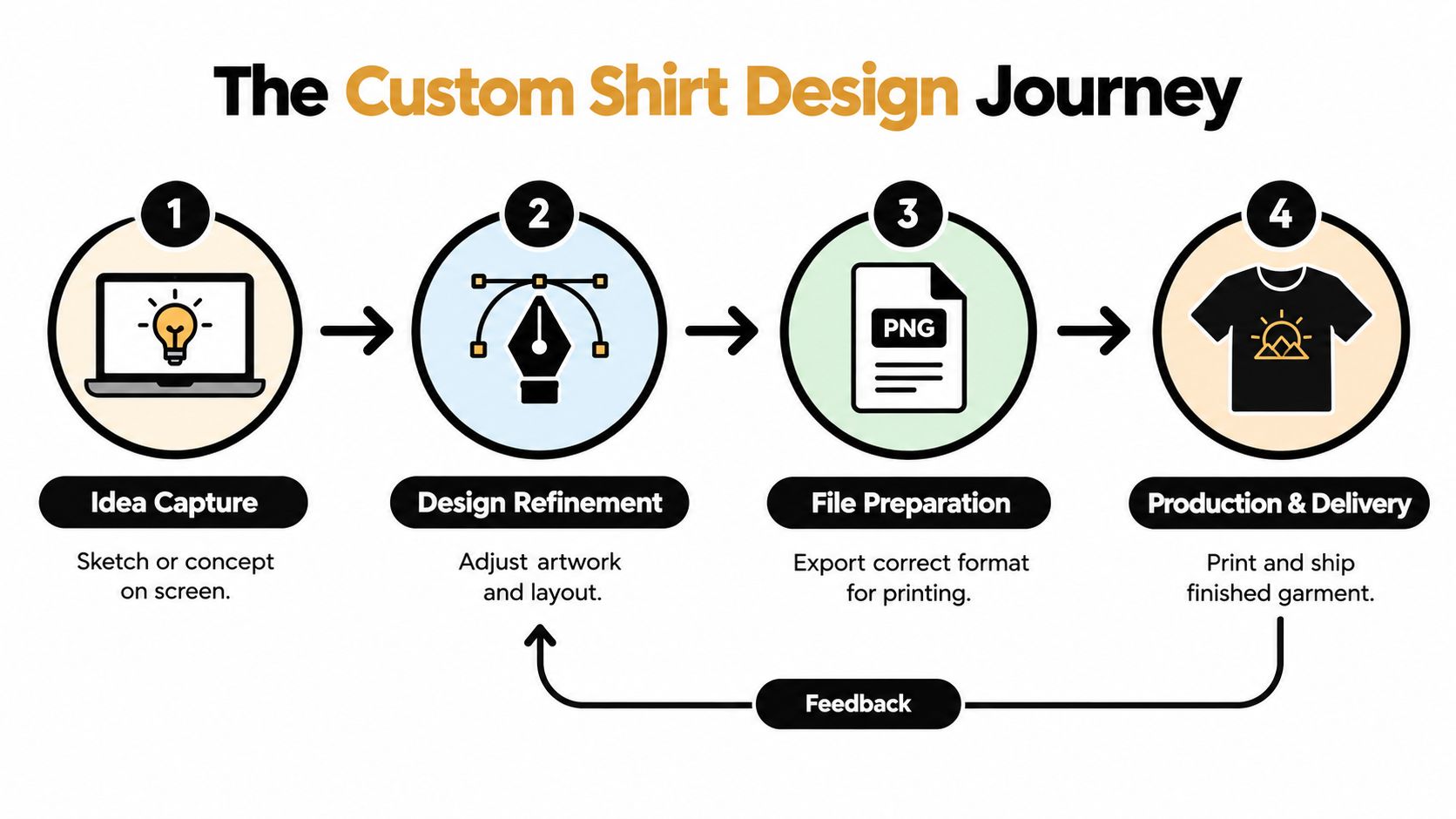
For beginners, the guide to understanding DTF printing can help clarify how a digital file becomes a transfer. The most reliable workflow is simple: capture the idea, refine the layout, prepare the file, test the combination of artwork and garment, then approve the finished result. Each stage protects the next one.
Mastering Layout and Composition for DTF
A shirt is a moving canvas. Unlike a poster, it wraps around a body, disappears into folds, and changes shape whenever the wearer sits, walks, or raises an arm. Good composition respects those conditions before you worry about decorative details.
Start by identifying the primary visual mass. This might be a bold illustration, a wordmark, or a central symbol. Place it where the wearer's body gives it room to breathe. A large back design usually needs a clear relationship with the shoulder line and the lower back. A chest design needs restraint because the natural curve of the torso can make a wide graphic feel crowded.
Build the hierarchy from large to small
Use this order when developing the artwork:
- Main shape or message: Decide what someone should notice first from a short distance.
- Supporting element: Add a secondary illustration, subtitle, date, or brand detail only if it strengthens the main idea.
- Typography: Check that letters remain readable when the shirt is moving or viewed at an angle.
- Texture and micro-detail: Add distressing, grain, or fine linework after the structure already works.
DTF can reproduce fine details and full-color artwork, but technical capability doesn't make clutter readable. A design with too many competing elements can remain sharp and still fail visually. The viewer needs a clear entry point.
Choose the placement zone deliberately
Chest placements work well for compact logos, symbols, and short messages. Keep the visual weight controlled, especially on soft or lightweight garments that can sag under a dense transfer.
Back placements give illustrations and long-form typography more room. Align the design with the garment rather than the digital artboard. A graphic that looks centered in a square mockup may appear too high once the collar, shoulders, and back seams are visible.
Pocket placements need compact artwork with strong silhouettes. Fine text and delicate lines become difficult to read at this scale, even if the source file is technically clean.
Sleeve placements suit small marks, coordinates, icons, and short words. Keep important details away from seams and areas that twist constantly during wear.
Practical advice: Print a paper version at the intended size and place it on the actual blank shirt. A physical sheet reveals proportion problems faster than another hour of zooming around a screen.
Leave breathing room around letters and major shapes. Avoid positioning important details directly over seams, heavily ribbed areas, or high-stretch zones. For a design intended to feel like lifestyle apparel, consider a smaller logo, a strong back graphic, vintage typography, hand-drawn texture, or an oversized silhouette. Recent custom shirt design trend coverage describes these approaches as part of a movement toward shirts that feel more wearable and less like temporary promotional merchandise.
Color Theory and File Preparation Essentials
Color problems usually begin before the transfer reaches the heat press. A monitor emits light, while a shirt reflects light through ink, film, fabric, and the surrounding environment. That difference explains why a bright screen color can look subdued on a charcoal blank or why two garments can make the same artwork appear noticeably different.
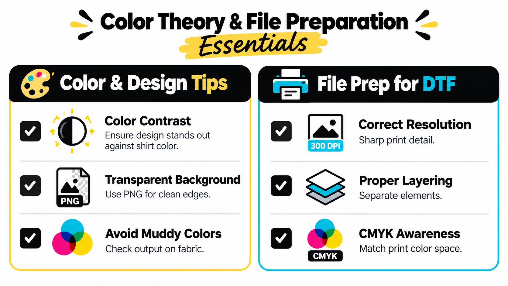
Choose contrast before you choose decoration. A dark graphic on a dark shirt may need a light outline, a stronger value shift, or a different garment color. Saturation alone doesn't guarantee visibility. Compare the relative lightness of the artwork and the fabric, then inspect the result at the size people will see it.
Prepare a clean source file
A PNG with a transparent background is a practical choice for many DTF workflows because the transfer can follow the actual edge of the artwork instead of placing an unwanted rectangular field on the shirt. A JPEG may introduce a background, compression artifacts, or a visible box around the design.
Keep the working file organized even when the final upload is flattened. Name layers clearly, preserve editable text where possible, and keep logos, illustrations, shadows, and background elements separate until the last review. If a client requests a color change or a different garment, an organized file saves reconstruction work.
Use a vector source for logos and simple shapes whenever you have one. For raster artwork, inspect the file at its intended output size. Enlarging a small image can make edges soft, create jagged curves, and expose compression noise that wasn't obvious in the original mockup.
Understand RGB and print output
Most design applications display color in RGB because screens use light. Printing systems work with inks and transfer processes that can't reproduce every luminous screen color. You don't need to eliminate color from your artwork, but you do need to anticipate shifts.
A reliable review sequence looks like this:
- Contrast check: Place the artwork over the actual shirt color, not a generic white canvas.
- Transparency check: Hide the background layer and inspect every edge for unwanted pixels.
- White detail check: Confirm that white areas are intentional and not missing because of a layer or knockout setting.
- Gradient check: Look for banding, unexpected transparency, or weak transitions in fades.
- Scale check: View small lettering and thin lines at final size, not only while zoomed in.
- Export check: Open the exported file independently and confirm that it still has the expected dimensions, transparency, and color appearance.
An ICC profile helps describe how color should be interpreted between devices and workflows. The explanation of ICC files for print workflows is useful when a client expects closer color consistency across design software, proofing, and production.
Don't promise exact screen-to-shirt color matching without a controlled workflow. Instead, communicate that the garment color, transfer process, and viewing light all influence the final appearance. A proof should show intent, while a physical test confirms behavior.
Choosing the Right Substrate for Your Design
The same artwork can feel soft and integrated on one shirt, then look heavy or behave differently on another. Substrate compatibility means matching the transfer, adhesive, artwork density, and press process to the material receiving the decoration.
Cotton is often a forgiving starting point for custom shirts. Its familiar surface can provide a comfortable hand feel and a straightforward base for many transfer workflows. A smooth, tightly knitted cotton shirt generally gives you a cleaner visual surface than a loose, uneven garment. That doesn't mean every cotton blank performs identically. Fabric weight, finish, dye, and construction still matter.
Synthetic garments require more caution. Polyester and performance blends can have different surface characteristics, stretch behavior, and dye interactions. A transfer may adhere successfully but still produce an unwanted feel, color interaction, or migration issue if the garment and process aren't tested together.
Compare the decision factors
| Substrate factor | What to inspect | Why it affects the design |
|---|---|---|
| Fiber content | Cotton, polyester, or a blend | Influences bonding, stretch, feel, and process settings |
| Surface texture | Smooth, brushed, ribbed, or uneven | Affects edge definition and perceived detail |
| Fabric movement | Stable or highly elastic | Determines how artwork behaves during wear |
| Garment color | Light, mid-tone, or dark | Changes contrast and the appearance of bright colors |
| Intended use | Casual, active, promotional, or retail | Sets expectations for comfort and durability |
A light-colored blank often makes color evaluation easier because the artwork has a clean visual foundation. Dark garments may need a carefully managed white underbase or stronger contrast so the design doesn't lose energy. Don't assume that adding more color solves a contrast problem. Sometimes changing the shirt is the cleaner solution.
The decoration method also matters. Industry coverage describes DTF as widely adopted among decorators, while noting that it isn't a universal replacement for screen printing. The same decoration trends report discusses DTF's flexibility alongside continued screen-printing use, which supports a method-by-method decision rather than a one-process-fits-all rule.
For designs intended for stretch garments or frequent laundering, evaluate transfer chemistry and bonding performance, not just artwork detail. A peer-reviewed thermal transfer printing study reported peel strength above 900 N/m and lap-shear strength above 7.85 MPa, with performance retained after 50 standard washing cycles. Those results describe a specific engineered system, not a guarantee for every transfer, so treat them as evidence that material selection, adhesive formulation, and interfacial bonding deserve serious attention.
Creating Professional Mockups and Proofs
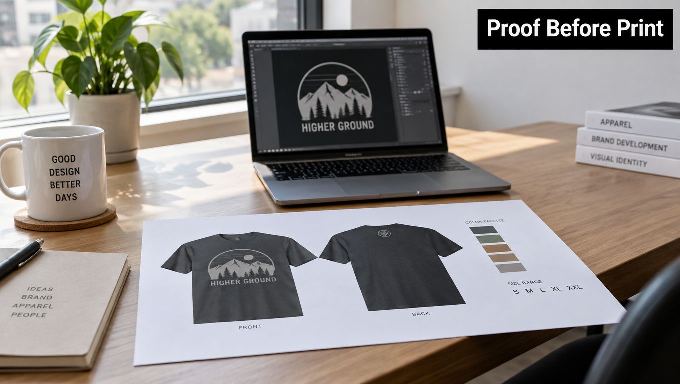
A mockup sells the concept. A proof protects the production decision. Treating them as the same document creates confusion, especially when a client approves a beautiful screen image without understanding how large the transfer will feel on the actual garment.
Start with a mockup that shows the shirt in a believable context. Use a garment with a similar cut, color, neckline, and drape to the intended blank. A relaxed oversized shirt, a fitted tee, and a performance garment won't present the same artwork in the same way.
Separate presentation from verification
Use a digital mockup to communicate the overall idea:
- Show front, back, or sleeve views when placement affects the decision.
- Include the garment color and approximate fit.
- Keep lighting realistic enough that the artwork's contrast remains clear.
- Label the image as a visual representation if color accuracy isn't guaranteed.
Use a production proof to verify the details that can cause a failed order. It should identify the final artwork, placement, size, garment, and any personalization. If a client has strict brand colors, explain that the screen preview supports approval but doesn't replace a physical sample.
Build a repeatable approval routine
The apparel mockup template guide can help you create consistent presentations rather than improvising every client preview. Save a master template with the correct perspective, lighting, and garment masks, then duplicate it for new concepts.
Before requesting approval, inspect the mockup for three common problems:
- Scale drift: The design became larger or smaller than the agreed physical size.
- Placement drift: The artwork moved relative to the collar, side seam, or pocket.
- Color illusion: The mockup uses lighting or blending effects that make the print appear more vibrant than the expected transfer.
Ask the client to approve the exact version that will be produced. Include the file name or revision label in your records. Once approved, lock the artwork and record the garment details. This simple discipline prevents a late revision from replacing the version everyone reviewed without notice.
A professional proof doesn't promise that a shirt will look identical to a glowing monitor. It gives the client enough information to make an informed decision and gives the production team a clear target.
Production-Ready Checklist for Consistent Results
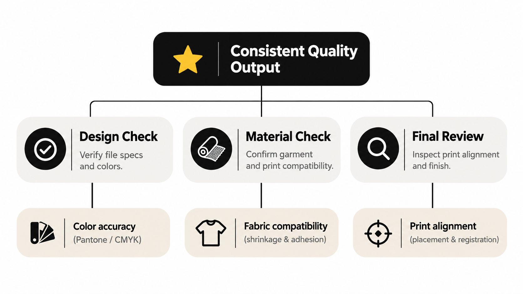
Consistency comes from removing guesswork. A skilled operator may remember what worked on the last order, but memory isn't a production system. Garments change, artwork changes, and different transfers can require different handling. Write down the successful combination so you can reproduce it.
Before pressing
Complete the design and material checks before the garment reaches the press:
- File verification: Confirm the approved artwork, transparency, edges, scale, and placement.
- Garment verification: Check the brand, color, size, fiber content, surface, and visible defects.
- Transfer verification: Inspect the film for missing areas, contamination, curled edges, or unexpected marks.
- Placement verification: Use a physical guide or measured reference instead of estimating by eye.
- Equipment verification: Confirm that the press surface is clean and that temperature, pressure, and dwell settings follow the transfer supplier's instructions.
Do a test on a matching or comparable blank when you're using a new garment, new artwork density, or new transfer. A scrap test can reveal poor adhesion, excessive shine, scorching, ghosting, or an uncomfortable hand feel before you commit the full order.
During and after pressing
The transfer must receive the right combination of heat, time, and pressure. A nominal press setting isn't proof that the entire artwork reached the required condition. Uneven pressure, a damaged pad, or a garment seam under the press can leave sections under-bonded.
Industry guidance identifies insufficient curing as a primary cause when a printed garment can't withstand 5 to 6 washings, because the full ink film must reach the required curing temperature for proper washfastness. The textile washfastness guidance from PRINTING United Alliance recommends verifying the cure profile rather than relying only on the displayed press setting.
Follow the transfer supplier's instructions for peeling and cooling. Don't pull at an edge while the adhesive is still vulnerable, and don't stack freshly pressed garments in a way that traps heat or transfers unwanted texture.
Document what worked
Record the garment, transfer type, artwork size, placement reference, press settings, peel instruction, and inspection result. Then review the finished shirt under ordinary light and stretch the garment gently to check for cracking, lifting, or distortion.
Quality-control habit: Keep one approved sample from a recurring product line. Compare future production against it, not against memory.
Wash testing should follow the care instructions you give the customer. Look for edge lifting, fading, cracking, residue, and changes in hand feel. If a result fails, change one variable at a time. Replacing the garment, transfer, temperature, pressure, and artwork simultaneously makes the cause impossible to identify.
Real-World Examples and Common Pitfalls
A common first attempt uses a detailed illustration, thin script, several low-contrast colors, and a large placement across a soft shirt. On screen, every element looks expressive. On the garment, the script competes with the illustration and the dark colors blend into the fabric.
The fix isn't always to simplify the entire concept. Keep the illustration, strengthen the hierarchy, remove secondary text, increase contrast, and test the design at its actual size. If the shirt stretches across the placement, move delicate details away from the most active area.
Another frequent mistake is scaling a small logo far beyond its original quality. The designer sees soft edges only after the transfer is produced. Start with a vector file where possible, or rebuild important shapes instead of enlarging a compressed raster image.
Peeling edges usually point to a production problem rather than a composition problem. Check the garment surface, pressure, dwell time, temperature uniformity, and peel procedure. Fading after laundering requires a separate investigation into curing, care instructions, and transfer compatibility. Adhesive residue may indicate excess material, contamination, or incorrect handling.
The strongest working habit is to ask one question at every stage: what could change when this design leaves the screen? That question catches placement, color, fabric, and durability problems early.
Raccoon Transfers provides custom DTF transfers for apparel and hard surfaces, with upload options, gang sheet building, sizing choices, heat-press instructions, and support for small-batch or bulk projects. If you're ready to turn a tested design into a physical product, visit Raccoon Transfers and choose the transfer format that fits your garment and workflow.