
what is an icc file? A Simple Guide to Color Accuracy
Have you ever designed something with a stunning, vibrant red on your screen, only to get a dull, muddy orange from the printer? That exact frustration is what an ICC file is built to prevent. Think of it as a small, powerful data file that acts as a universal translator for color, keeping everything consistent from your screen to the final print.
The Role of an ICC File in Color Management
An ICC file—which stands for International Color Consortium profile—is basically a unique fingerprint for any device that handles color. Your monitor, camera, scanner, and printer all see and create color differently.
A brilliant blue on your screen is made from a specific mix of RGB (Red, Green, Blue) light. But to get that same exact blue in print, a printer needs a precise recipe of CMYK (Cyan, Magenta, Yellow, Black) ink. Without a translator, that conversion is just a wild guess, which leads to unpredictable, often disappointing, results.
An ICC file bridges that gap. It contains a detailed description of how a specific device produces color, ensuring that the blue you saw on screen is the blue you get on your t-shirt.
Creating a Standard for Color
It wasn't always this straightforward. Back before the 1990s, color management was a mess of competing, proprietary systems. Moving a design from one computer to another almost guaranteed the colors would shift, sometimes dramatically.
To solve this chaos, the International Color Consortium was founded in 1993 by eight industry giants, including Apple. They set out to create an open, universal standard for color. The result was the ICC profile, which has become the foundation of modern color management and brought much-needed predictability to the creative world.
Key Takeaway: An ICC profile doesn't actually change the colors in your file. It simply provides an exact definition of what those colors are supposed to look like, so other devices know how to reproduce them accurately.
Why This Matters for Your Projects
Ultimately, using the right ICC profile gives you control. It puts an end to the frustrating and expensive cycle of printing a design, seeing it's wrong, tweaking it, and printing it all over again.
When your monitor is properly calibrated and you're using the correct output profile for your printer, you can design with confidence. You know what you see is what you’ll get.
To make sure your colors pop just right, it’s also crucial to start with high-quality source images. Resources like the 7 Best Sources for Pictures to Print can help you find files that are already optimized for fantastic results from the very beginning.
How ICC Profiles Create a Universal Color Language
Ever tried to describe the color "sky blue" to a group of people? You'll quickly find that everyone imagines a slightly different shade. Digital devices like your monitor, scanner, and printer have the exact same problem. A set of RGB values—say, R-135, G-206, B-235—is just a recipe. Each device interprets that recipe differently based on its unique hardware and calibration.
This is the classic problem of device-dependent color. Without a common frame of reference, that "sky blue" recipe is ambiguous. Your monitor might show a bright, vibrant blue, but your DTF printer might interpret it as a duller, almost purplish color. These subjective interpretations are the root cause of frustrating color mismatches.
An ICC profile acts as the universal translator to fix this. It takes that subjective, device-specific color and maps it to a standardized, objective language. This "master language" is called a Profile Connection Space (PCS), with CIELAB being the most common standard. Think of it as a definitive color dictionary that every device in your workflow can refer to.
This diagram shows how an ICC profile translates color in a typical design-to-print workflow, ensuring what you see on screen is what you get in print.
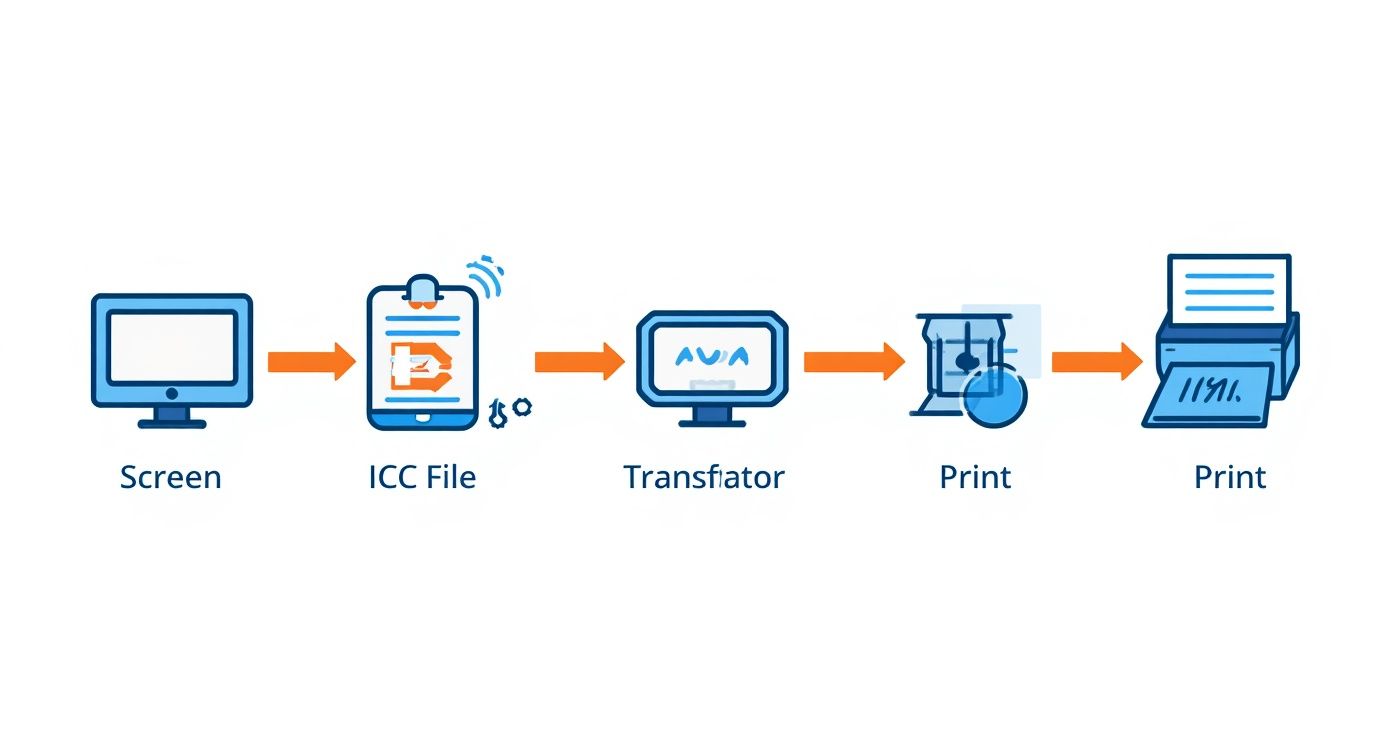
As you can see, the process moves from the subjective color on your monitor, through the objective translation provided by the ICC file, and finally to an accurate, predictable reproduction on the printer.
The Translation Process in Action
Let’s walk through how this translation happens in the real world. When you hit "Print" in a program like Adobe Photoshop, the color management system (CMS) kicks in and performs a quick, two-step conversion behind the scenes.
-
Source to Standard: First, the CMS looks at your monitor's ICC profile. That profile essentially tells it, "When this specific monitor is asked to show R-135, G-206, B-235, the actual color it produces corresponds to this precise coordinate in the CIELAB master dictionary." It translates the ambiguous RGB numbers into the universal PCS language.
-
Standard to Destination: Next, the CMS grabs the printer’s ICC profile. This profile says, "Okay, to reproduce that exact same CIELAB coordinate, I need to mix a very specific recipe of CMYK ink—something like C-52, M-15, Y-0, K-8."
This seamless process makes sure the final printed color is a dead ringer for what you saw on screen. The underlying numbers (RGB vs. CMYK) and the technologies (emitted light vs. reflective ink) are totally different, but the ICC profile is the critical bridge that guarantees they look the same.
Defining What a Device Can (and Can't) Do
Every device has a gamut—the total range of colors it is physically capable of displaying or printing. A professional photo printer, for example, will always have a much wider gamut than a standard office monitor, especially in tricky colors like bright greens and deep cyans.
An ICC profile meticulously maps out this entire gamut. It creates a detailed 3D model of a device’s color space, defining its boundaries, its strengths, and its limitations.
Why This Matters: Knowing a device's gamut is everything. If your design includes a brilliant neon green that's outside the printer's capabilities, the profile helps the CMS handle that "out-of-gamut" color intelligently. It uses something called a rendering intent to shift the color to the nearest printable equivalent, preserving the overall look and feel of your image.
Without that profile, the printer would just "clip" the color, resulting in flat, blocky patches where all your subtle details disappear.
This table really drives home the difference between a workflow with and without this standardized system.
Device vs. Independent Color Spaces
| Concept | Device-Dependent Color (Without ICC Profile) | Device-Independent Color (With ICC Profile) |
|---|---|---|
| Color Definition | Based on ambiguous device values (e.g., RGB numbers) that mean different things to different hardware. | Defined by a precise, universal standard (e.g., CIELAB) that is understood by all devices. |
| Consistency | Wildly inconsistent. The same color values produce different visual results on every screen and printer. | Highly consistent. The visual appearance of a color is maintained across your entire workflow. |
| Predictability | A total crapshoot. You're just guessing how a print will look based on what's on your screen. | Completely predictable. "Soft-proofing" allows for accurate on-screen previews of the final print. |
| Workflow | Leads to a frustrating cycle of trial-and-error, wasted materials, and constant color correction. | Creates a smooth, efficient "what you see is what you get" (WYSIWYG) workflow. |
By translating color into this shared language, ICC profiles bring the reliability and consistency needed for any professional creative work. They turn color from a subjective guess into an objective science, ensuring your vision is perfectly preserved from screen to the final product.
Getting ICC Profiles into Your Design Workflow
Knowing the theory behind ICC profiles is a great start, but actually using them is where you take back control of your color. When you integrate a profile into your design workflow, you're essentially attaching a detailed instruction manual to your artwork. This ensures every device that touches your file—from your monitor to our printers—knows exactly how to interpret its colors.
It creates a clear, predictable path from your digital idea to the final physical product.

This whole process boils down to two key profile types you'll use in your design software: the working space profile and the output profile. Getting a handle on both is the secret to a smooth, color-accurate workflow.
Defining Your Creative Color Palette
Your working space is the color environment you create in. Think of it like choosing your box of crayons before you even start drawing. It sets the range of colors, or gamut, you have available to you right inside the software.
You'll most often run into these two:
- sRGB: This is the standard for the web and just about every consumer screen out there. Its smaller gamut is designed to look pretty consistent across millions of uncalibrated monitors, making it the safest bet for anything that will only be seen on a screen.
- Adobe RGB (1998): This profile gives you a much bigger box of crayons to work with, especially in the cyan and green ranges. That wider palette is perfect for print projects because it can capture more color details that professional printers are capable of reproducing.
For DTF printing, it’s almost always a good idea to start your design in a wider-gamut space like Adobe RGB. You're preserving more color data from the get-go, which gives the final output profile more information to work with when it translates your design for our printers.
Embedding the "How-To" for Printing
While the working profile defines your creative playground, the output profile contains the specific instructions for a particular device, like one of our high-end DTF printers. When you get your file ready to send to Raccoon Transfers, you need to embed your working profile (like Adobe RGB). This tells our systems exactly what your color values are supposed to look like.
By embedding the profile, you're packing your creative intent right into the file itself. It eliminates the guesswork and makes sure the vibrant red you picked on your screen doesn't get misinterpreted as a dull orange during printing.
This isn't just a good idea; it's a global standard. It's estimated that ICC profiles are embedded in over 90% of professionally processed digital images, forming the very foundation of color management in industries worth billions. This is what makes consistent color possible, whether you're printing in your hometown or across the world.
Why Your File Format Matters
As you start working with ICC profiles, don't forget about your file format. The type of file you save your work as can directly affect how color information is stored and preserved. For anyone who wants to go a bit deeper, understanding common image formats like JPG and PNG offers some great context. For print, formats like TIFF and PNG are usually the way to go because they avoid the kind of compression that can degrade your colors.
Properly embedding your profiles is the critical bridge between your digital design and a flawless final product. It's a non-negotiable step for getting professional, predictable results in any color-critical work, from sublimation to our DTF transfers. To learn more about different printing methods, take a look at our guide on the best printers for sublimation and heat transfer.
When you combine the right working space, a properly embedded profile, and a high-quality file format, you create a powerful and reliable workflow that honors your original vision every single time.
Putting Color Profiles to Work in Adobe and Affinity
Okay, so we've covered the theory. Now let's get our hands dirty. This is where you really take control of your color and make sure what you see on screen is what you get in the final print. Thankfully, the major design apps like Adobe Photoshop, Illustrator, and Affinity Designer have powerful color management tools built right in. The trick is knowing where to find them and how to use them.
This part of the guide is all about practical steps. We'll walk through setting up your documents, previewing the final print before it even hits the printer, and handling files that come to you with the wrong settings. We’ll use specific menu commands to make it easy to follow along, turning those abstract concepts into real-world skills.

Start Your Document the Right Way
Honestly, the most critical step in managing color happens right at the beginning—before you’ve even drawn a single line. When you assign the correct working color profile from the get-go, you're building your design in the right "language" for its final destination, whether that’s a screen or a DTF transfer.
When you create a new document in Photoshop or Affinity Designer, look for an option called "Color Profile" or "Color Space." This is your starting point.
- For Print (and that includes DTF): Always, always start with a wider-gamut profile like Adobe RGB (1998). It captures a much broader range of colors, especially those vibrant greens and cyans. This gives our printers far more data to work with, resulting in a richer, more accurate final product.
- For Web/Digital Only: If your design is destined only for screens, sRGB is your go-to. It’s the standard for web browsers and mobile devices, so it keeps your colors looking consistent no matter where they're viewed.
Think of it this way: choosing Adobe RGB for print work is like an artist starting with a full palette of paints instead of a kid's watercolor set. You simply have more potential for vibrant color right from the start.
How to Convert an Existing File's Profile
What happens when you get a file from a client and it’s in the wrong color space, like an sRGB image you need to prep for print? Your first instinct might be to just assign a new profile, but that’s a big mistake. Assigning a profile just slaps a new label on the existing color numbers without actually changing them, which will cause a wild, unpredictable color shift.
Instead, you need to convert the file. This process intelligently remaps the color values from the original profile to the new one, doing its best to preserve the visual appearance of your artwork.
In Adobe Photoshop or Illustrator:
- Head up to the main menu and select Edit > Convert to Profile...
- In the pop-up window, choose your target Destination Space (in our case, Adobe RGB (1998)).
- Make sure the Conversion Engine is set to Adobe (ACE) and the Intent is "Relative Colorimetric" with "Black Point Compensation" checked. This combo almost always gives the best results for graphics and photos.
- Click OK, and you're done.
This one command is one of the most powerful and important tools in your entire color management toolkit.
Use Soft Proofing to See the Future
Here’s where the magic really happens. One of the best things about a color-managed workflow is the ability to see a surprisingly accurate preview of your final print right on your monitor. This is called soft proofing, and it lets your screen simulate how your design’s colors will look when printed with a specific ICC profile. It’s like getting a digital test print, which can save you a ton of time, money, and wasted materials.
Key Insight: Soft proofing temporarily makes your screen mimic the printer's more limited color range (its gamut). It immediately reveals which colors might look duller or shift in hue, giving you a chance to fix them before you send the file to print.
To set up soft proofing in Adobe Photoshop:
- Go to View > Proof Setup > Custom...
- From the "Device to Simulate" dropdown menu, select the specific ICC profile for the printer you're using. If you had a custom profile from Raccoon Transfers, this is where you'd choose it.
- Set the Rendering Intent to "Relative Colorimetric." This is usually the best option for maintaining the relationships between colors in your artwork.
- For the most accurate preview, check the boxes for "Simulate Paper Color" and "Simulate Black Ink." This will show you how the design will look on the actual print material.
With your proof setup active, you can now toggle this preview on and off with the keyboard shortcut Ctrl+Y (Windows) or Cmd+Y (Mac). You'll see an instant "before and after," showing you exactly how the colors will translate from your screen to the final transfer. This gives you the power to fine-tune any out-of-gamut colors for a perfect result. For an even deeper dive into prepping files, our guide on printing designs onto fabric has more great tips.
By mastering these three core skills—assigning, converting, and proofing—you're no longer just guessing and hoping for the best. You're taking complete control, making informed decisions that ensure your creative vision makes it from your screen to the final product flawlessly, every single time.
Troubleshooting Common Color Management Problems
Even when you do everything right, color can still be a tricky beast. You've spent hours perfecting a design on-screen, only for the final print to look… off. It’s frustrating, but the good news is that these issues almost always boil down to a simple breakdown somewhere in the color management chain. You don’t need to be a color scientist to figure it out—just a good detective.
Most of the time, the culprit is a missing profile, the wrong profile being assigned, or an uncalibrated monitor throwing everything off from the very beginning. Each of these mistakes sends bad information down the line, forcing every piece of software and hardware to make a bad guess about what you actually wanted. Let's walk through how to spot and fix these common problems.
The Problem of Untagged Color
Ever opened a file and gotten a pop-up warning about a "missing profile"? That's what we call an untagged file. It means your image has all the RGB or CMYK color numbers, but it's missing the instruction manual—the ICC profile—that tells the computer what those numbers are supposed to look like.
Without that profile, your design software is basically flying blind. It has to take a shot in the dark and apply its default color profile. If it guesses wrong (like applying a standard sRGB profile to a file you secretly created in the much wider Adobe RGB space), your colors will immediately look flat, dull, and just plain wrong.
Key Takeaway: An untagged file is a recipe for color chaos. It forces guesswork, and guesswork is the mortal enemy of getting predictable, consistent color. Always, always make sure your files have a profile embedded.
When Profiles Mismatch
A profile mismatch is a different flavor of the same problem. This is what happens when a file has an ICC profile embedded, but it’s the wrong one. Imagine taking a photo in sRGB but accidentally tagging it with an Adobe RGB profile.
You've essentially handed your color data to the wrong translator. The software sees the sRGB color values but interprets them using the rules of the much larger Adobe RGB color space. This stretches the colors out, making them look oversaturated, neon, and almost cartoonish. It might look punchy, but it’s not what you designed, and it will lead to a print that completely misrepresents your work.
Your Monitor: The Foundation of Color
Before you even think about ICC profiles, let's talk about the screen you're staring at. Is it telling you the truth? An uncalibrated monitor is easily the most common—and most overlooked—source of color headaches. If your screen isn't showing you accurate colors, every single decision you make is based on bad information.
Calibrating your monitor with a hardware tool like a colorimeter creates a custom ICC profile just for your display. This process neutralizes any color casts and ensures that what you see on screen is a true, accurate representation of your file. Trying to manage color on an uncalibrated screen is like trying to mix paint in a dark room; you’re just guessing.
A Simple Troubleshooting Checklist
When your print doesn't match your screen, don't panic. Just work your way through this checklist. The problem is almost always hiding in one of these four places:
- Is Your Monitor Calibrated? Seriously, start here. If your screen is lying to you, nothing else matters.
- Is the Right Profile Assigned? Dive into your software’s color settings. Make sure your document’s working space is what it should be (for DTF, that’s usually Adobe RGB).
- Did You Embed the Profile? When you save or export, look for that little checkbox that says "Embed Color Profile." Make sure it's ticked. That's what tags your file with the right instructions.
- Are You Using the Right Output Profile? If you're soft proofing to preview the final print, you have to use the specific ICC profile from your print shop. Anything else is just a guess. To see why this is so vital for modern methods, check out our guide on what Direct-to-Film printing is and how it depends on razor-sharp color accuracy.
A Few Common Questions About ICC Files
Once you start digging into color management, a lot of questions pop up. Let's tackle some of the most common ones I hear from designers to clear things up and help you get your files print-ready with confidence.
What’s the Real Difference Between sRGB and Adobe RGB?
This is a big one. The easiest way to think about it is to imagine two different boxes of crayons.
-
sRGB is your standard, smaller box of crayons. It’s the color language of the internet. Pretty much every monitor, smartphone, and tablet is designed to display sRGB well. Because its range of colors (its "gamut") is more limited, it’s a safe bet for ensuring colors look reasonably consistent everywhere online.
-
Adobe RGB (1998) is the bigger, professional-grade box of crayons. It can display a much wider spectrum of colors, especially in the bright greens and cyans. This is huge for professional printing because high-end equipment, like our DTF printers, can actually reproduce those extra, vibrant colors that sRGB simply can't contain.
So, what's the takeaway? If you're designing for print, always start your project in Adobe RGB. You're capturing more color information right from the start. If your design is only ever going to live on a screen, sRGB is the way to go for the most predictable results.
Do I Actually Need a Custom ICC Profile?
For printing a family photo on your home inkjet, the generic profiles that came with the printer are probably fine. But when color accuracy is the name of the game—like in professional DTF, sublimation, or fine art reproduction—a custom ICC profile is absolutely essential.
A generic profile is just a manufacturer's best guess for an entire printer model. A custom profile, on the other hand, is a precise map created for one specific combination of a printer, its exact ink set, and the material being printed on.
Think of it this way: a generic profile is an off-the-rack suit, while a custom profile is a bespoke suit tailored to your exact measurements. It accounts for every little variable in a professional workflow.
At a professional shop like Raccoon Transfers, we've built custom profiles for our specific machines and transfers. Using our provided profiles is the single best way to ensure the colors you see on your calibrated screen are the colors that end up on your final product.
How Do I Install an ICC Profile?
Getting an ICC profile onto your computer is simple. You're just placing the file where your operating system and design software know to look for it. The process is a little different for Windows and Mac.
On Windows:
- Find the profile file (it’ll have an .icc or .icm extension).
- Right-click on the file.
- Choose "Install Profile" from the menu that pops up. That's it!
On macOS:
- Copy the .icc or .icm file.
- Open a Finder window and go to one of these two locations:
- For all users on the Mac:
/Library/ColorSync/Profiles - For just your own account:
/Users/[Your Username]/Library/ColorSync/Profiles
- For all users on the Mac:
- The
Libraryfolder in your user directory is often hidden. A quick trick is to click "Go" in the Finder menu bar while holding down theOptionkey to make it appear.
After you've installed the profile on either system, it's a good idea to restart programs like Photoshop or Affinity Designer. This forces them to scan for new profiles so yours will show up in their menus.
What Does "Embedding" a Profile Mean?
Embedding an ICC profile is like attaching a digital "paint by numbers" guide directly to your image file (like a JPEG, TIFF, or PNG). This embedded file tells any other computer or printer, "Hey, these are the exact colors I'm supposed to be."
When another program opens your file, it reads that embedded profile to understand what the RGB numbers in your file are actually supposed to look like. It translates the raw data into a specific, accurate visual appearance.
If you don't embed a profile, your file is "untagged." The next program in line has to guess which color space you used, and it almost always guesses wrong. This is where you get those frustrating color shifts. Always, always check the "Embed Color Profile" box when you save your work. It's the final, crucial handshake that keeps your colors consistent from your screen to the final print.
Ready to see your perfectly color-managed designs come to life with stunning vibrancy and accuracy? At Raccoon Transfers, we make professional-quality DTF printing easy. Upload your artwork, and let us handle the rest.