
Heat Transfer Designs Made Simple for Perfect Prints
You've finished a design that looks sharp on your monitor. The colors are bright, the lettering is centered, and the mockup looks ready for your shop. Then the transfer arrives, and the print feels too heavy on the shirt, loses detail on a dark fabric, or sits awkwardly on a curved bottle. The problem often isn't the printer. It's that the artwork was prepared as digital art, rather than as a design intended for a specific material and application process.
Heat transfer designs have to survive more than a screen preview. They must work with heat, pressure, adhesive, fabric stretch, surface texture, and the way a customer will use the finished product. A soft cotton shirt, a stretchy synthetic garment, a glass tumbler, and a plastic case all ask different things from the same artwork.
That's why the strongest workflow starts with the application. DTF transfers for apparel behave more like a heat-applied patch, while UV-DTF transfers for hard surfaces behave more like a decorated adhesive layer. File preparation, color choices, sizing, and spacing all change depending on which job the design must perform.
Introduction Why Great Heat Transfer Designs Start Before Printing
A first-time designer often begins with the artwork and treats production as the final button to press. That order feels natural, but it creates avoidable surprises. A transparent PNG may look clean in a design program, yet a hidden background can produce an unwanted box. A delicate line can look elegant on screen but disappear when reduced for a small chest mark. A large solid graphic can look bold in a mockup and feel stiff once it's pressed onto a shirt.
The better question isn't only, “Does this design look good?” Ask, “Where will this design live, and what will happen to it there?”
For apparel, the transfer must bond to fabric while remaining comfortable enough to wear. Stretching, seams, repeated washing, and the garment's color all affect the result. A design that works on a light cotton shirt may need different contrast, opacity, or detail treatment on a dark synthetic garment.
Hard surfaces create a different set of conditions. A UV-DTF graphic applied to glass, acrylic, plastic, metal, or ceramic needs clean edges and strong contact with a smooth surface. Curves, corners, handling, moisture, sunlight, and scratching influence how the finished decoration performs. A design intended for a bottle may need more breathing room around its contour than one applied to a flat sign.
Practical rule: Choose the substrate before you finalize the artwork. The material determines the transfer method, and the transfer method affects nearly every design decision that follows.
This guide moves from the basic idea of a heat transfer to file setup, application-specific design, sizing, mockups, and production planning. You'll learn why DTF and UV-DTF aren't interchangeable, how to avoid blurry or color-shifted files, and how to prepare artwork that looks intentional after application, not just before printing.
How Heat Transfers Work and Why Design Choices Matter
A heat transfer carries printed artwork on a film or carrier and moves it onto another material. The transfer is only one part of the finished result. The artwork, ink layer, adhesive, heat or curing method, pressure, surface, and application technique all work together.
Think of DTF for apparel as an iron-on patch with a printed image built into it. The design is printed onto film, adhesive powder is used to help it bond, and a heat press transfers the finished layer to fabric. It's suitable for detailed, full-color artwork on many garments, but the design still needs to account for fabric movement and the feel of the applied layer. For broader background reading, this guide to what heat transfer printing means gives useful process context.
UV-DTF for hard surfaces is a different job. Instead of relying on a heat press to bond the design to fabric, UV-curable inks form the printed decoration, and an adhesive layer helps move it onto a smooth object. The result behaves more like a durable sticker or decal than an iron-on patch. It doesn't require the same fabric stretch considerations, but surface preparation, contour, pressure, and contact quality become especially important.
Why the same artwork can behave differently
Fine lines need enough visual weight to remain visible after printing and application. Tiny gaps can close up, especially when several colors sit close together. Gradients can reproduce attractively, but they may need enough area to show a smooth transition rather than becoming a muddy blend.
Solid fills create another tradeoff. On apparel, a large uninterrupted ink area can feel heavier than a design with open space. On a hard surface, a solid background may help preserve contrast, especially when the substrate is transparent, dark, or visually busy.
The distinction also matters when selecting a service. For example, heat transfer vinyl clothing follows an iron-on approach that differs from printed DTF artwork, so you shouldn't prepare every file as though the processes were identical. For hard, smooth goods, Upload Your Own UV DTF Gang Sheets accepts PNG, PDF, and AI files, and the service instructions say not to mirror the artwork before uploading.
The printer reproduces the file you provide. It can't repair a background, restore missing pixels, or make an unsuitable design fit a curved surface.
File Formats Color Management and Resolution Essentials
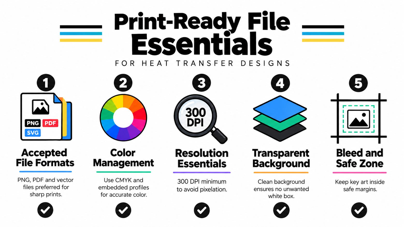
A print-ready file should be clean, intentional, and easy for production software to interpret. Start by separating the artwork from the background. For most transfer work, a transparent background is important because it prevents an unwanted rectangle around a logo, illustration, or lettering.
Build the artwork in the right format
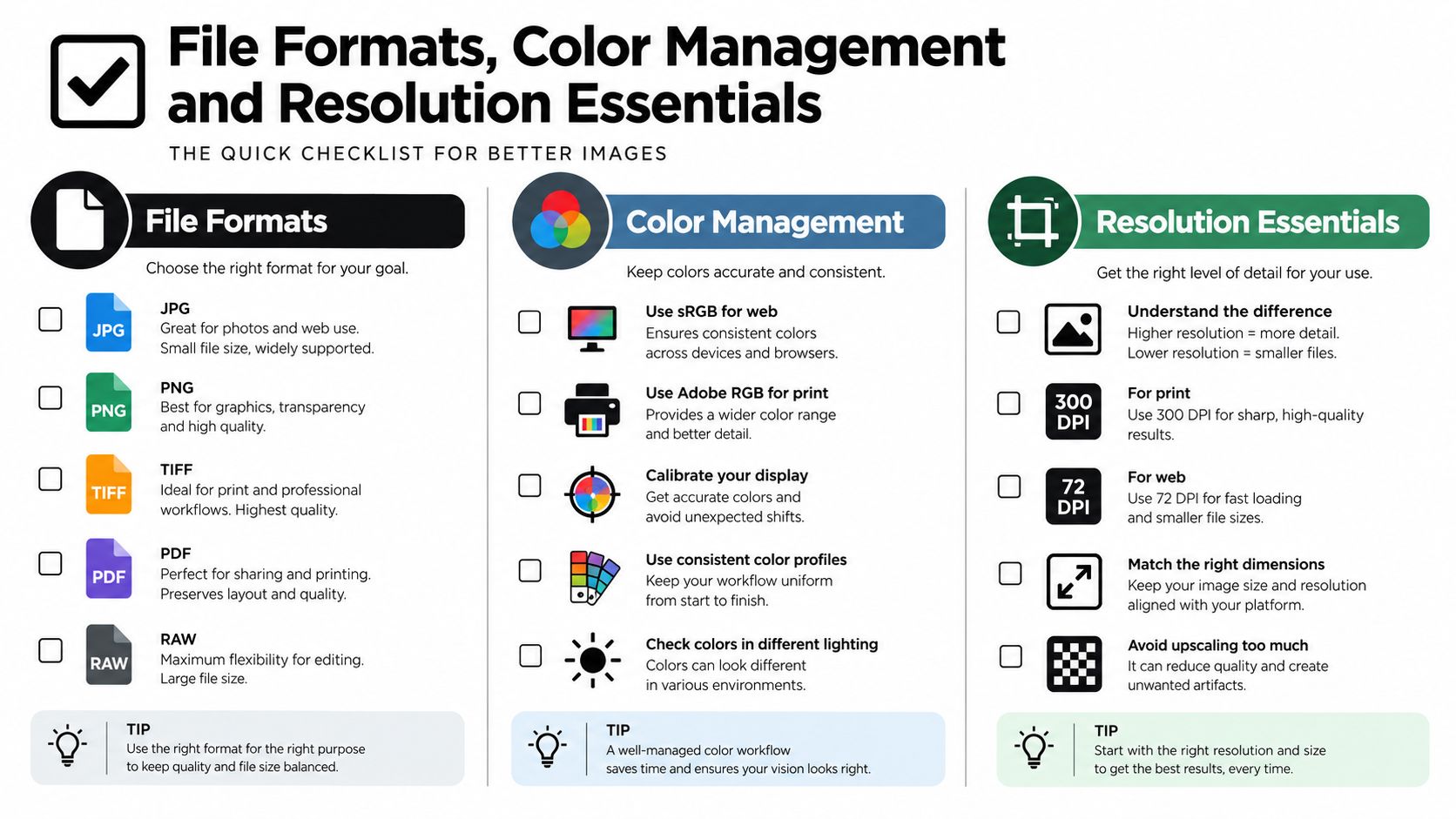
Vector files are useful for logos, icons, and lettering because their paths can scale without becoming visibly pixelated. AI and PDF files may preserve those paths, depending on how they were created and exported. Raster artwork, such as a PNG, can also work well when it has enough original detail and a transparent background.
A low-resolution screenshot is a poor starting point. Enlarging it doesn't create new detail. It only spreads existing pixels across a larger area, which can produce soft edges, jagged curves, or fuzzy small text.
For raster artwork, use 300 DPI at the final print size as a practical minimum for crisp output. This is a file-preparation standard, not a guarantee that every design will look perfect. A detailed illustration still needs clean source artwork, suitable line thickness, and enough physical size for the viewer to see its features.
Treat color as a production decision
Design programs often display color in RGB because screens create color with light. Printing systems may interpret artwork through CMYK workflows or their own color-management process, so a color that looks electric on a monitor can print less intensely. Neon shades, soft pastels, and very bright greens deserve special attention because they can shift when translated from screen appearance to printed ink.
Keep the color profile embedded when exporting, and ask the printer which workflow it prefers before converting everything manually. Converting without understanding the destination profile can create an unexpected change rather than improving accuracy. If you're unsure what the profile does, this explanation of ICC files and color management can help you understand why profiles matter.
Use a pre-flight check before uploading:
- Inspect transparency: Hide the background layer and confirm that only intended artwork remains.
- Review edges: Zoom in on curves, thin strokes, and small text for jagged pixels or accidental gaps.
- Confirm final size: Check the artwork at the physical dimensions you will print, not only while zoomed in.
- Check color intent: Identify colors that rely on screen brightness and decide whether contrast needs adjustment.
- Export carefully: Use the accepted file type, preserve transparency, and avoid unnecessary compression.
If a design contains white elements, make sure they're actual artwork rather than white space in the canvas. White space is transparent. White ink is a printed color.
Designing for Apparel Versus Hard Surfaces
The substrate should control the design treatment. Apparel moves, folds, stretches, and gets washed. Hard surfaces stay rigid, but they introduce curves, edges, handling, and contact challenges. Using one identical file for both applications can make the design technically printable but poorly suited to the product.
| Design Factor | DTF Apparel Transfers | UV DTF Hard Surface Transfers |
|---|---|---|
| Material behavior | Fabric stretches, folds, and changes shape during wear | Glass, metal, plastic, acrylic, and ceramic stay rigid but may curve |
| Contrast | Garment color can affect how the design reads | Surface color, transparency, and reflections can change visibility |
| Detail | Fine detail must remain legible through fabric texture and movement | Fine detail can look sharp on smooth surfaces but may suffer on edges or curves |
| Coverage | Large solid areas may feel heavier or less flexible | Broad coverage can work, but clean contact matters across the whole design |
| Placement | Seams, stretch zones, and body movement affect comfort and alignment | Corners, rims, handles, and curved sections affect application |
| Durability concerns | Washing, stretching, abrasion, and cure consistency matter | Scratching, moisture, sunlight, handling, and surface preparation matter |
Apparel needs flexibility and readable contrast
A shirt design should account for the garment's color before you finalize the palette. On dark fabric, a bright foreground may need a strong underlayer or a simpler surrounding shape to keep its edges clear. On a light shirt, subtle colors can remain readable without as much contrast.
Stretchy synthetics deserve extra care. Tiny disconnected details can become harder to read as the fabric moves, while a dense graphic can feel less comfortable. Leave breathing room where the design needs to flex, and avoid placing important details directly across seams or highly curved body areas.
If you're still developing the visual direction, browsing examples of AI-powered t-shirt concepts can help you explore compositions. Treat those concepts as starting points, then rebuild the chosen idea as a production-ready file.
Hard surfaces need contact and contour planning
UV-DTF artwork should match the object's usable area rather than merely its widest measurement. A graphic that fits a flat panel may wrinkle or misalign when it reaches a bottle curve. Keep critical lettering away from edges and plan how the design will look when the object is viewed from different angles.
Smooth, clean surfaces generally offer better contact than dusty, oily, textured, or heavily uneven ones. A transfer may have strong adhesive properties, but the application still depends on surface compatibility and consistent pressure. Don't treat a weather-resistant claim as permission to apply the decal to every material or use it in a critical application. Performance can vary with conditions and usage.
Sizing Placement and Mockups That Sell Your Design
A design can be technically perfect and still look wrong because it's the wrong size. A small logo placed too low can disappear beneath a jacket. A full-front graphic that reaches too close to the sides can look crowded when the shirt is worn. On a bottle or ornament, a design that fits the template may still collide with a curve or hardware.
Start with the product, not the artwork. Measure the usable decoration area, identify seams and edges, and decide whether the design should be a focal point, a supporting mark, or a small identifier.
Use placement as part of the composition
For apparel, common placement categories include a small chest or pocket mark, a centered front design, a back graphic, and a sleeve treatment. Don't rely on the garment's image bounds alone. A mockup can make a design look centered while the actual artwork is shifted because the transparent canvas contains extra empty space.
Check three things before you approve the file:
- The visible artwork is centered: Align the graphic itself, not the outer canvas.
- The scale matches the garment: A design intended for a youth garment shouldn't automatically use the same physical size as an adult shirt.
- The design clears construction details: Keep important words away from collars, seams, pockets, buttons, and zippers.
For hard goods, measure along the actual application zone. A narrow wrap may need a horizontal layout, while a front-facing logo may work better as a compact vertical mark. Leave clear space around the edge so minor placement variation doesn't cut into a letter or illustration.
Let mockups expose mistakes early
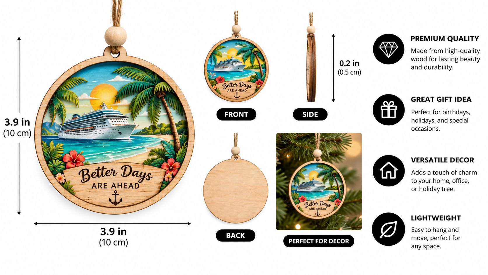
A mockup should show more than the design floating on a blank template. Use a realistic garment fold, bottle curve, ornament shape, or sign surface. Apply the artwork at the intended scale, then inspect it at normal viewing distance and close up.
Look for common errors:
- The tiny logo problem: The artwork is readable when enlarged but disappears in the product view.
- The oversized chest problem: The graphic dominates the garment and crowds the collar or side seams.
- The off-center problem: The canvas is centered, but the visible illustration is not.
- The contour problem: A hard-surface design crosses a curve where text becomes difficult to read.
- The contrast problem: The design blends into the substrate even though it looked strong on a white artboard.
Create a separate mockup for each important garment color or product shape. A design's relationship with its background is part of the product preview, not an afterthought.
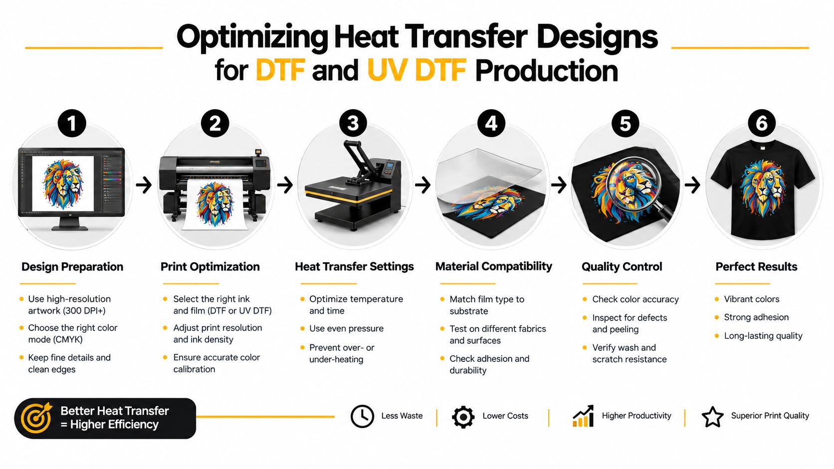
Optimizing Heat Transfer Designs for DTF and UV DTF Production
Efficient production begins with a layout that respects both the artwork and the process. A gang sheet lets you arrange multiple designs on one larger sheet, which can be useful when you have several logos, sizes, colors, or product variants ready for the same production run.
Place related designs together, but don't pack them so tightly that trimming becomes awkward. Leave consistent space between pieces, keep each graphic easy to identify, and avoid placing delicate edges close to neighboring artwork. Grouping by size can make sorting and application faster after the sheet is cut.
Separate design quality from application quality
A beautiful file doesn't automatically create a durable transfer. The finished result also depends on powder adhesion, curing consistency, bondline thickness, surface contact, pressure, and the material itself. Independent thermal-design guidance makes a similar point in a different engineering context, where interface thickness, contact pressure, surface quality, thermal cycling, vibration, and manufacturing consistency can determine long-term performance. The lesson transfers well to print production: the artwork matters, but the interface and process matter too. See this discussion of designing an effective thermal path for the underlying durability principle.
For apparel, confirm the garment type and follow the transfer provider's press instructions. For UV-DTF, clean the hard surface, avoid unnecessary handling of the adhesive side, apply firm and even pressure, and follow the recommended care approach. A smooth, well-prepared surface gives the decal a better chance of making consistent contact.
Choose the method according to the job:
- DTF: A practical option for full-color apparel artwork across suitable fabric types.
- UV-DTF: A fit for hard, smooth surfaces where heat pressing isn't the application method.
- Sublimation: Useful when the fabric and product coating are designed for dye-sublimation behavior, rather than as a universal replacement for DTF.
Raccoon Transfers provides DTF and UV-DTF transfer services, including custom gang-sheet workflows, so you can submit multiple prepared designs in one layout. Its UV-DTF printing guide offers additional process context before you decide how to arrange a hard-surface order.
Your Next Heat Transfer Design Ready to Press
The best heat transfer designs balance visual intention with production awareness. You don't need to become a color scientist or manufacturing engineer, but you do need to know what the artwork will touch, how it will be applied, and what the customer will do with the finished item.
Use this final checklist before you upload:
- Name the substrate: Decide whether the design is for apparel or a hard surface.
- Choose the process: Match DTF, UV-DTF, sublimation, or another method to the material and application.
- Clean the file: Remove hidden backgrounds, stray marks, unnecessary layers, and accidental borders.
- Protect the detail: Inspect fine lines, small text, gradients, and negative space at the final physical size.
- Manage the color: Check contrast against the actual garment or product color, not only a white artboard.
- Confirm the dimensions: Measure the usable area and keep key artwork away from seams, edges, and curves.
- Build a realistic mockup: Review scale, alignment, contour, and visual balance before production.
- Plan the layout: If using a gang sheet, arrange artwork with readable spacing and an efficient cutting path.
- Follow application guidance: Use the recommended pressure, heat, curing, surface preparation, and care instructions.
Good preparation doesn't remove creativity. It gives creativity a reliable way to survive the press, the product, and everyday use.
Save an approved master file, then create application-specific versions rather than forcing one design into every product category. A shirt version may need a different width, contrast treatment, or amount of open space than a bottle version. Test the design on the substrate whenever possible, review the result, and adjust the file before committing to a larger run.
The fastest route to professional-looking transfers is usually not more decoration. It's clearer decisions earlier in the workflow.
Raccoon Transfers offers custom DTF and UV-DTF transfers, gang-sheet options, artwork uploads, and transfer-by-size workflows for apparel and hard, smooth surfaces. Visit Raccoon Transfers with your cleaned file, intended substrate, and target dimensions ready, then use the production guidance to move from design concept to a practical transfer order.