
8 Neckline T Shirt Styles for Branding and Printing
A seller uploads one chest design and sends it to a crew neck, a henley, and a mock neck. The artwork file is identical, but the finished garments aren't. On the crew neck, the print sits neatly below the collar. On the henley, it competes with the placket. On the mock neck, the same graphic feels crowded and may need to move to the back.
That's why the neckline t shirt decision belongs at the start of a DTF order, before artwork is sized or placed on a gang sheet. The neckline changes the open space available for printing, the landmarks used for alignment, the way a heat press reaches the fabric, and the kind of brand message the garment communicates.
This guide compares crew neck, V-neck, henley, scoop neck, polo collar, mock neck, raglan, and asymmetrical or off-shoulder styles. Each entry focuses on the blank itself, the printable zone it leaves, the press problems it creates, and the branding situations where it makes sense.
The neckline doesn't just frame the garment. Its depth and construction define the print zone.
1. Crew Neck
The crew neck is the safest starting point for most custom apparel projects. It has a rounded, collarless opening with a close-fitting neckband, and its shape comes from the early standardized T-shirt worn by the U.S. Navy in 1913. The garment was lightweight, breathable, washable, and practical for demanding work, which helped establish the crew neck as the visual template for modern T-shirts. The BBC's history of the T-shirt traces how that military undershirt moved from private underwear toward visible workwear.
The printable zone is broad and predictable. A centered chest logo, full front graphic, pocket print, or back design usually has a clean surface below the collar. The rounded neckband also gives you a dependable alignment landmark, but don't measure every size from the same visual point without checking the blank. Shoulder width, body length, rib height, and fabric weight all change how high a transfer appears.
For many shops, the crew neck is the best blank for corporate shirts, sports merchandise, concert tees, employee uniforms, and promotional runs. It also gives a gang sheet a consistent base because the same general artwork proportions can work across many sizes.
Pressing and placement
Keep the transfer clear of the ribbed collar. A practical starting point is to place the top of a standard chest graphic below the neckband, then adjust it against the actual garment size and design height. The often-used 2 to 3 inch range should be treated as a starting reference, not a universal rule, because the source garment and artwork proportions control the final balance.
Pre-press the garment if the blank allows it, smooth the collar away from the platen, and verify that the press surface supports the chest area evenly. For a larger graphic, check that the collar seam won't create a ridge under the press.
If you're comparing blank construction before decorating, the guide to blank crewneck sweaters can help separate neckline choice from broader blank selection. For artwork ordered to a defined size, Custom DTF Transfer by Size: Perfect Prints for Every Project is a relevant option when the print must match a tested chest or back zone.
2. V-Neck
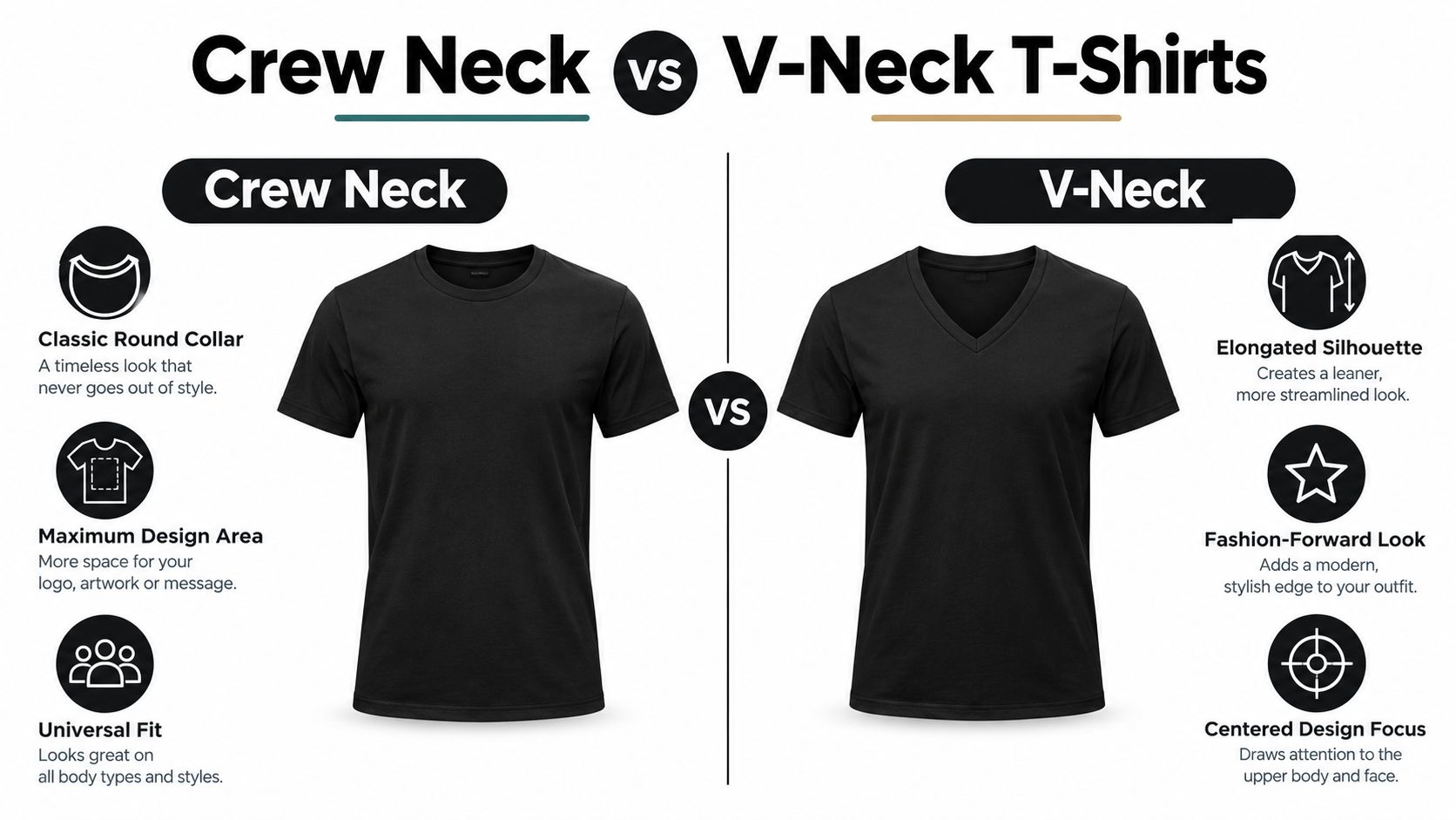
A V-neck changes the front of a shirt before any artwork is added. Its pointed opening exposes more upper chest and creates a directional line, so the garment can look more open and elongated. Historically, the V-neck developed as a variation of crew-neck construction rather than as a separate short-sleeved garment. The T-shirt overview from Wikipedia explains the structural difference between these neckline forms.
The point narrows the upper printable zone. A wide design that sits comfortably on a crew neck may look too high, too close to the point, or visually split on a V-neck. Tall logos and narrow vertical artwork often suit the available space. Broad designs require more room below the opening and careful centering around the garment's actual shape.
V-necks suit boutique collections, fashion-led streetwear, premium lifestyle products, and unisex merchandise where the neckline contributes to the brand identity. They also work for women's collections and professional casualwear. Check the actual depth before ordering blanks, because two shirts sold as V-necks can leave very different amounts of chest coverage.
Pressing around the point
Lay the shirt flat and identify the center of the V before positioning the transfer. Do not stretch the point while aligning the artwork. Measure from a repeatable landmark, such as the high-point shoulder or collar seam, rather than judging the placement by eye. Extra clearance is safer than forcing a large graphic into the upper chest.
A smaller centered logo often presses more cleanly than a full-chest transfer. For a primary design, begin lower than you would on a crew neck. The common 3 to 4 inch placement range is a starting reference only. Collar depth, garment size, and design height determine the final position.
Pressing rule: Treat the V point as a no-go zone until a sample proves otherwise.
Use a firm, flat pressing surface and keep the transfer from bridging the opening. If the film touches the ribbed edge, adhesive can bond unevenly, and the neckline may look pulled after pressing. A small chest mark, sleeve print, or back graphic can provide a cleaner branding solution than filling the space directly beneath the V.
3. Henley Neck
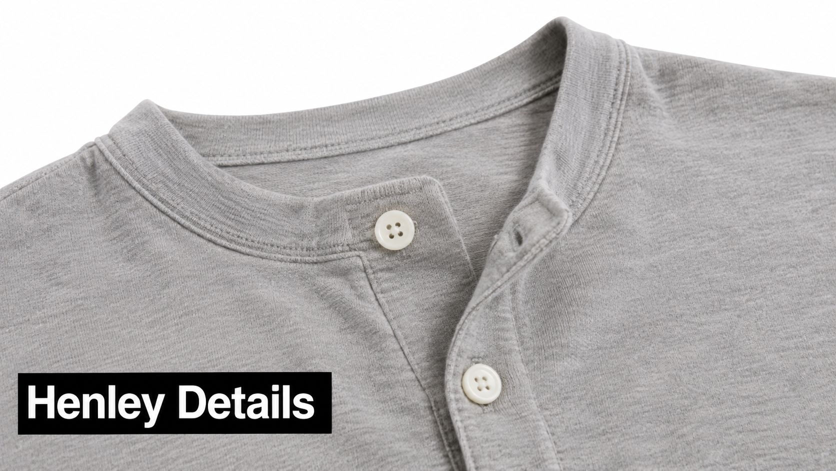
A henley changes the front of the shirt more dramatically than a simple neckline variation. Its partial button placket extends down from the neck and creates a Y-shaped opening. That placket becomes a permanent interruption in the printable chest area, even when the buttons are closed.
The best decoration zone usually begins below the placket. A small left-chest logo can work if it clears the button area and doesn't collide with the wearer's hand or outer layer. Centered artwork needs more caution. A large graphic placed too high may overlap the placket, bridge the opening, or look off-center when the shirt is worn open.
Henleys fit heritage workwear, outdoor brands, vintage-inspired collections, rugged lifestyle products, and independent labels that want more character than a basic tee provides. A Carhartt or Filson-inspired visual language, for example, benefits from restrained decoration and visible garment construction rather than a crowded front.
Keep the placket out of the transfer path
The placket creates a raised area that can prevent even pressure. Don't place the garment on the platen with buttons or placket layers directly under a large transfer. If possible, use a pressing pillow or repositionable pad to lift the print area and reduce pressure from the raised center section. Always follow the blank and transfer supplier's application instructions.
Plan the design from the bottom of the placket, not from the neckline opening alone. Some henleys have a short opening, while others leave a longer vertical interruption. The specific garment measurement matters more than a generic placement formula.
A small logo below the placket, a side-chest mark, or a back-neck transfer usually works better than a large center-chest print. Retro lettering, a compact emblem, or a simple one-color-style graphic can support the garment's character without fighting its construction.
4. Scoop Neck
The scoop neck has a wider, deeper rounded opening than a traditional crew neck. It exposes more of the upper chest and may shift the visual center of the shirt downward. That creates more openness around the collarbone, but it also removes some of the stable upper-chest area that makes crew-neck placement straightforward.
Scoop necks suit women-focused apparel, contemporary lifestyle brands, summer collections, festival merchandise, and relaxed streetwear. They can support asymmetrical decoration because the wider opening gives the design more room to balance against the garment's shape. A small off-center emblem may look intentional rather than misplaced.
The main front graphic should sit below the deepest part of the opening. If it sits too high, the transfer can appear disconnected from the garment body or crowd the wearer's upper chest. A back print often gives the front a cleaner finish, while a small front mark can reinforce the brand without competing with the open neckline.
Measure the actual curve
A scoop neckline doesn't give you one obvious straight reference line. Measure from the center-front opening and then compare the side clearance before committing to the final position. A graphic can be mathematically centered and still look low or high because the curve changes the amount of visible fabric across the chest.
The frequently used 4 to 5 inch range for primary artwork is a starting point only. Design height, body size, neckline depth, and intended coverage all matter. For a shallow scoop, that distance may leave too much empty space. For a deep scoop, it may be necessary to keep the design away from the opening.
Use a pressing pillow when the neckline edge causes the chest to sit unevenly on the platen. Smooth the surrounding fabric without pulling the opening wider. Broad neckline binding can distort if the operator stretches the garment while trying to remove wrinkles.
A scoop neck needs optical centering, not just ruler centering.
5. Polo Collar
A polo collar combines a folded collar with a buttoned placket. It isn't technically a standard T-shirt neckline, but it belongs in the same blank-selection conversation because its collar structure changes both the brand impression and the printable area.
The folded collar takes up the upper chest and creates a formal boundary around the decoration zone. A small left-chest logo is usually the strongest choice. Large center-front artwork often looks out of place because it competes with the collar and placket, especially when the garment is intended for corporate uniforms, golf events, professional services, country clubs, or executive casualwear.
Polo blanks also vary in surface texture. Piqué fabric has a visible knit structure that can affect how the transfer settles and how the design edge reads. Before decorating, compare the fabric construction, collar height, button position, and chest panel. The polo fabric and piqué guide is useful when the material choice is part of the production decision.
Use restraint on the front
Keep the transfer below the collar line and away from the button placket. A small company mark generally gives the garment a cleaner result than a large promotional graphic. If the design needs more visual impact, consider a sleeve, back, or yoke location rather than enlarging the chest logo.
Heat pressing requires a flat decorated area. The folded collar and placket can create height differences under the platen, so position the garment carefully and use suitable protective and leveling materials. Avoid pressing directly across buttons. If the blank has a textured surface, test the transfer on the exact fabric before committing to a production run.
The polo collar suits brands that want approachability with more structure than a basic tee. It can support a premium merchandise program, but only when the decoration respects the garment's built-in hierarchy.
6. Mock Neck
The mock neck raises the collar toward the neck without extending into a full turtleneck. Its tall, close-fitting structure makes the neckline a major part of the silhouette. That leaves less usable space above the chest graphic and makes a standard T-shirt placement feel crowded.
Mock necks work well for contemporary streetwear, minimalist labels, tech and startup merchandise, fashion-forward unisex collections, and designer-led capsule products. They communicate more intentional styling than a basic crew neck, so a loud center-chest graphic may undermine the garment instead of strengthening the brand.
The back often becomes the best printable zone. A shoulder-blade graphic, rear logo, sleeve mark, or small chest emblem can preserve the clean front silhouette. Atmospheric artwork, tonal branding, and restrained typography suit the style better than designs that need a large uninterrupted front panel.
Protect the high collar
The press itself may be straightforward when the main transfer sits on the body, but the collar changes how you load the garment. Make sure the raised neck doesn't sit under the platen or create an uneven pressure point. Thread the body over the platen if the construction allows it, and keep seams, collar folds, and thick bindings outside the transfer area.
A small chest print can work when it sits well below the collar base. Don't force a conventional high chest placement into the garment. The transfer may technically adhere, but the finished shirt can look compressed because the neckline and graphic occupy the same visual territory.
For gang sheets, group mock-neck artwork by placement type. Back prints, sleeve graphics, and small front marks should be sized separately rather than treated as one universal T-shirt template. The blank decides the artwork family.
7. Raglan or Baseball Collar
Raglan construction is primarily a sleeve treatment, but it changes the neckline and print plan because the contrasting sleeves extend diagonally toward the collar. Many baseball-style blanks also use contrasting neck binding, so the upper body becomes a frame made from several connected elements.
The main printable area remains on the body panel below the diagonal sleeve seams. That makes raglans a strong choice for vintage baseball graphics, sports merchandise, indie music products, retro streetwear, and small brands that want a distinctive blank without relying on complex artwork.
A standard center-chest design can work, but it should sit below the shoulder seam junction. If it climbs too high, it may run into the diagonal seams or appear squeezed between the contrasting sleeves. A compact chest emblem and a larger back graphic often create a more balanced set.
Work with the diagonal seams
The seam is the main heat-press challenge. It creates an uneven transition from body to sleeve, and a transfer that crosses it may receive inconsistent pressure. Keep the primary transfer on the flatter body panel unless the artwork is deliberately designed to cross the seam.
A starting placement around 3 to 4 inches below the neckline may suit some raglan blanks, but measure from the actual seam junction and collar binding. The shoulder shape is different from a set-in sleeve, so the usual crew-neck landmark can mislead you.
Use contrasting sleeve colors as part of the branding system. A two-color gang sheet can pair front and back artwork for a coordinated product, but don't assume every design will fit every raglan body. Check sleeve seam position, body width, and collar contrast before finalizing the sheet. For baseball-themed decoration, baseball DTF transfers can help align the artwork concept with the blank.
8. Asymmetrical or Off-Shoulder Neckline
An asymmetrical or off-shoulder neckline removes the centered reference points that make basic T-shirt placement easy. One shoulder may sit higher, the opening may angle across the body, or the garment may expose one side more than the other. The neckline becomes part of the design composition instead of a neutral boundary.
These blanks suit high-fashion labels, artistic streetwear, festival collections, experimental indie brands, and gender-nonconforming apparel. They can make a simple graphic feel more directional, but they also reduce the value of automatic center placement. The artwork must respond to the garment rather than treating the shirt as a symmetrical rectangle.
A diagonal graphic can echo the neckline angle. An off-center emblem can balance the exposed shoulder. A back print can provide a stable decoration area when the front opening is too irregular for a reliable large transfer. The best choice depends on whether the garment's visual energy comes from the neckline or the artwork.
Press for the finished silhouette
Lay the garment in the same orientation it will be worn. Mark the high-point shoulder, center front, and the actual opening edge before positioning the transfer. If the artwork is angled, confirm that the angle looks intentional on a person or dress form, not only on a flat table.
Uneven necklines can create unsupported fabric on the platen. Use a pressing pillow or other appropriate support to keep the decoration area flat, and avoid stretching the exposed edge while loading the garment. A transfer that adheres perfectly can still look wrong if the fabric was pulled during placement.
On an asymmetrical blank, the garment's angle is part of the artwork brief.
Gang sheets can be useful when each design needs a slightly different orientation or placement. Build those variations intentionally. Don't place several identical centered graphics on a sheet and expect them to suit garments with different shoulder exposure or neckline angles.
8 T-Shirt Neckline Styles Comparison
| Style | Implementation Complexity 🔄 | Resource Requirements ⚡ | Expected Outcomes 📊 | Ideal Use Cases 💡 | Key Advantages ⭐ |
|---|---|---|---|---|---|
| Crew Neck | Low 🔄, straightforward DTF placement and pressing | Low ⚡, standard, inexpensive blanks | Reliable mass-market performance; consistent print quality 📊 | Bulk orders, branded giveaways, event tees | Universal fit; maximum print area; production efficiency ⭐ |
| V-Neck | Medium 🔄, must account for deeper neckline and placement | Medium ⚡, slightly pricier blanks; careful pressing near V | Polished, fashion-forward appeal; higher resale margins 📊 | Boutique apparel, centered chest logos, fashion-conscious lines | Flattering silhouette; trend appeal; good for small centered designs ⭐ |
| Henley Neck | Medium-High 🔄, placket requires precise positioning | Medium ⚡, specialty blanks; careful heat-press at placket | Distinctive heritage aesthetic; niche audience engagement 📊 | Outdoor/heritage brands, vintage collections | Vintage look; visual interest without complex artwork ⭐ |
| Scoop Neck | Medium 🔄, wide opening needs offset placement | Medium ⚡, slightly higher-cost blanks; careful pressing | Contemporary, airy aesthetic; strong seasonal demand 📊 | Women's lines, summer collections, festival wear | Shows collarbones; large design flexibility; modern look ⭐ |
| Polo Collar | High 🔄, collar and placket constrain placement | High ⚡, more expensive polos; embroidery/DTF planning | Professional, upscale results for corporate buyers 📊 | Corporate uniforms, golf/event merchandise, premium promos | Professional appearance; suitable for embroidered logos; premium positioning ⭐ |
| Mock Neck (Turtleneck Hybrid) | High 🔄, high collar limits chest placement options | Medium-High ⚡, pricier blanks; favors back/sleeve prints | Fashion-forward, niche appeal; good for layered styling 📊 | Streetwear, minimalist brands, tech/startup merch | Sleek modern aesthetic; strong trend appeal; layering-friendly ⭐ |
| Raglan / Baseball Collar | Medium 🔄, diagonal sleeve seam affects placement | Medium ⚡, two-piece blanks may increase cost | Retro-sporty impact; distinctive niche positioning 📊 | Sports merch, retro lines, indie band tees | Sporty vintage look; shoulder mobility; contrast options ⭐ |
| Asymmetrical / Off-Shoulder | High 🔄, uneven neckline complicates placement & pressing | High ⚡, specialty blanks and careful sizing | Highly distinctive, trend-driven premium products 📊 | High-fashion, avant-garde collections, limited editions | Memorable silhouette; strong differentiation; artistic expression ⭐ |
Match the Neckline to Your Print Plan
Choose the blank by audience, use case, and brand tone before you choose the transfer size. A crew neck gives the broadest and most predictable front zone. A V-neck opens the chest and needs more clearance around its point. A henley and polo collar reserve part of the center front for a placket, while a mock neck pushes the strongest decoration toward the back or sleeves. Scoop, raglan, and asymmetrical styles can work well, but their construction demands optical placement rather than automatic centering.
The historical standard still matters operationally. The crew neck was embedded in the earliest standardized T-shirt design, which is why it remains the default for uniforms, event merchandise, and broad-market basics. Market analysis also places crew necks ahead of V-necks in global production, with reported shares of 38.5% for crew necks and 26.8% for V-necks, while noting that the figures are directional benchmarks rather than audited industry statistics because the report doesn't disclose a transparent primary-survey method. The cited T-shirt market analysis supports using the crew neck as a starting blank, not treating it as the only viable option.
Fabric weight changes the result as well. Reported B2B guidance places standard North American T-shirts around 180 to 220 GSM, heavier Southeast Asian garments around 240 to 280 GSM, and premium European positioning around 200 to 240 GSM. The Alibaba B2B neckline selection guide also recommends evaluating collar stretch, neckline distortion, and artwork clearance on the finished decorated garment. Those checks are especially important when heat-applied graphics sit near ribbing, binding, or a raised seam.
Use this decision path before ordering:
- For a small promotional run: Test a crew neck first. It gives you a stable reference for logo size, chest placement, and wearer expectations.
- For a fashion-led collection: Sample a V-neck or scoop neck, then photograph the opening from the front and side so shoppers can judge coverage.
- For a henley: Measure from the bottom of the placket and keep the main transfer below it. Don't use a standard crew-neck template.
- For a polo program: Reserve the front chest for a compact logo and check the fabric texture before production.
- For a mock neck: Build the artwork around a back, sleeve, or low chest position instead of forcing a high front graphic.
- For a raglan: Measure from the diagonal sleeve seam and keep the transfer on the flattest body panel.
- For an asymmetrical blank: Place the garment in its worn orientation and balance the artwork against the exposed shoulder.
- For any online product listing: Publish garment measurements, state whether they were taken relaxed or stretched, and show the neckline front, side, and during movement.
Fit deserves the same attention as print quality. A 2025 returns report found that 56% of apparel and footwear brands reported return rates of at least 30%, and other industry estimates place size and fit among the leading apparel-return causes at approximately 52% to 58%. The 2025 State of Returns report gives context for why neckline tightness, neck drop, shoulder width, collar recovery, and fabric weight belong in your product notes. A snug crew neck can feel restrictive even when the chest measurement is correct. A deep V can create coverage concerns, while a wide opening may shift during movement.
Before approving production, decorate the exact blank you plan to sell. Measure the transfer from a defined landmark, such as the high-point shoulder or collar seam, and record the size, neckline depth, garment weight, and placement. If you're arranging multiple designs, Raccoon Transfers' online gang sheet builder can help organize artwork after you've separated it by neckline and placement zone.
For golf-related collections, the same principle applies to collared garments and performance layers. The personalized golf apparel guide is a useful reference when the audience expects a polished collar, a restrained chest logo, and decoration that stays clear of movement areas.
A neckline isn't a finishing detail. It's a production specification. Select the blank, map the safe print area, test the press setup, and only then lock the final artwork dimensions.
Raccoon Transfers offers ready-to-press DTF transfers by size and custom gang sheets for organizing artwork across crew necks, V-necks, collars, sleeves, and back placements. Visit Raccoon Transfers to upload your designs and prepare transfers around the exact neckline construction you plan to print.