
What is ICC Profile: what is icc profile and how it ensures color accuracy
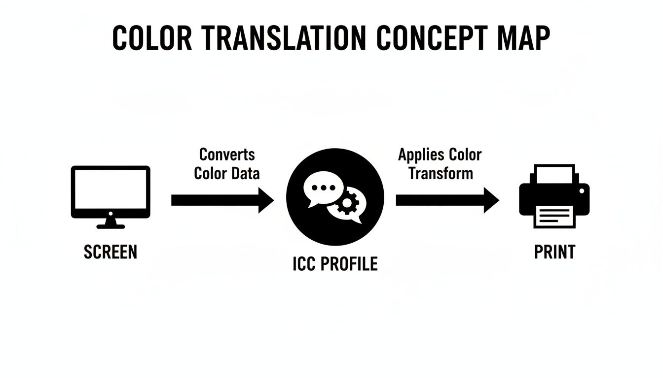
An ICC profile is a small, unassuming file with a massive job: it's a universal translator for color. Its whole purpose is to make sure the fiery red you perfected on your screen is the exact same fiery red that rolls out of your printer. It's the secret weapon against those frustrating color surprises.
Decoding the Language of Color
Ever create a design with a killer electric blue, only for the print to look like a dull, sad purple? It's a classic, hair-pulling problem. This happens because every single device—your monitor, your camera, your scanner, and your printer—sees and reproduces color in its own unique way. They all speak different color "languages."
Think of your monitor as a giant box of light-emitting crayons. It uses combinations of Red, Green, and Blue (RGB) light to create millions of bright, vivid colors. A printer, on the other hand, is working with ink on paper or film. It uses Cyan, Magenta, Yellow, and Black (CMYK) ink to mix colors, which is a fundamentally different process with its own set of limitations.
This is exactly where the ICC profile comes in. It's the Rosetta Stone that translates colors from one device's language to another, bridging that critical gap between your digital design and the final physical print.
The Role of a Digital Translator
An ICC profile is essentially a data file that maps out how a specific device—like a printer—reproduces color. It allows all the different pieces of your workflow to communicate effectively and maintain color consistency. This whole system came about back in 1993 when industry giants like Adobe, Apple, and Microsoft formed the International Color Consortium (ICC) to solve this exact problem. They created an open standard for predictable color management, which you can read more about in the history of the ICC profile format on Wikipedia.
For businesses that rely on precise color, like DTF transfer providers, this is non-negotiable. An embedded profile lets the printer's RIP software intelligently convert a design's color space (like sRGB) into the precise ink combinations required for its specific system, dramatically minimizing color shifts.
Without this translation, every device is just guessing, and that leads to chaos. The profile provides the hard data needed for a controlled, predictable color workflow.
Key Takeaway: An ICC profile doesn't actually change the colors in your artwork. It simply describes a device's color capabilities so that software can accurately convert colors from one system to another, ensuring what you see is what you get.
At the end of the day, getting a handle on ICC profiles gives you direct control over your final product. For apparel brands and designers, this isn't just a technical footnote—it's fundamental to protecting your brand's integrity and consistently delivering the quality your customers expect.
Getting to Grips with Color Management
To really get what an ICC profile does, you have to understand the world it lives in. The whole point of color management is to solve a very common, very frustrating problem: why colors look different depending on where you see them. Once you nail these core ideas, you're well on your way to getting prints that actually look like what you designed.
So, What's a Color Space?
At the heart of it all is the color space. Think of it as a device's color vocabulary—the full library of colors it knows how to create or display.
Your computer monitor, for example, speaks in RGB (Red, Green, Blue). It's an "additive" system that uses light to mix colors. It’s like having a giant box of crayons, where a common space like sRGB can define over 16 million distinct colors.
But your printer? It works with CMYK (Cyan, Magenta, Yellow, Black) ink on a physical surface. It's a "subtractive" system, and its color library is just different—and usually smaller. That's the root of the problem. It’s why that super-bright, electric green on your screen might come out looking a bit dull and flat on a t-shirt. The printer simply doesn't have that "crayon" in its box.
This is where the ICC profile steps in. It acts as a translator, taking the color language of your screen (RGB) and converting it into the language your printer understands (CMYK) as accurately as possible.
Without that profile translating between the two, the printer is just guessing what you want, and guesses usually lead to disappointment.
Understanding a Device's Gamut
The next key piece of the puzzle is the gamut. If a color space is the entire library of possible colors, the gamut is the specific range of colors a single device can actually produce.
While the sRGB color space holds millions of colors, your monitor's gamut might be a little smaller. Your DTF printer's gamut will be different again.
Why Don't Devices Match? No two devices see color in exactly the same way. Tiny variations in manufacturing, the tech in your screen, the specific formula of your inks, and even the t-shirt fabric you're printing on give each device a unique color "fingerprint." The ICC profile is the document that records that fingerprint.
This is the central problem color management exists to solve. When you pick a color in Photoshop that is "out of gamut" for your printer, the system has to figure out what to do. The profile takes away the guesswork by giving it a precise map to the closest available color the printer can physically create.
If you're curious to learn more about how colors are defined and interact, understanding the basic principles of color theory is a great place to start.
How a Profile Is Made: Device Characterization
So, how does an ICC profile get all this information? Through a process called device characterization.
To create a profile for a printer, you start by printing a chart filled with hundreds of specific color patches. Then, a highly sensitive tool called a spectrophotometer reads each of those printed patches. It meticulously measures what the printer actually produced, comparing it to the original color data.
That measurement data reveals everything: the printer's true gamut, its quirks, and how it behaves with a specific ink and film combination. All of this data gets compiled into a small file—your ICC profile. It's the ultimate instruction manual for your setup.
There are a few main types of profiles you'll encounter:
- Input Profiles: For devices that capture color, like scanners or digital cameras.
- Display Profiles: These characterize your monitor to make sure what you see is what you get.
- Output Profiles: These are for printers. They describe how that printer will lay down ink on a specific material, like DTF film.
These concepts are the foundation for anyone working in https://raccoontransfers.com/blogs/guides/digital-printing-in-textile. Without this system, you're designing with a blindfold on, just hoping the colors turn out right. An ICC profile gives you control, turning color from a source of frustration into a predictable, reliable part of your workflow.
Choosing the Right Rendering Intent for Your Design
So, you've got your ICC profile loaded. Now what? Your design software, whether it's Adobe Photoshop or Illustrator, needs one last piece of the puzzle. It needs a game plan for dealing with any colors in your design that your printer physically can't create.
This game plan is called a rendering intent. Think of it as the set of rules your computer follows when it translates the vibrant colors you see on your screen to the real-world inks in your printer.
Getting this choice right is a pretty big deal. It directly affects the final look, feel, and vibrancy of your DTF transfers. Each intent has a different priority—some chase after perfect accuracy, while others care more about the overall vibe of the image. The best one for the job really depends on what you're printing.
Let's use an analogy. If an ICC profile is a bilingual dictionary translating between two languages (your screen's RGB and your printer's CMYK), the rendering intent is the translation style. Are you doing a literal, word-for-word translation (Absolute), a faithful translation that adapts grammar for the new language (Relative), or a poetic one that captures the spirit of the original text (Perceptual)?
The Four Main Rendering Intents Explained
You’ll typically run into four main rendering intents. Each one takes a different swing at handling those tricky "out-of-gamut" colors—the ones that exist on your screen but not in your printer's ink set.
1. Perceptual Rendering
The Perceptual intent is the artist of the group. Its main goal is to preserve the overall visual relationship between all the colors in your image. When it finds colors the printer can't make, it gently nudges every color in the design—both the ones that are in-gamut and the ones that are out—to squish them all into the printer's smaller color space.
The result? The transitions from one color to another, like in a photograph of a sunset, look smooth and natural to our eyes. Even though the individual colors might not be a perfect match to the original, the overall image just feels right.
- Best For: Photos, detailed illustrations with lots of gradients, and any artwork where the overall mood is more critical than nailing one specific color swatch.
- DTF Example: Printing a t-shirt with a stunning photograph of a tropical beach. Perceptual keeps the smooth shift from deep blue ocean to turquoise shore looking beautiful, even if the brightest blues get toned down a bit.
2. Relative Colorimetric
Relative Colorimetric is the pragmatist. It’s all about accuracy where it counts. It takes any color in your design that your printer can reproduce and matches it perfectly. For any colors that are out-of-gamut, it simply maps them to the nearest printable color it can find, leaving all the other "good" colors alone.
It also smartly compares the white of your screen to the white of your print material (the DTF film and powder) and adjusts everything to match. This means pure white in your digital file becomes the actual white of the transfer, which is exactly what you want.
Key Insight: Relative Colorimetric is the go-to workhorse for most professional print jobs, especially for brands. It locks in the colors that can be matched while making the smallest possible changes to the rest.
- Best For: Company logos, vector art, and any design where hitting specific brand colors is non-negotiable.
- DTF Example: You're printing a batch of hoodies with a company's logo. This intent ensures that the brand's signature red prints as accurately as the machine possibly can, provided that red is within the printer's gamut.
3. Absolute Colorimetric
Absolute Colorimetric is the literalist. It's the most uncompromising of the four. It tries to reproduce every color exactly as it is in the file, with zero adjustments—and that includes the white point.
Unlike Relative, it doesn't compensate for the white of the paper or film. If your design has an off-white background, this intent will actually try to print that off-white tint with ink instead of just letting the transfer's base show through. This can lead to some strange and undesirable color casts on your final product.
- Best For: Mostly used for "hard proofing," where you're trying to simulate exactly how a print will look on a specific colored material, like cream-colored stationery. It's almost never the right choice for final apparel printing.
- DTF Example: You'd generally steer clear of this for a final DTF print. Its only practical use might be in a complex proofing workflow to see how a design might look if printed on a beige garment, but even that is a stretch.
4. Saturation Rendering
The Saturation intent is here for one reason: to make colors punch. It throws color accuracy out the window and focuses entirely on producing the most vivid, saturated colors possible. When it converts your design, it pushes every color to its brightest, most intense equivalent within the printer's gamut.
This is fantastic for grabbing attention, but it comes at a steep price. Hues can shift dramatically, and you lose all sense of color fidelity.
- Best For: Business graphics like charts, graphs, and diagrams. In these cases, you care more about the bars on the chart being distinct and vibrant than whether they are a specific shade of blue or green.
- DTF Example: Imagine printing a promotional tee for a trade show with a big, colorful bar graph on it. The main goal is to make the data easy to read from a distance, and Saturation rendering will make sure each bar pops.
To make it even clearer, here’s a quick-reference table to help you decide which rendering intent fits your project.
Choosing the Right Rendering Intent for Your DTF Project
This table breaks down the four main rendering intents, explaining what they do and offering practical examples for apparel and merchandise design.
| Rendering Intent | What It Does | Best For | Use Case Example |
|---|---|---|---|
| Perceptual | Compresses the entire color gamut of your design to fit the printer's gamut, preserving visual relationships. | Photographic images and complex illustrations with smooth gradients. | A t-shirt with a detailed sunset photo, where the smooth color transitions are key to the design's appeal. |
| Relative Colorimetric | Matches in-gamut colors exactly and maps out-of-gamut colors to the closest match. Adjusts for media white. | Logos, brand colors, and vector graphics requiring high color accuracy. | Printing a company logo on polos where matching the official brand blue is critical for consistency. |
| Absolute Colorimetric | Matches in-gamut colors exactly but does not adjust for media white. Tries to simulate the source's white. | Hard proofing to simulate printing on non-white materials. | Rarely used for DTF. Could be used to simulate a print on a colored shirt before actually printing it. |
| Saturation | Prioritizes vividness over accuracy, shifting colors to be as bright and intense as possible. | Business charts, graphs, and simple graphics where impact matters most. | A promotional giveaway shirt with a vibrant, eye-catching bar chart designed to grab attention at an event. |
Ultimately, knowing which rendering intent to pick comes down to understanding the priorities of your specific design. Are you aiming for photorealism, brand accuracy, or just pure, eye-searing impact? Once you know the answer, choosing the right intent becomes a whole lot easier.
How to Use ICC Profiles in Photoshop and Illustrator
Knowing what an ICC profile is is one thing, but actually using it is where you take real control over your color. For most of us, that means working in Adobe Photoshop and Illustrator. These are the workhorses of the design world, and thankfully, they have powerful, built-in tools for managing color. Using them correctly is the final, crucial step to make sure your digital vision translates perfectly to a physical DTF transfer.
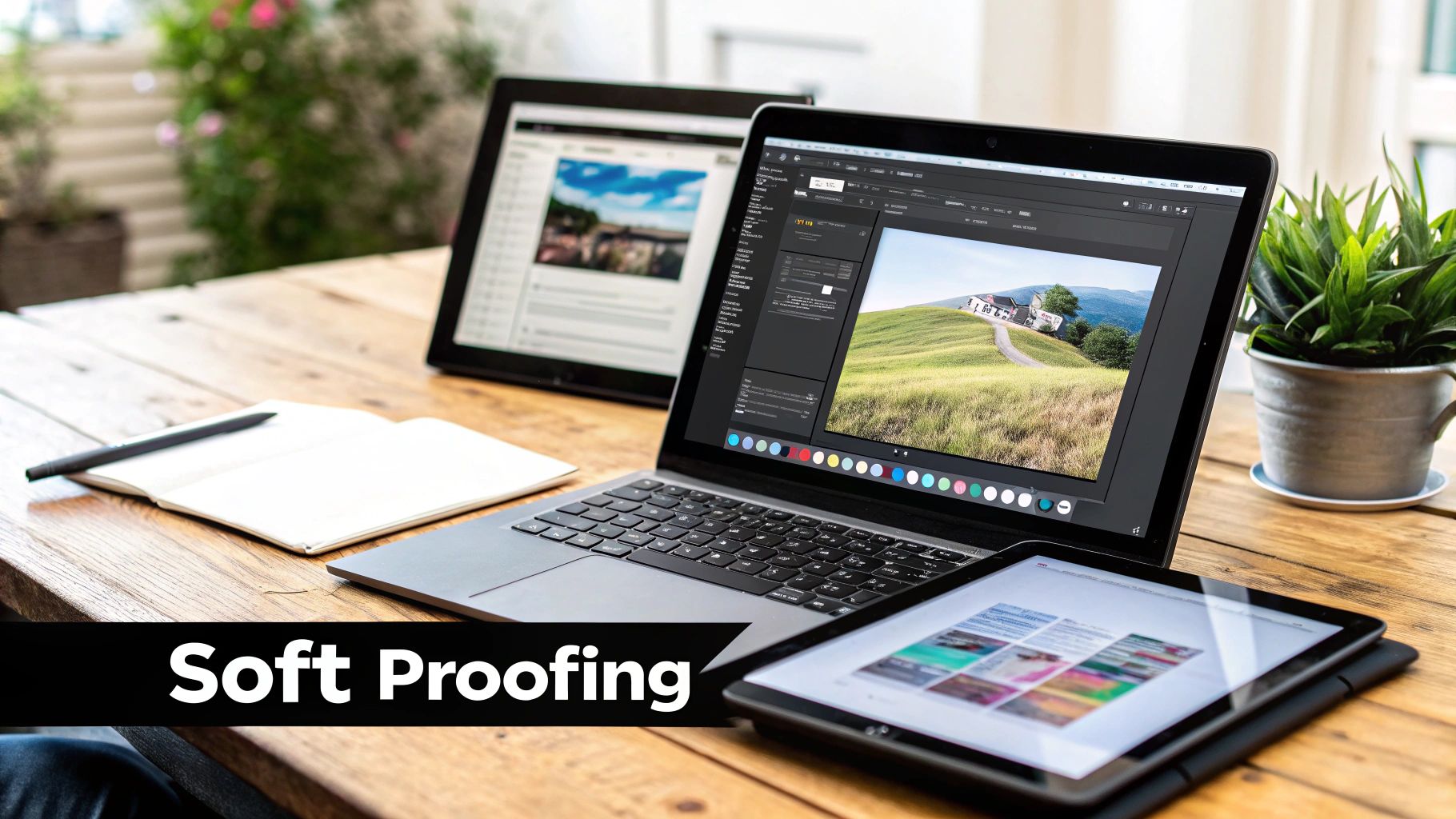
The whole process boils down to two key actions: setting up your document with the right profile and then previewing what the final print will look like on your screen before you even think about sending the file. That preview feature is called soft proofing, and it’s your secret weapon against costly reprints and color headaches.
Let's walk through the essential steps to prep your files for flawless printing with Raccoon Transfers.
Setting Up Your Color Settings
Before you even drop a single graphic onto your artboard, it's a great habit to get your application's color settings in order. This gives the software a consistent starting point for how it handles color across all your projects.
- In Photoshop or Illustrator, find your way to Edit > Color Settings.
- Under Working Space for RGB, a solid, universal choice is sRGB IEC61966-2.1. It’s the standard for the web and pretty much any digital display you'll encounter.
- For your CMYK Working Space, U.S. Web Coated (SWOP) v2 is a widely accepted default for North American printing.
- Now for the important part: under Color Management Policies, set both RGB and CMYK to "Preserve Embedded Profiles." This tells the software to always respect the color information already saved in any file you open, rather than overriding it.
Getting these initial settings right establishes a reliable baseline for all your design work.
Assigning and Embedding an ICC Profile
When your artwork is polished and ready to go, you have to embed the correct ICC profile. Think of this as packaging the color "instructions" right into your file, so our printers know exactly how to interpret the colors in your design.
Step-by-Step in Photoshop:
- With your finished design open, navigate to Edit > Convert to Profile.
- In the "Destination Space" dropdown menu, select the profile you're aiming for. For most artwork prepared for the web, this will probably be sRGB. If you have a custom profile from us at Raccoon Transfers, this is where you’d select it.
- Choose your Rendering Intent. Relative Colorimetric is usually best for brand work with specific spot colors, while Perceptual often works better for photographic images.
- When you save your file (as a PNG or TIFF, for example), make sure the "Embed Color Profile" checkbox is ticked. This is a non-negotiable step.
Key Takeaway: Forgetting to embed the profile is like sending a letter without an address. The post office (the printer) will have to guess where it’s supposed to go, and you can bet the results won't be what you intended.
The Power of Soft Proofing
Soft proofing is easily the most powerful—and most overlooked—tool in a designer's toolkit. It uses a specific printer's ICC profile to simulate on your screen what the final colors will look like when printed on a certain material. This lets you spot and fix out-of-gamut colors before they turn into expensive, real-world mistakes.
How to Soft Proof in Photoshop:
- Head to View > Proof Setup > Custom.
- From the "Device to Simulate" dropdown, pick the ICC profile for the printer you're targeting. This would be the specific profile provided by Raccoon Transfers for our DTF system.
- Select the Rendering Intent that best matches your design.
- Check the "Simulate Paper Color" box. This is a neat feature that adjusts the white point on your screen to match the white of the print material, giving you a much more realistic preview.
Once you hit "OK," you'll see your screen update to show a very close approximation of the final printed transfer. You might notice some colors suddenly look a bit duller—that's the tool doing its job! It's showing you which colors are outside the printer's gamut. Now you can go in and adjust those specific colors until they look right within the proofed view, giving you confidence in the final result. Understanding this is essential to successfully printing designs onto fabric with predictable outcomes every time.
From a practical standpoint, ICC profiles are the bedrock of the entire modern imaging world. The default web color space, sRGB, has been defined in ICC terms since 1996, and nearly every image you see online is tagged with it. In professional printing, RIP software is constantly juggling multiple profiles—one for your monitor, one for the artwork's source space, and one for the printer itself. By mastering these simple steps in Photoshop and Illustrator, you're tapping into a powerful system built for one thing: color consistency.
Solving Common Print Color Problems
We’ve all been there. You spend hours, maybe even days, getting a design just right on your screen. That specific shade of electric blue or fiery orange looks perfect. Then the print arrives, and your heart sinks. The colors are dull, flat, and nothing like the masterpiece you approved.
This gap between what you see on your monitor and what comes off the printer is probably the most common frustration in the design world. The good news? It's not some random glitch. It’s a predictable problem, and it's almost always fixable with good color management.
When you see a major color shift, it's a dead giveaway that a device in the chain—your monitor, the RIP software, the printer—is just guessing what the colors should be. An ICC profile is what replaces that guesswork with cold, hard data. It turns unpredictable, frustrating results into the consistent, professional prints you expect.
Let's look at some of the most frequent color issues and see how a proper ICC profile acts as the cure.
Why Do My Prints Look So Dull Compared to My Screen?
This is the big one. The number one complaint we hear is that bright, glowing screen colors turn into flat, muted prints.
The reason for this comes down to a fundamental clash between two different color worlds: RGB and CMYK. Your monitor creates color using light with the additive RGB (Red, Green, Blue) model. It can produce millions of brilliant, luminous shades that simply can’t be mixed with physical ink.
Printers, on the other hand, use the subtractive CMYK (Cyan, Magenta, Yellow, Black) color space. They create color by applying ink to a surface. The range of achievable colors, known as the gamut, is naturally smaller and different from what your screen can show.
When you send a vibrant RGB file to a printer without a specific ICC profile, the printer's software is forced to make its best guess on how to translate those colors. It has no choice but to tone down any colors that are outside its printable range, leaving you with that dull, lifeless result.
The Fix: Don't wait until the print to discover the problem. Start your design in the right color space and use soft proofing. By applying the printer's specific ICC profile in Photoshop or Illustrator, your screen can simulate the final CMYK output. This lets you see the printer's limitations ahead of time and adjust your colors to look their best within its actual capabilities.
Why Did My Brand's Colors Print Incorrectly?
You have a specific Pantone or hex code for your brand. It’s non-negotiable. You use it in the design file, but the final print is just slightly off—a bit too red, a little too dark. For any brand, this inconsistency looks unprofessional and can dilute your identity.
This kind of color shift usually happens because of a profile mismatch. If your design document is set to a generic RGB profile but the printer is calibrated for its own specific CMYK profile, a translation error is bound to occur. The software tries its best, but without precise instructions, the conversion is just an approximation.
The specific ink chemistry also plays a huge role. Understanding the properties of your chosen DTF printer ink is a key part of nailing true color fidelity. When a print provider dials in their entire system—printer, ink, film, and powder—with custom ICC profiles, they can slash color-related reprints and waste from double-digit percentages down to almost nothing.
Troubleshooting Your Color Workflow
Getting color right means being proactive. For instance, knowing how to achieve flawless color when printing on specific materials like Coroplast is essential for consistent results in that niche. The same principle applies here.
Follow these steps to prevent color problems before they even start:
- Calibrate Your Monitor: First things first. An uncalibrated screen is lying to you. Use a hardware calibration tool (like a Spyder or i1Display) to ensure what you see is what you’ll get.
- Use the Right Profiles: This is the most important step. Always ask your print provider for their recommended ICC profile. A custom profile built for their exact machine, ink, and materials is the single best way to guarantee color accuracy.
- Embed the Profile: When you save your final file, always find and check the box that says "Embed ICC Profile." This little step packages the color "recipe" directly into your file, leaving no room for misinterpretation by the printer's software.
- Soft Proof Everything: Make this a habit. Before you send anything off, use the soft proofing feature in your design program. This on-screen preview is your last, best chance to catch and fix color shifts before they become a costly mistake.
How to Get Perfect Color with Raccoon Transfers Profiles
After wrestling with color spaces, rendering intents, and troubleshooting, you've probably realized the single best way to nail your colors: using a custom ICC profile made for your exact print setup. Generic profiles can get you into the ballpark, but a profile engineered for a specific printer, ink set, and transfer film is the only way to guarantee absolute accuracy. It simply takes the guesswork out of the equation.

This is precisely why we’ve poured so much effort into developing meticulous ICC profiles for our DTF and UV-DTF printing systems. Think of them as the final, crucial step to getting professional-grade results on every single order you place.
Your Path to Perfect Prints
When you use our profiles, your designs are translated with the highest possible fidelity. The result? You get richer colors, smoother gradients, and consistent output, print after print. Our profiles are calibrated to account for every tiny variable in our workflow, from the specific chemistry of our inks to the unique properties of the adhesive powder we use.
Getting started is easy. Just download our custom profiles and install them on your computer. From there, you can use the soft-proofing features in Photoshop or Illustrator to see an accurate on-screen preview of how your final transfer will look.
Key Takeaway: Our custom profiles aren't just a helpful tool; they are the bridge between your creative vision and a flawless physical product. They ensure what you see on your calibrated screen is exactly what you get on your finished apparel.
Using a dedicated ICC profile for our equipment is the most effective color management strategy you can adopt. Here’s a quick guide on how to bake our profiles into your workflow:
- Download and Install: Head over to our resources page to grab the Raccoon Transfers ICC profiles. On Windows, just right-click and "Install Profile." On a Mac, you'll place the file in the correct Library folder. It’s that simple.
- Soft-Proof Your Design: In your design software, go to your proof setup and select our profile under the "Device to Simulate" option.
- Adjust and Finalize: Based on the soft-proof preview, make any final color tweaks needed to get your design looking perfect.
- Embed and Export: When saving your final print file, always make sure you embed the sRGB profile. This locks in your color information so our system can read it correctly.
Your ICC Profile Questions, Answered
Even when you've got a good handle on color management, some questions always pop up. Let's tackle the most common ones head-on so you can get your files ready with total confidence.
Do I Need a Different ICC Profile for Every T-Shirt Color?
Nope, you don't. The ICC profile is all about the printer, its inks, and the DTF film we use. Its one and only job is to make sure the colors hitting the transfer film are dead-on accurate.
The final color of the t-shirt or hoodie is a completely separate thing. Because DTF transfers are opaque, the color accuracy is locked in on the film itself, long before it ever meets the fabric.
Can I Just Use a Generic sRGB Profile for My DTF Prints?
You should definitely be designing and saving your files in the sRGB color space, but you shouldn't rely on it for the final print. Think of it this way: the sRGB profile describes what colors look like on a standard screen, not how a professional DTF printer physically mixes ink.
Using a generic profile is like using a generic map for a specific city—it gets you in the general area, but it won’t show you the exact street address. Our custom printer profile is the precise GPS coordinate that guarantees your colors arrive at the right destination.
For the best results, always use our custom ICC profile for soft proofing. It's the only way to see a reliable preview of how our specific printers will interpret the colors in your sRGB file.
What Is the Difference Between Assigning and Converting a Profile?
This is a huge one, and getting it wrong can wreck your colors.
- Assigning a Profile: This is like slapping a new label on your file without actually changing the color data inside. You're telling the software, "Pretend these numbers mean something else." This almost always results in some wild, unexpected color shifts.
- Converting to a Profile: This is the right move. The software intelligently adjusts the RGB numbers to make sure the color looks the same as it moves from your screen's color space to our printer's. When preparing files, always, always use "Convert to Profile."
Why Are My ICC Profiles Not Showing Up in Photoshop?
We hear this one a lot, especially from Mac users. If you've downloaded our profile but it's not appearing in Photoshop's dropdown menus, it probably just landed in the wrong system folder.
Sometimes, just reinstalling the printer driver sorts it out. On macOS, the profiles often need to be in a very specific location, like Library/Printers/EPSON/InkJetPrinter2/ICCProfiles. A quick Google search for "missing ICC profiles macOS" will give you a bunch of easy guides to get that file where it needs to be.
Ready to stop guessing and start getting perfect, predictable color on every order? At Raccoon Transfers, our custom-built ICC profiles and streamlined process are designed for one thing: making your designs look incredible. Upload your artwork now and see the difference for yourself!