
A Practical Guide to Design Heat Transfers for Flawless Prints
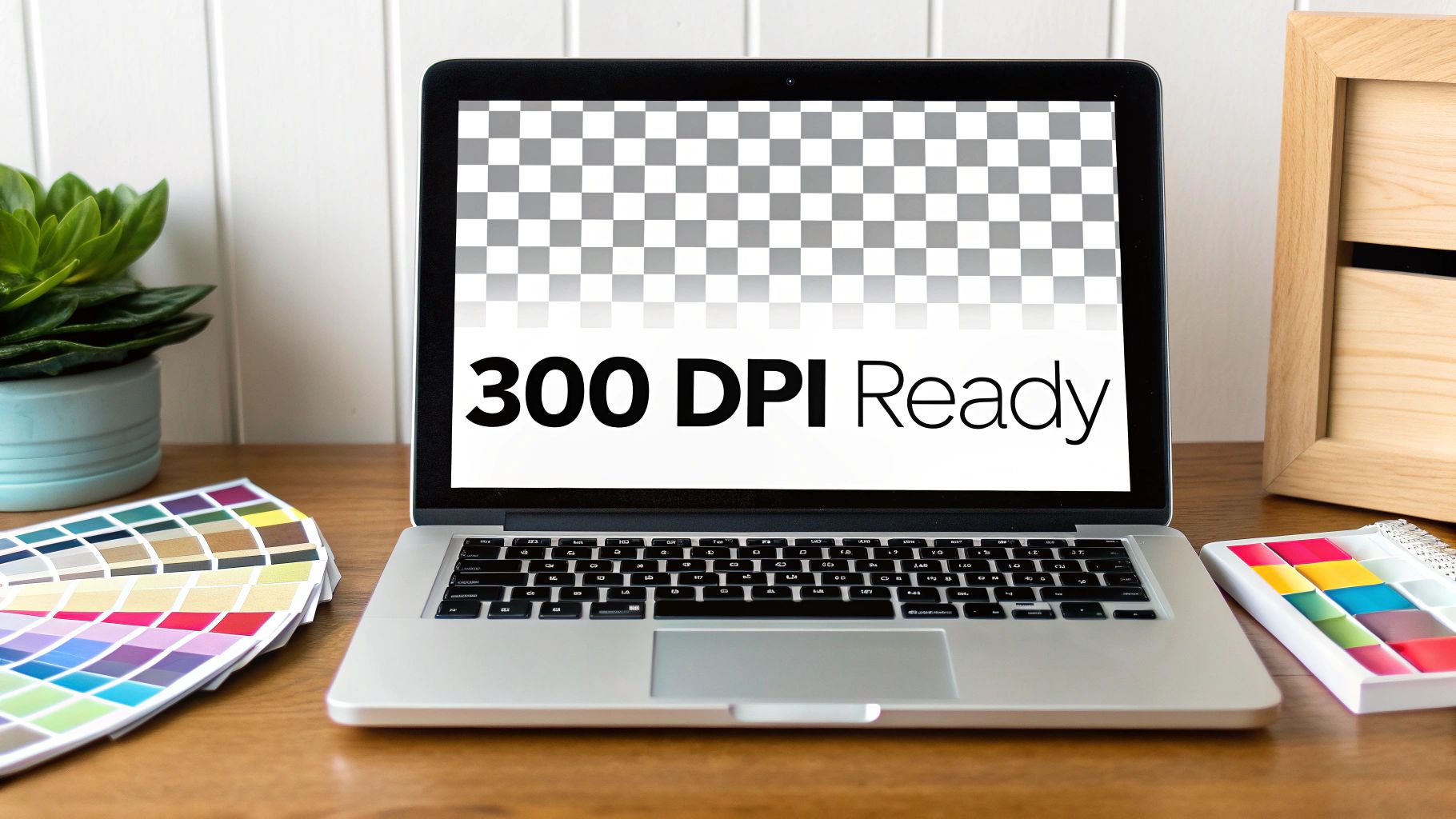
The process of designing a heat transfer is all about creating a digital file that’s perfectly prepped for printing. This isn't just about making cool art; it's about building a technically sound file that will produce a crisp, vibrant, and professional-looking final product. To do this, you'll need a high-resolution file (300 DPI), a transparent background, and the right color profile (sRGB). Getting this initial setup right is easily the most important part of the whole process.
Setting Up Your Artwork for Perfect Heat Transfers
A killer custom product doesn't just happen. The secret isn't only in the idea but in a flawless digital file. Long before your design gets anywhere near a heat press, its fate is sealed inside your design software—whether you're using Adobe Illustrator, Procreate, or another program. This setup phase directly controls the quality, color accuracy, and longevity of your transfer.
Think of this as laying the foundation for a house. If you get it wrong, everything that comes after will be a little off. Small mistakes here can lead to fuzzy prints, weird color shifts, or that dreaded white box around your design on the final product. By focusing on a few core principles from the very beginning, you can sidestep the most common issues and make sure your vision translates perfectly from the screen to the real world.
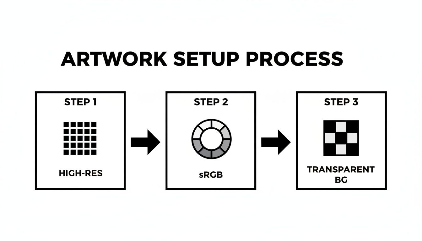
Mastering Resolution for Sharp Details
The absolute bedrock of any quality print is resolution, which we measure in Dots Per Inch (DPI). For any kind of heat transfer, the industry standard is 300 DPI. This isn't an arbitrary number; it's the specific resolution needed to give the printer enough data to create sharp lines and smooth details without looking blurry or pixelated.
Ever tried to blow up a tiny photo to fit a big frame? It gets distorted and blocky. The exact same principle applies here. If you start your design in a low-resolution canvas, you can't just "make it bigger" later without losing quality. Designing at 300 DPI from the get-go means your artwork is born print-ready.
The Importance of Color Profiles and Transparency
Ever had that frustrating moment where you print something, and the colors look nothing like they did on your screen? That’s almost always a color profile mismatch. To avoid this headache, always, always set your canvas to the sRGB color profile. It's the universal standard for most printers and screens, ensuring the colors you see are the colors you get.
Just as critical is the background of your design. Heat transfers print everything—and that includes a white background if you forget to get rid of it. You need to work on and export your file with a transparent background so that only your artwork gets printed. In most software, this looks like a gray and white checkerboard pattern. This is what gives your graphic that clean, professional look on the garment, instead of making it look like a sticker.
For more hands-on advice about sizing, check out our guide on finding the perfect graphic size for a t-shirt.
Key Takeaway: Before you upload, do one final check. Is the file a 300 DPI PNG with "transparency" enabled? This one simple habit will save you from the disappointment of a white box appearing around your awesome design.
Essential File Setup Checklist
To make things even easier, here’s a quick-reference table. Keep these specs in mind every time you start a new design, and you'll be on the right track from the start.
| Specification | Requirement | Why It Matters |
|---|---|---|
| Resolution | 300 DPI (Dots Per Inch) | Guarantees your printed design is sharp, clear, and professional, not blurry or pixelated. |
| Color Profile | sRGB | Ensures the colors you see on screen are accurately reproduced in the final print. |
| Background | Transparent | Prevents an unwanted white or colored box from printing around your artwork. |
| File Format | PNG | This is the standard format that supports both high resolution and transparent backgrounds. |
Think of this checklist as your pre-flight inspection. A quick scan before you export can save you time, money, and a lot of frustration.
The demand for this kind of high-quality customization is exploding. The global heat transfer film market was valued at around USD 2.8 billion and is expected to climb to USD 3.95 billion by 2032. This surge is largely fueled by small brands and DIY creators using DTF technology for full-color prints on apparel, a category that already makes up over 41% of the market.
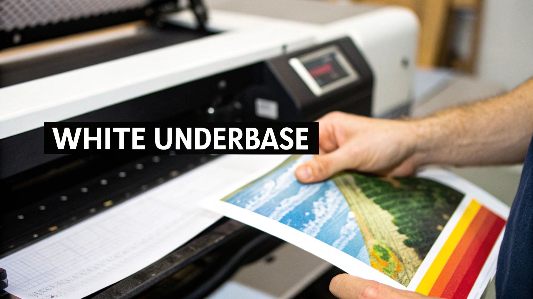
How White Ink Makes Your Colors Pop on Dark Materials
Ever wondered how a bright yellow design looks so punchy on a black t-shirt? The magic isn't just in the colored ink. It’s what’s hiding underneath. The secret weapon is a white underbase—a solid layer of opaque white ink that goes down first, directly onto the garment, before any colors are applied.
Think of it as a primer for your fabric. This underbase creates a bright, blank canvas that stops the dark material from swallowing up your colors. Without it, your design would look muddy and muted. With it, every color stays true and vibrant, giving you a professional, high-impact finish on anything from dark cotton hoodies to colored polyester jerseys.
The Magic is Automatic (Mostly)
Here’s the good news. One of the best parts about modern Direct-to-Film (DTF) printing is that you don’t have to manually create a separate file for this white layer. The printer’s software is smart enough to do the heavy lifting for you, automatically generating an underbase from any part of your design that contains color.
This means if you upload a red circle, the printer knows to first lay down a solid white circle and then print the red ink right on top. This automation really simplifies how you design heat transfers, letting you focus on the creative side of things. But this whole process hinges on one critical detail in your file: opacity.
Why Solid Colors are King
The software identifies where to print the white underbase by looking for solid pixels. Any area with color gets a matching layer of white ink. This is exactly why semi-transparent pixels, soft edges, or feathered gradients can cause such a headache.
These fuzzy elements just confuse the printer. It can’t produce a semi-transparent white layer, so it tries its best and usually ends up with a splotchy, hazy white effect called "ghosting" around your design. To sidestep this mess, you have to design with hard, solid edges.
For example, a cool glow effect made with a soft brush will look terrible once printed. The machine will try to put a speckled white underbase beneath it, completely ruining the look. The golden rule is to always design with 100% opaque colors for a clean, predictable result. For a deeper dive into how inks behave, check out our guide on understanding DTF printer ink.
Pro Tip: If you absolutely need a gradient, try using halftones. This technique uses a pattern of solid dots to simulate the fade, giving the printer the solid pixels it needs while creating the illusion of a smooth transition.
It’s this kind of versatility that has helped the DTF printing market grow into a global powerhouse, valued at USD 2.72 billion. The industry is projected to hit USD 3.92 billion by 2030, all thanks to designers and brands creating on-demand apparel with unlimited colors and incredible durability. This method also cuts production waste by 30-50% compared to older techniques. You can see more data on this booming market over at Grand View Research.
The Pro 'Choke' Technique
For those designs that demand absolute precision, pros use a technique called "choking" the underbase. It sounds aggressive, but all it means is making the white layer just a tiny bit smaller—usually by a few pixels—than the color layer that sits on top.
So, why bother? It creates a safety margin that prevents any white ink from peeking out around the edges of your design. Even a minuscule misalignment during printing can create an ugly white halo effect. By choking the underbase, you ensure the color layer completely covers it, leaving you with a perfectly clean and sharp transfer. While many print services do this for you, knowing how it works will help you create better, more reliable files from the get-go.
Using Gang Sheets to Maximize Value and Minimize Waste
For any growing brand or DIY creator, efficiency isn’t just a nice-to-have; it's the secret to actually making money. This is exactly where gang sheets become your best friend in the print world. Instead of paying to print every single design separately, a gang sheet lets you arrange multiple different designs onto one large transfer sheet. This move alone drastically cuts down on wasted material and slashes your cost per transfer.
Think of it like a game of Tetris with your artwork. You have a set print area—maybe 22x24 inches—and your mission is to fill it with as many designs as you can, leaving as little empty space as possible. For small businesses, this is a total game-changer. You can fit a big back graphic for a hoodie, a few left-chest logos, some sleeve designs, and even tiny neck tags all onto one sheet. You pay for that single sheet instead of a dozen small ones, which is fundamental to making custom apparel profitable when you're just starting out.
Building an Effective Gang Sheet
Putting together a great gang sheet is part art, part strategy. The goal is simple: use every square inch of that film. Most print shops, including Raccoon Transfers, have online builders that make this pretty easy, but if you understand the logic behind it, you'll get more bang for your buck on every single order.
First things first, gather up all the designs you need for a project or a product drop. Don't just think about one t-shirt; think about the whole collection. Do you need smaller versions of your main logo for hats or beanies? What about branding tags for the inside collar? Every single piece you need printed is a candidate for the gang sheet.
Once your files are ready, start by placing your biggest graphics on the sheet. These are the anchors for your whole layout. From there, you can start "nesting"—the process of tucking your smaller designs into the awkward empty spaces left behind by the bigger ones. A circular logo, for example, always leaves empty space in the corners. That spot is perfect for a small text design or a tiny icon.
Spacing and Organization Best Practices
While you want to pack the sheet tightly, you absolutely have to leave enough room to cut everything out later. A sheet that's too crowded is a nightmare to work with and can lead to costly mistakes.
-
The Quarter-Inch Rule: A solid rule of thumb is to leave at least a quarter-inch (0.25") of space around each individual design. This buffer gives you a clean cutting line so you can easily separate them with scissors or a rotary cutter without nicking an adjacent graphic.
-
Think About Your Cuts: Before you hit "submit," just take a second to visualize how you'll cut the sheet apart. Try to arrange designs in straight lines when you can, as this allows for long, easy cuts. Grouping items of a similar size together also helps streamline the process.
-
Rotate and Flip: Don't hesitate to rotate your designs 90 or 180 degrees! Sometimes, turning a rectangular design on its side is all it takes to make it fit perfectly into a gap. This simple trick can be the key to squeezing in one last logo and maximizing your investment.
Real-World Scenario: Let's say you're prepping for a new apparel drop. You've got a 10-inch wide back piece, a 4-inch chest logo, and a 2-inch sleeve graphic. On your gang sheet, you'd place the big back piece first, then nestle the chest logo right next to it. In that empty space below the chest logo, you can probably fit multiple copies of your sleeve graphic, using up print area you’d otherwise have paid for and wasted.
Getting good at this directly saves you money on every print run. For a deeper dive into optimizing your layouts, our comprehensive guide to DTF gang sheets offers even more advanced tips and visual examples. At the end of the day, a well-planned gang sheet reflects a smart, efficient production workflow.
Advanced Techniques for Professional-Grade Transfers
Alright, once you've nailed the basics like resolution and color profiles, it's time to dig into the details that separate a decent print from a truly professional one. This is where the real magic happens. It’s less about artistic complexity and more about understanding the physical realities of the DTF process and designing with them, not against them.
We're talking about handling the tricky stuff—gradients, super-fine lines, and transparency. A design that looks incredible on your screen can easily become a smudged, peeling mess if you don't prep these elements correctly. By thinking ahead, you can create transfers that are not only sharp and vibrant but also hold up wash after wash.
Handling Transparency and Gradients
One of the most common traps I see people fall into is using soft transparencies and gradients. They look sleek on a monitor, but they just don't play well with DTF printers. The reason comes down to that all-important white underbase: it’s either there or it’s not. There's no "sort of" there.
When your printer sees a pixel that's 50% transparent, it doesn't know how to lay down a 50% transparent white layer. Instead, it often throws down a random spray of white dots, creating a hazy, unprofessional "ghosting" effect around your design.
To get a clean print, you have to stick to 100% solid colors and hard edges.
- Avoid Soft Brushes: Step away from any digital brushes that create feathered or soft edges.
- No Glow Effects: Effects like outer glows or drop shadows that fade out will print poorly.
- Use Halftones for Gradients: If a gradient is non-negotiable, your best bet is to simulate it with a halftone pattern. This technique uses solid dots of different sizes to trick the eye into seeing a smooth fade, giving the printer the solid, defined shapes it needs to work with.
To help you navigate these nuances, here’s a quick-reference table for common design elements.
Design Element Guidelines for DTF Printing
This table breaks down how different design elements behave in the DTF printing process and offers best practices to ensure they turn out just right.
| Design Element | Best Practice | Common Mistake to Avoid |
|---|---|---|
| Gradients & Fades | Use halftone patterns to simulate gradients with solid dots. | Using standard soft gradients, which causes "ghosting." |
| Fine Lines & Details | Set a minimum line thickness of 1-2 points (0.35mm). | Designing lines too thin for the adhesive to grab onto. |
| Small Text | Keep fonts at 8-10 points or larger; use bold, clear styles. | Using tiny, intricate fonts that become illegible blobs. |
| Transparency | Only use 100% solid opacity. | Applying soft-edged transparency or glow effects. |
| Negative Space | Intentionally remove parts of the design to use the garment color. | Creating a large, solid "sticker" that feels heavy and stiff. |
| Edges | Create a slight color bleed (0.2-0.5mm) over the white underbase. | Not accounting for minor registration shifts, leading to a white halo. |
By keeping these guidelines in mind during the design phase, you can prevent most common printing errors before they even happen.
The Art of Negative Space
Here’s a powerful technique that too many designers overlook: using negative space. Instead of plastering a giant, solid block of ink onto a shirt, you can strategically "knock out" parts of your graphic, letting the garment's own color become part of the design.
This does a couple of big things. First, it gives the final print a much softer feel—more like it's part of the fabric instead of a thick plastic sticker sitting on top. Second, it dramatically improves the breathability and flexibility of the shirt, which is a huge win for comfort.
Real-World Example: Imagine you have a detailed graphic of a forest for a black t-shirt. Instead of printing a solid background, you could knock out the spaces between the trees. The black fabric of the shirt would then show through, creating natural depth and shadow. The result is a lighter, more dynamic, and far more comfortable design.
Minimum Line Thickness and Text Size
Details are great, but only if they actually make it onto the final product. I've seen countless designs ruined by fine lines and tiny text that simply vanish during printing or peel off after the first wash.
If a line is too thin, there isn't enough surface area for the adhesive powder to properly bond. It's that simple. To make sure your details are durable and legible, stick to these rules of thumb:
- Minimum Line Thickness: I always aim for a line weight of at least 1-2 points (0.35mm). Anything less is a gamble.
- Minimum Text Size: Keep your text at 8-10 points or larger. This is especially true for anything other than a clean, bold font.
A good habit is to zoom way in on your design before you export it. If you have to squint to see a line or read a word on your screen, it’s definitely too small to print reliably. For those interested in the cutting edge of design, understanding how AI is being leveraged can open new creative avenues for your artwork; you can explore AI fashion design concepts to see how technology is shaping future apparel.
Understanding Bleed and Safe Areas
Finally, let's talk about the edges. Every so often, a tiny misalignment between the white underbase and the color layer can leave a nasty little white halo around your graphic. To head this off, pros use a bleed.
A bleed simply means extending your color layer ever-so-slightly beyond the edge of the white underbase. This creates a small buffer, ensuring that even if there’s a minor shift during printing, the color will still completely cover the white ink, leaving you with a crisp, clean edge. Most professional print shops will handle this for you, but it’s a critical concept to understand for getting consistently perfect results.
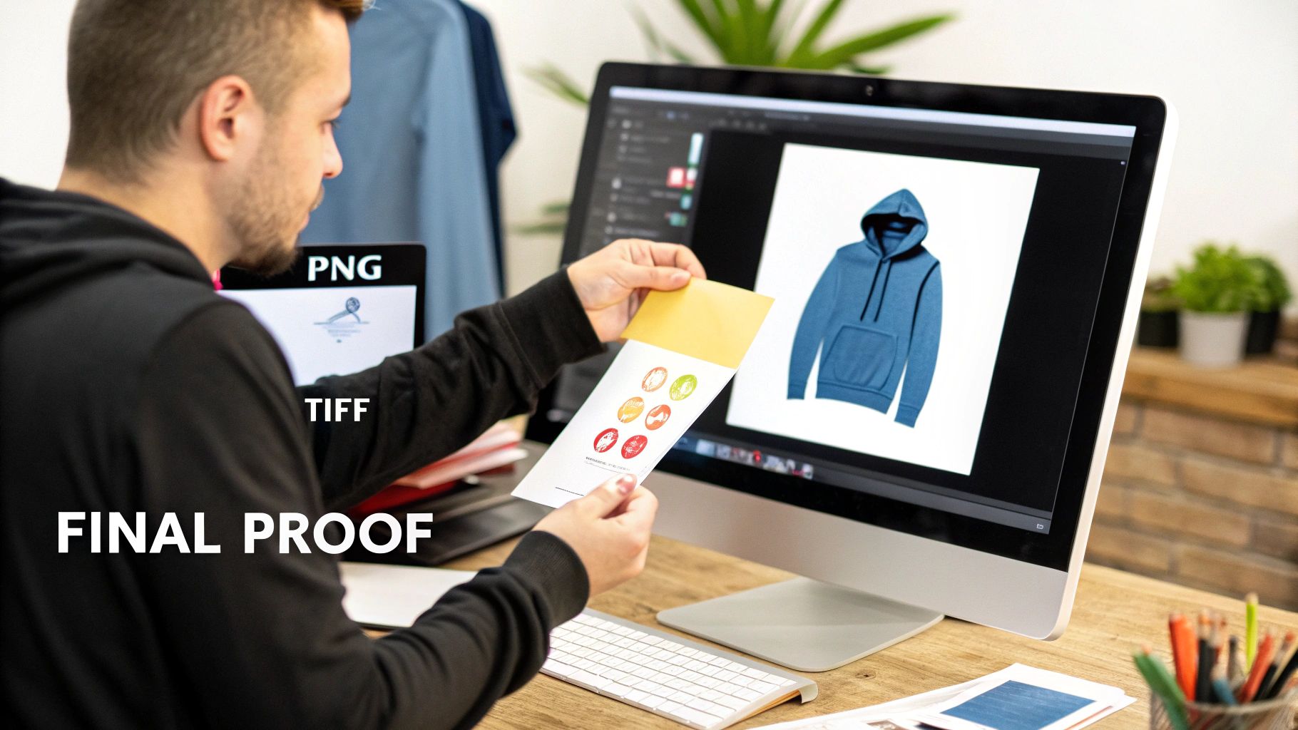
Getting Your Designs Ready for Print
That moment right before you send a design to the printer is critical. This is your last chance to spot any issues and make sure the artwork you spent so much time on will look just as good in real life as it does on your screen. Honestly, skipping this final check is one of the biggest—and most expensive—mistakes I see people make, especially when they're just starting out.
Think of proofing as your personal quality control. It's what stands between you and a box of misprinted transfers, wasted money, and the frustration of a finished product that just isn't right. From creating a quick digital mockup to double-checking your export settings, this process is what ensures all your hard work pays off.
Use Digital Mockups to See the Future
Before you print anything, you absolutely have to create a digital mockup. This is a non-negotiable step. It's as simple as taking your finished design and placing it on a good photo of the actual product—a t-shirt, a mug, whatever you're making. This quick visual preview is your best line of defense against mistakes in sizing and placement.
Something that looks perfectly balanced on a flat artboard can suddenly look tiny or just plain awkward on a real-world object. A mockup makes these problems jump out at you. You might realize your main graphic needs to be bumped up by 15% on a hoodie to have the right impact, or that a logo on a cap is sitting way too close to the seam.
Here’s a perfect example: I once designed a vertical text graphic for the sleeve of a long-sleeve tee. On my screen, it looked sharp. But as soon as I dropped it onto a sleeve mockup, I saw the text wrapped around the arm so much you couldn't read it. That simple check let me tweak the design's width before wasting a single transfer.
Catching these problems on your computer costs you a few minutes. Catching them after you've printed costs you real money and time.
Exporting Your File for Flawless Printing
Okay, so your mockup looks great. Now it's time to export the file correctly. Your goal here is to package up your design so that the printer has every single piece of information it needs to produce a perfect transfer. The wrong export settings can completely ruin your work, causing fuzzy edges, weird colors, or other disasters.
For both DTF and UV-DTF printing, your best bets are PNG and TIFF files.
- PNG (Portable Network Graphics): This is the go-to for most people. It's easy to work with, and its killer feature is support for lossless compression and transparency. That means you get a crisp image with a perfectly clear background, which is exactly what you need for transfers.
- TIFF (Tagged Image File Format): Professionals often lean on TIFF files. They're typically uncompressed, which makes them ideal for really complex or large-scale art where you need to preserve every last pixel of detail.
Whichever you choose, just make sure you lock in your export settings at 300 DPI and don't change the original dimensions of your artwork.
Always Think About the Final Application
Lastly, part of your final check should always involve thinking about where this transfer is actually going. The material you're pressing onto should influence your design decisions. The heat press settings for a 100% cotton shirt are totally different from what you'd use for a heat-sensitive polyester jacket or a hard coffee mug.
This is more important than ever. The heat transfer film market is exploding and expected to reach USD 3.79 billion by 2030, largely because small brands are creating incredible products on all sorts of materials. You can learn more about the rise of heat transfer films in this market research report.
Modern transfers are incredibly tough—often achieving 99% wash-fastness even after 50 washes—but only if you apply them correctly to the right surface. For example, a design with super fine, delicate lines might look amazing on a smooth cotton t-shirt but could have trouble sticking properly to a rough canvas tote bag. Considering these real-world limitations during your final review will help you create a design that’s not just beautiful, but one that will actually last.
A Few Common Questions About Designing Heat Transfers
Even with the best guide, you're bound to run into questions when you're deep in a project. Let's be honest, navigating the technical side of things when you first design heat transfers can be a little overwhelming. This section is all about giving you quick, clear answers to the questions we hear all the time, helping you sidestep common headaches and get your projects looking great from the first press.
Here, we'll dive into the practical problems that creators bump into every day. From picking the right file format to figuring out why your colors look a bit "off," these answers should give you the confidence you need to finalize your art and get it ready for printing.
What’s the Best File Format for My Heat Transfer Design?
If you want the short answer, it's a high-resolution PNG with a transparent background, saved at 300 DPI. This is the gold standard. PNGs are fantastic because they support transparency, which means only your actual design gets printed—no ugly white box surrounding it. This is probably the single most important file spec to get right.
Now, other formats like TIFF, PSD, and AI also work great. If you happen to have a vector file, like an AI or SVG, that’s even better. Vector graphics are magic; they're built with math instead of pixels, so you can scale them from a tiny chest logo to a massive back piece without losing an ounce of quality.
But if you’re sticking with a pixel-based file like a PNG, it's absolutely critical to create it at the exact size you plan to print. Trying to blow up a small PNG is a recipe for a blurry, pixelated disaster.
My Two Cents: For simplicity and reliability, you can't go wrong with a 300 DPI PNG with a transparent background. It checks all the boxes for a top-notch DTF print and plays nice with pretty much all design software.
Can I Use Gradients or Shadows in My DTF Design?
This is a big one. While DTF technology is incredible and can print millions of colors, it really struggles with soft gradients, transparent shadows, and feathered edges. The culprit is the white underbase—it's a solid, completely opaque layer of ink. It just can't reproduce a smooth fade from 100% color down to nothing.
When the printer sees a semi-transparent area in your design, it often creates a weird, speckled effect called "ghosting" where that soft fade should be. You end up with a harsh, unappealing edge instead of the beautiful transition you saw on your screen.
So, for the most predictable and professional-looking results, stick with solid, 100% opaque colors.
If a gradient is absolutely essential to your design, there's a pro workaround: use halftones. This classic technique fakes a gradient by using a pattern of solid dots that get smaller or larger. To our eyes, it looks like a smooth fade, but to the printer, it's just a bunch of solid shapes it can handle perfectly.
How Small Can My Text or Fine Lines Be?
Details are everything, but only if they actually show up on the shirt. For your design to be both clean and durable, make sure all your text and fine lines have a minimum thickness of at least 1 to 2 points (which is roughly 0.35mm).
Why does this matter so much? Anything smaller than that runs into two major problems:
- Print Clarity: Super-thin lines might not print cleanly. They can look broken, splotchy, or sometimes disappear completely.
- Adhesive Problems: More importantly, a tiny line just doesn't have enough surface area for the adhesive powder to grab onto. This means those delicate parts of your design are likely to peel right off during application or after the very first wash.
Before you send your file off, zoom way in and inspect the thinnest parts of your art. A good rule of thumb I use is if I have to squint to see it clearly on my monitor, it's probably too thin to print well. It's always better to be safe and thicken up any lines that look questionable.
Why Do My Printed Colors Look Different Than They Do on My Screen?
The dreaded color shift—it's one of the most frustrating things for any designer. This mismatch almost always comes down to the fundamental difference between how your screen and a printer create color.
Your monitor uses an RGB (Red, Green, Blue) color model, which is based on light. Printers, on the other hand, use a CMYK (Cyan, Magenta, Yellow, Black) model, which is based on ink. When your RGB file gets converted for printing, some color shifts are just unavoidable. The range of colors (the "gamut") that ink can reproduce is different from what light can show.
To keep these shifts to a minimum, always design your files using the sRGB color profile. It’s the most universal profile out there and helps ensure the conversion is as consistent as possible. Also, remember that every screen is calibrated a little differently. That vibrant red on your fancy monitor might look slightly different on someone else's, and different again once it's ink on a shirt.
For any project where color accuracy is absolutely critical, the only way to be 100% sure is to order a single sample print first.
Ready to bring your amazing designs to life? At Raccoon Transfers, we make it easy to get professional-quality custom DTF transfers with next-day shipping. Upload your art, build a gang sheet, and let us handle the rest. Get started today at https://raccoontransfers.com.