How to Put Logos on T Shirts: how to put logos on t shirts, a quick guide
Putting a professional logo on a T-shirt is actually much simpler than you might think, especially with modern transfer methods. The secret sauce for getting those crisp, retail-quality results is a combination of high-quality Direct-to-Film (DTF) transfers and a dependable heat press. This duo is what a huge number of pros rely on for small and medium-sized production runs.
Your Starting Point for Professional Logo T-Shirts
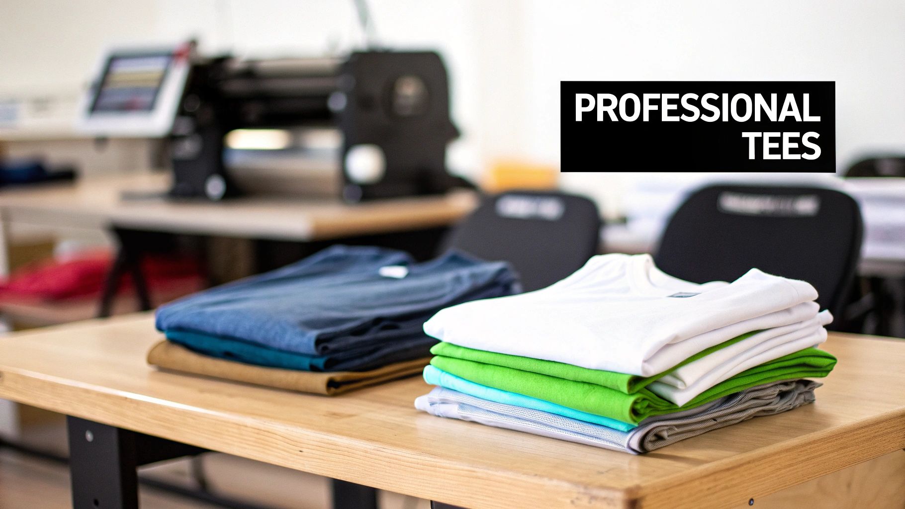
It's never been easier to create custom apparel that looks sharp, feels fantastic, and holds up wash after wash. In this guide, we’re moving past the basic craft-store methods and jumping straight into the techniques the professionals use. You'll see exactly why DTF transfers have become such a game-changer because of their sheer versatility and impressive quality.
We're going to walk through the entire process, from prepping your digital artwork perfectly to laying out your designs on a gang sheet to get the most bang for your buck. Let's skip the frustrating guesswork and common pitfalls that cause peeling logos and crooked prints.
Why This Method Works
This isn't just about sticking a logo on a shirt; it's about crafting a durable, sellable product. The methods I'm about to show you are all about getting a predictable, repeatable outcome every single time. Here’s what makes it so effective:
- Vibrant, Full-Color Prints: DTF technology handles unlimited colors and super-fine details without any complicated screen setups.
- Fabric Versatility: You can press these logos onto cotton, polyester, blends, and even more challenging fabrics with consistent, great-looking results.
- Exceptional Durability: When you press them correctly, these transfers are incredibly wash-resistant and have a soft, flexible feel on the shirt.
- Cost-Effectiveness: It's the perfect solution for small businesses or brands that need anywhere from one to several hundred shirts without a massive upfront investment.
To really see the business potential here, it helps to understand the models that make it work. A great place to start is learning What is Print on Demand, which shows you how to create and sell apparel without ever holding inventory. This business model, often powered by DTF technology, is exactly how so many small brands are able to compete and grow.
Pro Tip: The real secret to a professional finish isn't just the transfer itself—it's mastering your heat press. Consistent temperature and even, firm pressure are what truly fuse the logo into the fabric fibers, ensuring it will never crack or peel.
By the time you're done with this guide, you’ll have the hands-on knowledge to produce T-shirts that don't just look good, but also meet the high standards your customers will expect.
Getting Your Logo Artwork Ready for Perfect Transfers
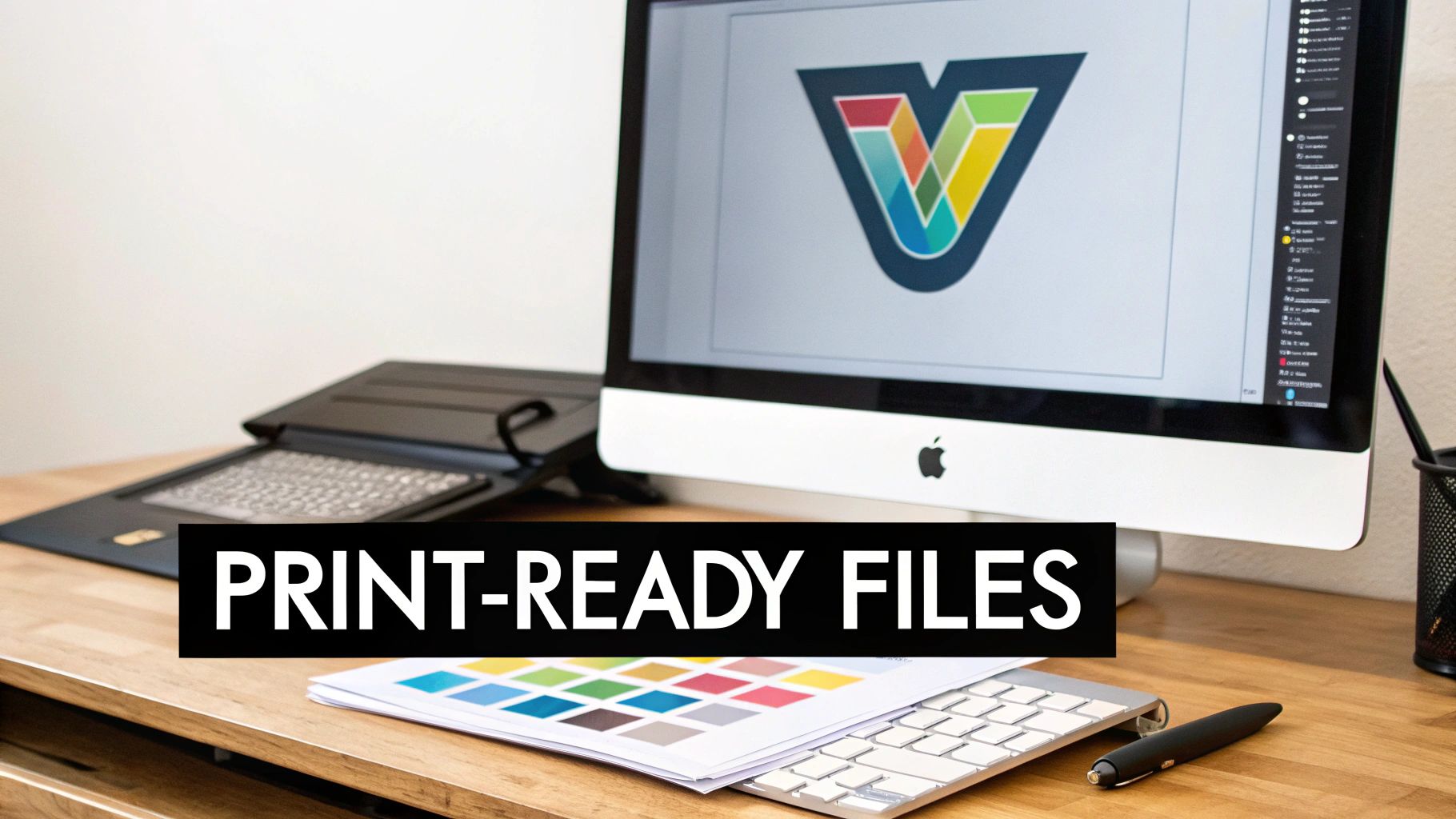
Here's a truth I've learned over countless print jobs: a killer T-shirt logo starts on your computer, long before you ever touch a heat press. Your digital file is the blueprint. Any flaw in that blueprint—a blurry edge, a weird color—will show up on the final shirt. If you want results that look like they came from a high-end shop, getting this stage right isn't just important; it's everything.
Before you even think about pressing, you have to nail the artwork. Using some creative logo design tools can help you start with a professional, clean concept. From there, the most critical decision is your file type.
Vector vs. Raster: The Only Real Choice for Pro Quality
When you're dealing with logos for apparel, you'll run into two kinds of image files: vector and raster. Getting this wrong is the fastest way to a blurry, pixelated disaster.
- Raster files (like JPEG, PNG, GIF) are made of tiny squares called pixels. They work fine for photographs, but they are a nightmare for logos. Ever tried to make a small logo bigger and watched it turn into a fuzzy, blocky mess? That's because you're just stretching the pixels.
- Vector files (AI, EPS, SVG, PDF) are completely different. They're built with mathematical formulas—points, lines, and curves. This means you can scale a vector logo to any size imaginable, from a tiny tag print to a giant banner, and it will stay perfectly crisp and clean every single time.
For DTF transfers, there’s no debate. Vector is the way to go. It guarantees every line is sharp and your logo looks polished, no matter the size.
Sending a low-res JPEG to a printer is like giving a master car builder a blurry, hand-drawn sketch and expecting a Ferrari. The final product can only be as good as the instructions you provide.
The Essential Artwork Prep Checklist
Got your logo in a vector format from a program like Adobe Illustrator or Affinity Designer? Great. Now, a few quick setup steps are essential to avoid common headaches like weird colors or missing fonts.
- Set the Right Color Mode: Your screen uses RGB (Red, Green, Blue) light, but printers use CMYK (Cyan, Magenta, Yellow, Black) ink. You absolutely have to design and save your file in the CMYK color space. If you design in RGB, the colors will shift when printed, sometimes dramatically. For a deeper dive into color management, it's worth understanding what an ICC file does to keep colors consistent.
- Make Sure the Background is Transparent: Your logo should look like it's printed directly on the fabric, not stuck inside a white box (unless that’s your design!). Always double-check that your background is transparent before you export the file.
- Convert All Text to Outlines: This is a big one. If you use a cool font that your print shop doesn't have, their computer will just swap in a default one, ruining your design. The fix is simple: select your text and "Create Outlines" (or "Convert to Curves"). This turns the letters into solid shapes, locking them in place forever.
- Check Your Line Thickness: I see this trip people up all the time. Tiny details that look amazing on your monitor can be too thin to print properly. A good rule of thumb is to make sure every line and element is at least 1 point (0.014 inches) thick. This ensures a clean transfer without bits and pieces getting lost.
Save Money and Maximize Your Order with Gang Sheets
Want to know the secret to ordering transfers affordably? Gang sheets.
A gang sheet is just a large sheet of transfer film where you can arrange, or "gang up," as many different designs as you can fit. Instead of paying for each logo individually, you pay for the whole sheet. It’s the single most cost-effective way to get DTF transfers made, especially for small-batch runs.
You can pack a 22x60 inch sheet with dozens of chest logos, a few big back pieces, and a bunch of sleeve graphics—all for one price. To get the most out of it, treat it like a game of Tetris. Rotate and nest your designs to fill every possible inch. This simple trick dramatically lowers your cost-per-logo and is a pro move for anyone serious about printing shirts efficiently.
Mastering Logo Sizing and Placement
You can have the best-looking logo in the world, but if you slap it on a shirt in the wrong spot, the whole thing just looks off. It’s one of those subtle details that separates a DIY-looking shirt from a professional, retail-quality garment.
Think about any brand-name shirt you own. The logo placement feels intentional, balanced, and just… right. That’s our goal. It’s not about guessing; it's about knowing the industry standards that make a design look like it truly belongs on the fabric.
The Go-To Spots for T-Shirt Logos
While you can always get creative, most professional jobs rely on three classic placements. Nail these, and you'll be set for 99% of the logo shirts you'll ever make.
-
Full Front: The classic, big-and-bold placement. It’s centered on the chest and designed to make a statement. The trick here is finding that sweet spot—not so high that it’s choking the collar and not so low it becomes a “belly print.”
-
Left Chest: This is your go-to for a cleaner, more corporate look. Think polo shirts. It's subtle, professional, and aligns over the heart. It’s just as sharp with a heat transfer as it is with traditional embroidery.
-
Back Yoke: A great spot for secondary branding, like a small icon or a tagline, right below the back collar. It adds a polished, high-end touch without distracting from a main design on the front.
Each of these placements has its own unwritten rules for sizing and vertical positioning, which you'll need to adjust based on the T-shirt size. For a super deep dive, check out our complete guide to graphic size for T-shirts, which is packed with detailed charts.
T-Shirt Logo Sizing and Placement Cheat Sheet
To get you started, I've put together a quick cheat sheet. These are my go-to starting measurements for placing logos, measured from the bottom of the collar seam down to the top edge of your transfer.
| Placement Location | Adult Small/Medium | Adult Large/XL | Adult 2XL/3XL |
|---|---|---|---|
| Full Front | 3.0" – 3.5" down | 3.5" – 4.0" down | 4.0" – 5.0" down |
| Left Chest | 3.0" – 4.0" down | 4.0" – 5.0" down | 5.0" – 6.0" down |
| Back Yoke | 3.0" – 4.0" down | 4.0" – 5.0" down | 5.0" – 6.0" down |
These numbers are a fantastic starting point. Tweak them as needed based on the specific garment and logo shape, but you can’t go wrong starting here.
My Favorite Trick: For a perfect left chest placement every time, find your vertical center by drawing an imaginary line straight down from the outside edge of the collar. Where the shoulder seam meets the collar is your anchor point. It’s a simple visual cue that works like a charm.
Why One Size Doesn't Fit All
Here’s a rookie mistake I see all the time: using the exact same size transfer for every shirt in an order, from an Adult Small all the way up to a 3XL. A logo that looks great on a Medium will look massive and awkward on a Small, while that same logo will get totally lost on a 3XL.
The professional approach is to scale your artwork. I recommend creating at least two, sometimes three, different sizes for a full run of shirts.
For example, a full front design might break down like this:
- Youth & Adult XS/S: Use a smaller 9-inch wide graphic.
- Adult M/L/XL: This is your standard size, maybe 10.5 to 11 inches wide.
- Adult 2XL+: Scale it up to 12 inches wide to keep it looking proportional.
Yes, this takes a little more planning when you set up your gang sheet, but the payoff is huge. Your customers will notice that attention to detail, and every single shirt in the order will look fantastic, no matter the size.
Getting It on the Shirt: The Heat Press Process
Alright, this is where the prep work pays off and your digital design becomes a real-deal product. You've got your art dialed in, your transfers are ready to go, and a fresh stack of tees is waiting. Nailing the heat press process is what separates a peeling, homemade-looking shirt from a durable, professional one that you can proudly sell or wear.
The whole game is a delicate dance between three things: temperature, time, and pressure. Each step is built on the one before it, so paying attention to the small details is what prevents the most common (and frustrating) mistakes. Let's walk through a repeatable workflow.
First Things First: The Pre-Press
I can't stress this enough: do not skip the pre-press. It's the most overlooked step by beginners, and it's absolutely non-negotiable if you want professional results.
Garments, especially cotton ones, are like sponges for moisture in the air. When you hit a shirt with 300+ degrees of heat, that moisture turns to steam, and steam is the mortal enemy of a good transfer. A quick pre-press does two crucial things:
- It zaps all that hidden moisture out of the fabric, giving the transfer's adhesive a clean, dry surface to bond to.
- It irons out every last wrinkle and crease, creating a perfectly smooth canvas for your logo. Pressing a transfer over a wrinkle will lock that flaw into the shirt forever.
Just lay your shirt on the heat press, smooth it out, and give it a quick press for 5-7 seconds at your target temperature. You might actually see a little puff of steam—that's good! It means you just dodged a bullet that could have ruined your print.
Lining It Up and Locking It Down
Now that you have a moisture-free, flat surface, it's time for placement. Grab your transfer and position it on the shirt, using the placement guidelines we talked about earlier. Eyeball it, use a T-shirt ruler—whatever it takes to get it perfectly straight and centered.
Once it's in just the right spot, you need to make sure it stays there. The slightest shift when you lower the press can throw the whole design off-kilter. Your best friend for this is heat-resistant thermal tape.
A couple of small pieces on opposite corners are all you need to tack the transfer film to the shirt. This special tape can take the heat without leaving any gunk behind. It's a tiny, cheap insurance policy against crooked logos.
My Two Cents: Don't go crazy with the tape. A little piece on two corners is plenty. If you tape all four sides down too tightly, you can sometimes get weird pressure marks right at the edge of the design.
With that, you're ready for the main event.
The First Press: Application and The Peel
This is where the ink meets the fabric. Lay a protective cover sheet (like Teflon or parchment paper) over the transfer. This acts as a buffer and keeps the transfer film from melting onto the hot plate of your press.
Close the press. You're aiming for medium-to-firm pressure. It should take a bit of muscle to lock it down, but you shouldn't have to throw your whole body into it. Press for the time and temp your transfer supplier recommends—for most DTF on cotton/blends, this is usually around 15 seconds at 300-320°F.
When the timer beeps, pop it open. Now comes the moment of truth, and it's dictated entirely by what kind of transfer you're using.
- Hot Peel: This means you rip that film off immediately while it's still smoking hot. Do it in one smooth, confident motion. No hesitation!
- Cold Peel: You have to wait. Take the shirt off the press and let it cool completely to room temperature. Seriously, go grab a coffee. If you try to peel it even a little warm, the design will likely come right off with the film.
Always, always follow the instructions for your specific transfers. Guessing here is a great way to waste a perfectly good shirt and transfer.
This diagram shows a few of the classic placements you'll be dealing with day in and day out.
![]()
Whether you're going big with a full-front graphic or keeping it classic with a left-chest or back-yoke logo, the fundamental application process remains the same.
The Finishing Press: The Secret to Durability
You’ve peeled the film away, and the logo looks fantastic. You might be tempted to call it a day, but there’s one final step that takes a print from "good" to "great." This is the finishing press.
This quick, final press does two things. It pushes the ink deeper into the shirt's fibers, which dramatically improves stretchability and wash-resistance. It also knocks down that slight plastic-y shine a fresh transfer can have, giving it a softer, more high-end matte finish.
Just place a sheet of parchment paper over the now-exposed logo and press it again for another 5-10 seconds. This simple move is what helps your designs survive dozens of washes without cracking or peeling.
The drive for this kind of quality is a huge part of why the custom apparel world is booming. The global custom T‑shirt printing market has exploded, with one analysis pegging it at USD 6,088.4 million in 2025 and projecting a leap to USD 13,722.6 million by 2032. That's a compound annual growth rate (CAGR) of 12.3%. This massive growth is pushing shops to adopt efficient digital methods like DTF to keep up. If you're curious, you can explore more about the trends in the custom apparel market to see where things are headed.
Dialing In Your Heat Press for Different Fabrics
If you treat every T-shirt the same on a heat press, you're setting yourself up for disaster. A setting that works perfectly for a thick cotton tee will absolutely scorch a delicate polyester shirt. On the flip side, a polyester-safe temperature won't be hot enough to properly cure a transfer on cotton. Learning to dial in your time, temperature, and pressure for each fabric is what separates the pros from the people who end up with a pile of ruined shirts.
It all comes down to how different fibers react to heat. Cotton is a natural, resilient fiber that can take higher temperatures without much of a fight. But synthetics like polyester? They’re essentially a type of plastic. Too much heat can melt the fibers or, even worse, cause dye migration.
The Polyester Nightmare: Dye Migration
Dye migration is the bane of anyone pressing logos on polyester. When the fabric gets too hot, the dye in the shirt turns into a gas, seeps into the base layer of your transfer, and permanently stains it. That beautiful, crisp white logo you pressed on a red polyester shirt can come off the press with an ugly pink halo.
There's only one real way to stop this: use a lower temperature. For polyester, you have to keep your heat press below the dye's activation point, which is usually around 280-300°F. This is non-negotiable if you want clean, vibrant prints on synthetic garments.
A Solid Starting Point for Common Fabrics
Every heat press is a little different, and transfer formulas can vary, but these settings are a reliable place to start. I always recommend doing a quick test press on a scrap piece of fabric or a hidden area first, just to be safe. For a more comprehensive list that covers a ton of different materials, check out a detailed heat press temperature chart.
| Fabric Type | Temperature Range | Time | Pressure | Key Considerations |
|---|---|---|---|---|
| 100% Cotton | 300-320°F | 12-15 sec | Medium-Firm | Very forgiving. Always pre-press for a few seconds to get the moisture out. |
| 50/50 Blends | 280-300°F | 10-12 sec | Medium | A good middle ground. I'd err on the lower side to protect the polyester fibers. |
| 100% Polyester | 260-280°F | 8-10 sec | Light-Medium | Crucial: Stay below 280°F. This is your best defense against scorching and dye migration. |
| Tri-Blends | 260-275°F | 8-10 sec | Light-Medium | These are very heat-sensitive. Treat them just like you would 100% polyester. |
This need for variable settings is more important than ever, thanks to the explosion of e-commerce. The print-on-demand market was projected to hit USD 8.16 billion in 2025 and is now expected to soar to about USD 19.8 billion by 2029. That boom means shops need fast, reliable ways to put logos on every type of fabric imaginable to keep up with online demand. You can find more insights on the rise of print-on-demand fulfillment and its market impact.
What to Do When There's No Tag
So, what happens when you get a shirt with no tag? You can usually figure out the fabric just by the feel.
- Cotton has a soft, natural, and slightly textured hand-feel.
- Polyester feels smooth, silky, and often has a slight synthetic sheen to it.
- Blends feel like a mix of the two—combining the softness of cotton with the smoothness of polyester.
If you're ever in doubt, just start low. Set your press to around 270°F and do a test. It's always better to press twice at a lower temp than to scorch a shirt with too much heat on the first try. Once you get a feel for these settings, you'll be able to press any logo with confidence, knowing it will be vibrant, durable, and perfectly bonded.
Working Through Common Logo Transfer Problems
Sooner or later, you're going to press a transfer that just doesn't want to play nice. It happens to everyone, even seasoned pros. Don't get frustrated—think of it as part of the learning curve. Almost every single issue you'll face comes down to one of three things: your temperature, your pressure, or your timing.
When you see a logo start peeling or lifting after a single wash, the cause is almost always an incomplete bond. The adhesive on the transfer simply didn't melt and sink into the fabric fibers the way it's supposed to. This usually means your pressure was too light or the heat wasn't high enough for that specific material.
What a Bad Press Looks Like
A failed transfer can show up in a few different ways, but the reasons behind them are usually connected. Here are the most common things you'll see and what's likely going on.
-
Edges Lift When You Peel the Film: This is the classic sign of not enough pressure or heat. If the corners of your logo are trying to come up with the carrier sheet, it means the adhesive got warm but wasn't pushed into the fabric with enough force to create a solid bond.
-
Only Parts of the Logo Stick: When you get a patchy transfer—some spots look perfect while others are left behind on the film—it's almost always an issue of uneven pressure. This is super common when you're pressing near a thick collar, a hem, or a pocket seam that keeps the platen from making flat, even contact across the whole design.
-
Cracking After the First Wash: A study that put various printed shirts through 25 wash-and-dry cycles found that heat transfers were the most prone to cracking, sometimes in just five washes. This is what happens when the ink just sits on the surface instead of truly bonding with the fabric. It’s a direct result of a poor initial press.
How to Fix Application Issues on the Spot
The good news? Most of these problems are totally fixable, especially if you catch them right away. You can often save both the shirt and the transfer.
The biggest mistake I see beginners make is being too timid with the pressure. A heat press needs firm, even pressure to work correctly. It should take a good bit of muscle to lock that handle down. If it closes with just a light touch, your pressure is way too low.
To get things right, start by double-checking the recommended settings for your transfers and the fabric you're using. First, try increasing your pressure. If that doesn't solve it, bump the temperature up by 5-10 degrees.
And whatever you do, don't skip the final finishing press. After you peel the carrier film, cover the logo with parchment paper or a Teflon sheet and press it again for another 5-10 seconds. This simple step is a game-changer for locking the design in and making it last through dozens of washes.
Answering Your Top Questions About T-Shirt Logos
Even with a perfect plan, you're bound to run into questions, especially when you're first getting your sea legs. Having good answers ready can save you from a major headache and a pile of wasted shirts. Let's tackle some of the most common questions I get asked.
How Do I Make My Logos Last Through Endless Wash Cycles?
Nothing's worse than a logo that cracks and peels after a few washes. Long-term durability really boils down to getting three things right. First, don't skimp on quality—always start with a top-notch DTF transfer. Second, you have to nail your heat press settings for the specific fabric you're working with.
But the real game-changer? The finishing press.
Once you've peeled the transfer film, cover the logo with a sheet of parchment paper and give it a second press for another 5-10 seconds. This simple step works magic by pushing the ink deeper into the fabric's fibers. It drastically improves washability and is your best defense against cracking. A study on promotional shirts found that heat transfers were the most prone to cracking, sometimes in as few as five washes, which shows just how critical this final press really is.
Can I Get Away With Using a Home Iron Instead of a Heat Press?
Look, if you're making a single shirt for yourself as a fun one-off project, an iron can work. But for anything you want to look professional or, more importantly, sell? Absolutely not.
A regular home iron is a recipe for disaster. It has hot spots, can't maintain a consistent temperature, and you'll never get the even, heavy pressure needed for a proper bond. This is exactly why iron-on transfers often start peeling after the first wash. If you're serious about creating quality products, investing in a heat press is non-negotiable.
My Two Cents: For professional, durable logos, a heat press isn't just a suggestion—it's essential. The consistent heat and pressure it provides are what create a solid, long-lasting bond between the transfer and the shirt.
What's the Deal With Hot Peel vs. Cold Peel?
This one is simple but crucial. The term just refers to when you peel the clear carrier film off the design after pressing. It's not a choice you get to make; it's determined by the specific adhesive on your transfers.
- Hot Peel: You rip that film off immediately, right after the press opens while the shirt is still piping hot.
- Cold Peel: You have to wait. Take the shirt off the press and let it cool down completely to room temperature before you even think about peeling.
Always, always follow the instructions from your transfer supplier. Peeling at the wrong temperature is a surefire way to ruin the shirt and waste the transfer.
Ready to create T-shirts with vibrant, durable logos that actually last? The secret is starting with the best transfers. At Raccoon Transfers, we provide premium, easy-to-use DTF transfers with next-day shipping. Upload your artwork and see the professional difference for yourself.