
10 Types of Mockups for Apparel and Merch
Most advice about mockups starts in the wrong place. It assumes the best mockup is the most polished one, usually a clean digital render that looks ready for a product page. That's useful, but it's not enough for apparel and merch work where buyers and print shops need to make different decisions at different stages.
A seller launching a shirt online needs a fast visual preview. A brand comparing colorways needs side-by-side clarity. A shop building a gang sheet needs layout confidence before anything goes to print. A client ordering drinkware or decals for hard surfaces needs to see whether the design still reads well on glass, metal, or plastic. And when the order matters, a buyer often needs something digital can't prove on its own, which is how the transfer looks and behaves after production.
That's why the most useful way to think about types of mockups isn't by file format alone. It's by decision. Some mockups help you sell. Some help you approve. Some help you place art correctly. Some help you avoid color surprises. Some help you validate print quality before you commit.
Mockups also sit in a specific place in the design process. They're more detailed than wireframes because they show real color, typography, imagery, and finish, but they're still not the same thing as a live prototype or finished product. That distinction became more important as design tools evolved from rough structural planning into polished, near-final visuals across the wireframing-to-prototyping timeline.
Here are 10 mockup formats that matter for apparel and merchandise, organized by the decisions they help you make.
1. Digital T-Shirt Mockups (PNG/PSD Format)
If your immediate decision is, “Can I list this design today?” digital t-shirt mockups are usually the first answer. They're fast, editable, and good enough for early customer review, product thumbnails, and pre-launch social content.
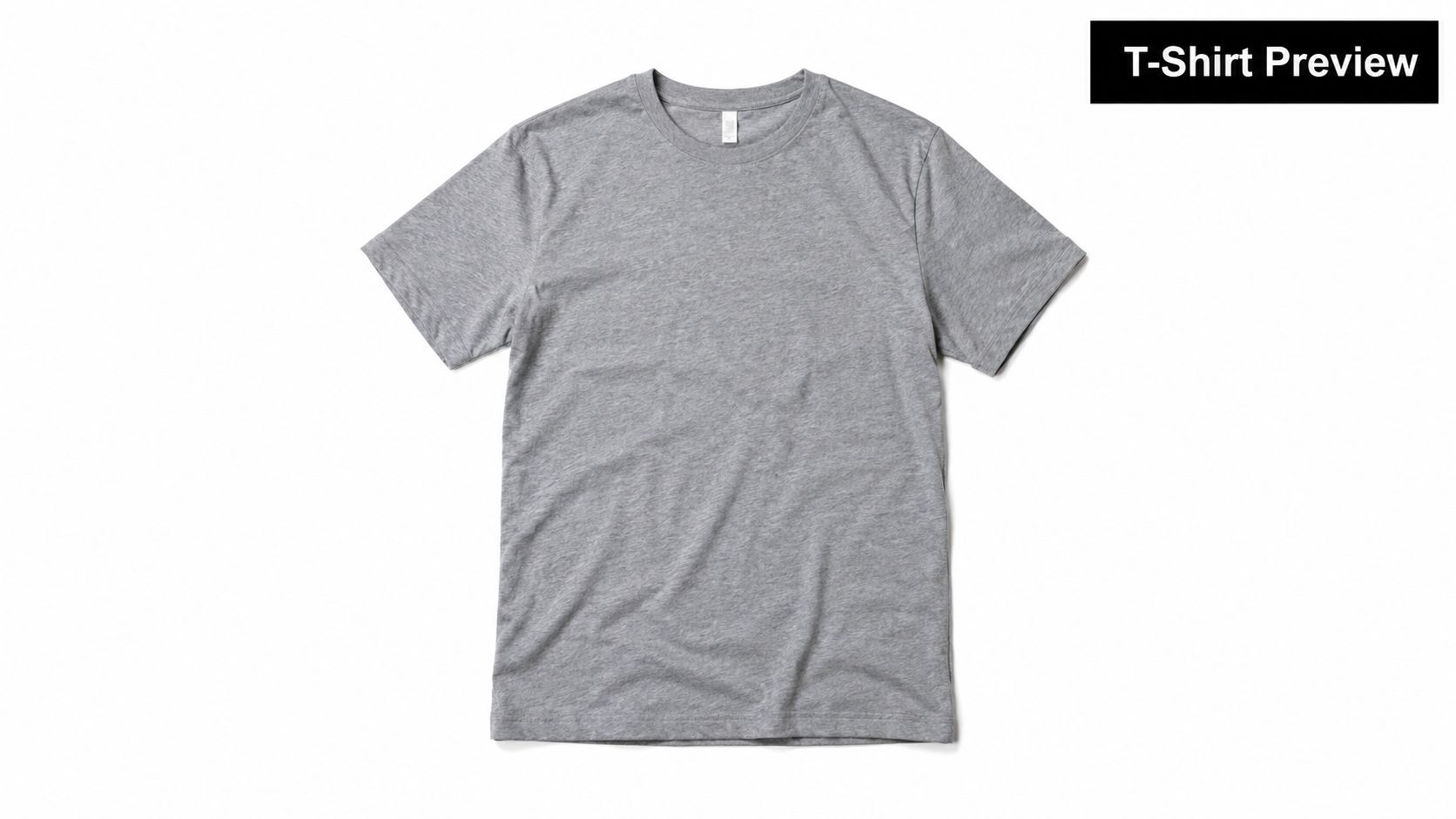
A PNG or PSD mockup works best when the artwork is already clean and placement is mostly settled. Etsy sellers use them for storefront images. Small apparel brands use them to preview drops before ordering blanks. Agencies use them when a client needs a yes-or-no visual before anyone pays for samples.
What they reveal
Digital shirt mockups are strongest at showing composition. You can judge scale on the chest, whether the print reads on dark or light garments, and whether the design looks balanced on a crew neck, hoodie, or oversized tee.
They don't prove hand feel, opacity, fabric interaction, or how the transfer will look once the shirt wrinkles, stretches, or gets pressed on a specific blank. That's the line many beginners miss.
Practical rule: Use digital apparel mockups to approve appearance, not production certainty.
A few habits make them much more credible:
- Use editable layered files: PSD templates make it easier to swap garment colors and reposition art without rebuilding the whole image.
- Show more than one garment color: A design that works on black can fall apart on athletic heather.
- Keep the art file clean: Transparent backgrounds and sharp edges matter, especially if you plan to move from preview to print.
- Match output to platform: Listing images, email proofs, and social posts all need different crops.
If you need ready-made starting points, apparel mockup templates shorten setup time. File prep also matters upstream, especially if you're handing artwork off for print. It helps to confirm the formats supported by RevelRaw or any other production partner before you build a whole proofing workflow around the wrong file type.
2. Physical Sample Transfers (Actual Printed Samples)
This is the mockup type people skip when they're in a hurry, then wish they hadn't. A physical sample transfer answers the question digital previews can't settle. What does the finished result look like on the material?
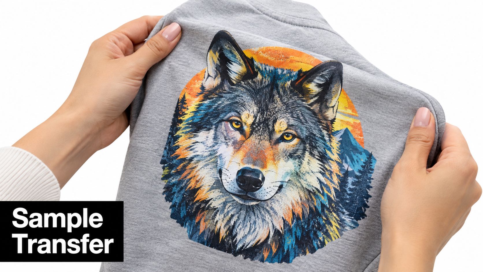
For schools, merch startups, promo product sellers, and anyone placing a meaningful order, a real sample often decides whether the order moves forward. It reveals edge definition, color behavior on the chosen blank, and whether fine details still hold up after transfer.
What digital previews can't prove
A sharp mockup can suggest quality. It can't verify it. You still won't know whether the ink coverage feels heavy, whether tiny text closes up, or whether a particular fabric color changes the perceived tone of the art.
That's where a sample earns its place in the workflow. Press it onto the same garment family you intend to use. Handle it. Photograph it in daylight and indoor light. Wash it according to the provided care guidance if the order is sensitive to long-term wear.
One practical option is the Free DTF UV DTF Sticker Sample Pack. The catalog description is straightforward: Try our samples to see the quality of our work! We offer DTF transfers and UV DTF stickers. Press DTF onto fabrics, and apply UV DTF stickers to hard surfaces like Tumblers, cups and phone cases. $5 shipping fee applies.
A physical sample is less about marketing and more about risk control.
Use samples when the artwork includes gradients, thin strokes, small lettering, or demanding brand colors. Those are the jobs where “looks good on screen” fails most often.
3. Apparel Line Lookbooks (PDF/Interactive Format)
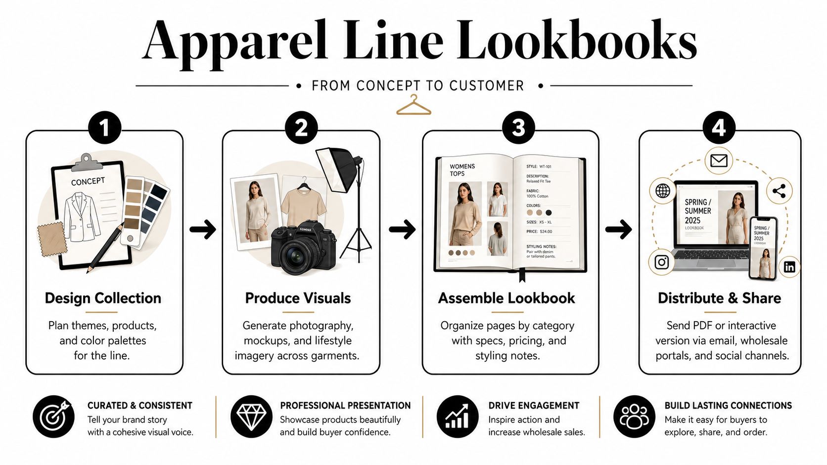
Buyers rarely approve a collection by inspecting isolated product renders one by one. They approve it when the line makes commercial sense as a set. A lookbook exists for that decision.
Use this format when the question is presentation and assortment, not print verification. A startup pitching a capsule collection, a school program reviewing spirit wear, or a promo seller assembling event merch needs to show how tees, hoodies, hats, tote bags, and add-on items fit together.
A good lookbook does more than stack mockups into a PDF. It helps the buyer compare options in the order they evaluate them. Start with the collection story or campaign, then group by garment family, audience, or price tier. That structure answers practical questions early: which pieces carry the core artwork, which items are upsells, and which SKUs are there only to round out the offer.
The visual mix matters too. Product-only renders handle clarity. Lifestyle shots help a buyer judge relevance. Close placement views answer layout questions before anyone asks for revisions. Repeating the same front-facing mockup across ten pages usually signals that the line is underdeveloped, or at least under-explained.
Include details that reduce back-and-forth:
- Garment and blank identification: Name the product so substitutions do not happen by accident.
- Placement and scale notes: Show whether the art is left chest, full front, oversized back, sleeve, or mixed placement.
- Colorway logic: Present only the garment colors that support the artwork and the audience.
- Assortment discipline: Keep hero items, budget items, and add-ons clearly separated.
- Ordering context: Call out minimums, bundle ideas, or event-specific groupings when they affect the buy.
Lookbooks speed alignment, but they cannot prove production quality, hand feel, or color accuracy on the final substrate. They also hide pricing problems if every page gets the same polished treatment. A premium hoodie and a low-margin giveaway tee should not be framed as if they carry the same sales role.
The strongest lookbooks narrow decisions. They help a buyer say yes to a direction, cut weak items, and request samples only for the products that need physical review.
4. Gang Sheet Layout Mockups (Print Sheet Preview)
Pretty apparel renders win approvals. Gang sheet previews prevent production mistakes.
That distinction matters because a gang sheet mockup supports a different decision than a shirt mockup or a lookbook page. It tells the print team, shop manager, or buyer whether the job is built efficiently, whether the pieces are grouped logically, and whether the sheet will still make sense once it reaches trimming, sorting, and pressing.
A strong layout preview catches problems that polished product visuals hide. I have seen clean artwork become messy jobs because the sheet mixed youth and adult sizes together, buried client-specific versions across the page, or packed pieces so tightly that cutting became slower and riskier.
Review the sheet like an operator, not a designer.
- Spacing for handling: Leave enough room for trimming and pickup. A tight layout can save material but create more errors at the table.
- Size integrity: Check whether left chest, sleeve, pocket, and full-front graphics still match their intended garment placements. Art that fits the sheet is not always art that fits the product.
- File version control: Confirm the final names, dates, and logos are present. Gang sheets are a common place for outdated revisions to slip through.
- Sorting logic: Group designs by customer, garment type, event, or press sequence so the sheet stays readable after printing.
- Yield versus labor: A denser sheet may reduce waste, but it can also slow cutting and increase the chance of mixing pieces from separate orders.
That last trade-off gets missed often. Material efficiency matters, but production flow matters too.
For teams building transfer sheets regularly, a practical DTF gang sheet builder guide is more useful than generic mockup advice because the question is not how the art looks in isolation. The question is whether the sheet supports clean output from print file to finished order. The product-side workflow is also relevant with Build Your Own DTF Gang Sheet, which is described in the catalog as offering gang sheets intended for multiple fabrics and detailed artwork handling.
Gang sheet mockups do not approve color, hand feel, or press durability. They prove layout discipline. Used at the right stage, they reduce avoidable waste, sorting confusion, and rework before ink or film gets consumed.
5. Hard-Surface Product Mockups (Glass, Metal, Plastic)
Hard-surface mockups matter most when the decision is about substrate fit, not style.
A design that sells on cotton can fail on a tumbler, acrylic sign, or phone case for very ordinary reasons. Glare cuts contrast. Curved walls distort spacing. A clear or metallic base changes how the art reads before anything gets printed. That is why I treat this mockup category as a screening tool for merchandise expansion. It helps teams decide whether a graphic should move onto glass, metal, or plastic at all.
The useful question here is simple. Will the artwork stay legible and properly placed on the actual object shape and finish?
That makes hard-surface mockups a practical fit for a few specific approvals:
- Drinkware layout: Check wrap height, handle clearance, seam position, and whether the logo feels oversized once it follows a cylinder.
- Sign and display concepts: Test visibility against reflective, frosted, or brushed surfaces before quoting production.
- Small-format merch: Review fine details on cases, key tags, labels, and accessory-sized products where artwork shrinks fast.
- Bundle planning: See whether an apparel graphic translates cleanly into matching add-ons or needs a simplified merchandise version.
The biggest production mistake in this category is assuming every product mockup answers the same question. It does not. An isolated product render helps with placement and scale. A shelf or desktop scene helps with sales context. Packaging teams use the same distinction between technical preview and buyer-facing presentation because each view supports a different decision, as explained in this packaging and product mockup guide from Pacdora.
Use these mockups to catch visual conflicts early. Do not use them to approve adhesion, coating compatibility, dishwasher wear, scratch resistance, or surface prep. Glass, powder-coated metal, and molded plastic can all accept artwork differently even when the digital preview looks convincing.
Physical validation still has to happen.
If the item is headed for retail, events, or repeated handling, move from mockup to a printed sample before signoff. That is where you find out whether highlights blow out on gloss, whether small type survives the curve, and whether the substrate itself makes the design feel premium or cheap.
6. Video Product Demonstrations (MP4/MOV Format)
Buyers rarely make a yes or no decision from a frozen frame alone. They want to know how the product behaves once it leaves the mockup and enters real viewing conditions. That is where video earns its place in the workflow.
Use this format when the decision is about conversion or appearance in motion. A short MP4 or MOV can show fabric drape, shifting glare, sleeve movement, zipper interference, and whether a chest print still reads once the garment is worn instead of laid flat. For mugs, bottles, cases, and other handled items, rotation matters just as much. A still can flatter a design angle that disappears the moment the product turns.
The practical value is speed. One 10 to 20 second clip can answer questions that would otherwise require multiple static renders, extra client explanation, or a reshoot after launch materials are already approved.
Video is strongest in a few specific production moments:
- Pre-launch selling: Show the product from several angles without building a full photo set.
- Client signoff: Reduce confusion around scale, placement, and visibility during normal handling.
- Apparel review: Check whether folds, side seams, collars, or movement interfere with the graphic.
- Merchandise demos: Show how decals, wraps, or printed surfaces look while being picked up, turned, or used.
Motion still has limits. It can suggest texture and realism, but it cannot approve print durability, adhesion strength, wash performance, hand feel, or actual color accuracy. A polished reel can make a weak sample look convincing if the lighting is controlled tightly enough. Production teams should treat video as a presentation and confidence tool, not as final physical proof.
For teams producing launch assets quickly, Veo3 AI's product demo guide is useful for the content side of the job. Keep the standard clear internally. Video helps buyers understand the product faster. Physical samples still handle final approval.
7. Lifestyle and Contextual Photography Mockups (JPEG/High-Res Images)
Lifestyle mockups answer a different buying question than technical previews. They help a customer decide whether the product fits their identity, use case, or setting. That makes them a conversion asset first, not a production asset.
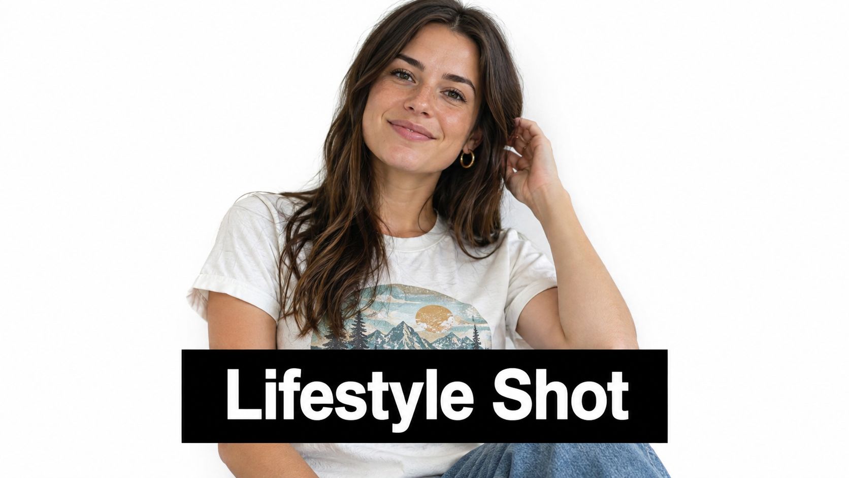
For apparel, that distinction matters. A chest print on a transparent PNG can confirm placement. A lifestyle image shows whether the shirt reads like streetwear, event merch, boutique retail, or creator merchandise once it is on a person and inside a believable scene. Buyers respond to context because context answers practical questions fast. Who wears this? Where does it belong? Does the graphic still hold attention once the garment becomes part of an outfit?
That is why lifestyle mockups tend to perform best in sales-facing slots such as collection headers, paid social, email campaigns, and product pages above the fold.
They are weaker for review work. Lighting, pose, cropping, and fabric folds can hide alignment problems or make a print look sharper and more saturated than it will appear on the actual blank. A strong photo can sell the idea of a product before the team has verified whether small type fills in, whether the ink sits cleanly on the fabric, or whether the garment color shifts the art.
Use them for these decisions:
- Presentation: Does the product feel right for the intended audience?
- Merchandising: Does the design make sense in a real outfit, room, event, or seasonal setting?
- Conversion: Does the image create enough confidence and desire to earn the click?
Do not use them to approve final print color, exact sizing, or production quality. Those calls still belong to digital placement mockups, gang sheet reviews, and physical samples.
A practical workflow is simple. Approve the artwork and placement first. Then build lifestyle imagery from the approved version so marketing gains realism without creating confusion for print production. That sequence protects both speed and accuracy.
8. Color Variation and Swatch Mockups (CMYK/Color Profiles)
Color mockups exist because one design rarely lives on one garment color. The decision here is simple but expensive if handled poorly. Which colorway should go into production?
Side-by-side swatch mockups help buyers compare navy versus black, cream versus athletic heather, or a bright print on multiple blank colors without opening a dozen separate previews. They also reveal when an artwork depends too much on one garment base to stay legible.
Where color previews fail
Most color issues aren't dramatic. They're subtle. Reds shift warmer or cooler. Whites appear harsher on deep garments. Mid-tone art loses separation on heathered blanks. Digital previews can signal these risks, but they don't guarantee output, especially when screens, profiles, and materials vary.
For concept testing and feedback, UX guidance recommends showing only 2 to 3 design variants in concept tests so respondents don't fatigue and default to shallow choices. That advice applies well to color mockups. Too many colorways don't help people decide. They blur the differences.
A practical review flow looks like this:
- Narrow the set first: Show only the strongest few garment colors.
- Compare on one page: Side-by-side views are easier to judge than separate image tabs.
- Pair digital with print when needed: If the color is brand-sensitive, sample it physically.
- Use proper file preparation: ICC-aware workflows reduce surprises during output. A plain-language guide to what an ICC file is helps when color consistency starts mattering more than speed.
Color mockups are selection tools. They are not final color approval by themselves.
9. Interactive AR/VR Mockups (3D Digital Experience)
Some mockups are meant to be viewed. AR and VR mockups are meant to be explored.
This format helps when buyers need spatial understanding. Rotating a cap, inspecting a bottle from multiple angles, or viewing a decal placement in a more dimensional way can close the gap between flat art and physical object faster than another static JPEG.
Useful, but only when the product benefits from it
Interactive mockups make the most sense for products with contour, wraparound graphics, or multiple viewing angles. That includes drinkware, packaging, accessories, and objects where edge placement affects the final impression.
They're also part of a broader shift. One design-industry roundup reports that Adobe Firefly was used by 66% of print-on-demand companies for mockups, 48% of UX/UI designers, and 35% of AR/VR teams, which suggests mockups are increasingly produced inside AI-assisted workflows rather than as isolated static assets. That doesn't automatically make AR the right answer for every seller. It does mean buyers are becoming more familiar with richer preview formats.
A second shift is credibility. AI-generated and 3D mockups can create context-rich previews that go beyond preset templates, but they also raise expectation risks if the rendered realism exceeds what production can deliver in this overview of AI product mockups.
Use AR or 3D when it helps someone inspect form. Skip it when a simple static mockup already answers the question. Fancy interaction isn't useful if the only unresolved issue is whether the red is too dark.
10. Before-and-After Transformation Mockups (Comparison Format)
Some products sell best when the buyer sees the blank object first. Before-and-after mockups do exactly that.
This format works well for custom merch because it visualizes the value of the print, not just the print itself. A plain hoodie next to the finished graphic version. A blank tumbler next to the decorated one. A clean sign panel next to the branded result.
Why comparison beats explanation
When you show both states in the same frame, buyers understand the intervention immediately. That's valuable for custom work, where customers often struggle to imagine how much impact their logo or artwork will have on a basic blank.
These mockups help in a few specific scenarios:
- E-commerce landing sections: Show the transformation without making visitors read paragraphs.
- Sales emails: Compare a blank item to a decorated sample for schools, events, or small businesses.
- Social content: Sliders and quick reveal videos are easy to understand.
- Client pitches: Especially useful when the buyer isn't visually trained.
The limitation is honesty. The “after” image has to reflect a plausible production outcome. If the transformed version is overly polished, hyper-lit, or physically impossible compared with the actual transfer method, the comparison becomes misleading.
The best before-and-after mockups don't exaggerate. They clarify.
Comparison of 10 Mockup Types
| Item | 🔄 Implementation Complexity | ⚡ Resource Requirements | ⭐ Expected Quality | 📊 Expected Outcomes | 💡 Ideal use cases & Key advantages |
|---|---|---|---|---|---|
| Digital T-Shirt Mockups (PNG/PSD) | Low–Medium, design software + smart objects | Low, templates, PSD/PNG assets | ⭐⭐⭐, photorealistic visuals but not exact print match | Fast approvals, scalable variations, strong e‑commerce visuals | E‑commerce listings, social posts; quick and affordable previews |
| Physical Sample Transfers (Actual printed samples) | High, print, apply, QA, ship | High, production time, materials, shipping, storage | ⭐⭐⭐⭐⭐, most accurate representation of final product | High buyer confidence; fewer surprises in bulk production | Pre‑production validation, QA, durability testing; builds trust |
| Apparel Line Lookbooks (PDF/Interactive) | Medium–High, photography + layout coordination | Medium–High, shoots, design, file prep | ⭐⭐⭐⭐, professional, comprehensive presentation | Improved brand credibility; streamlined wholesale pitches | Seasonal launches, B2B catalogs; organized product storytelling |
| Gang Sheet Layout Mockups (Print sheet preview) | Medium, layout rules, registration marks | Medium, layout tools/online builder, designer time | ⭐⭐⭐⭐, strong for planning material usage and cost | Material efficiency, cost savings, reduced production errors | Bulk order planning, cost optimization; maximizes sheet usage |
| Hard‑Surface Product Mockups (Glass/Metal/Plastic) | Medium–High, substrate‑specific templates & lighting | Medium, specialized templates or physical samples | ⭐⭐⭐⭐, good visualization; accuracy varies by finish | Expands product range; attracts non‑apparel buyers | Promotional merchandise, corporate gifts; diversify offerings |
| Video Product Demonstrations (MP4/MOV) | High, shoot, edit, production logistics | High, camera, crew, editing, hosting | ⭐⭐⭐⭐⭐, very high engagement and conversion potential | Higher engagement and conversions; shows movement & durability | E‑commerce pages, social ads, product launches; persuasive demos |
| Lifestyle & Contextual Photography (JPEG) | High, location, models, styling, retouching | High, photographers, talent, locations | ⭐⭐⭐⭐⭐, strong emotional connection, perceived quality | Boosts trust, brand storytelling, social engagement | Hero images, campaigns, influencer content; premium brand image |
| Color Variation & Swatch Mockups (CMYK/profiles) | Medium, color calibration, multiple renders | Medium, color‑managed workflow, swatches | ⭐⭐⭐⭐, excellent for selection but screen limits apply | Fewer color returns; confident color commitments | Color choosers, product pages; Pantone/repro reference tools |
| Interactive AR/VR Mockups (3D digital experience) | Very High, 3D modeling, AR dev, device testing | Very High, developers, 3D assets, maintenance | ⭐⭐⭐⭐⭐, highly engaging when executed well | Reduces returns, increases AOV, differentiates brand | Premium e‑commerce, virtual try‑ons, mobile AR experiences |
| Before‑and‑After Transformation Mockups (Comparison) | Medium, matched shots + slider/interaction | Medium, both state assets, interactive widget | ⭐⭐⭐⭐, persuasive visual contrast; interactive appeal | Strong conversion driver; demonstrates transformation value | Marketing content, social media, product pages; high impact visuals |
Build a Mockup System, Not a Single Preview
The most practical way to use different types of mockups is to stop treating them as interchangeable. They aren't. Each one supports a different decision, and the workflow gets easier when you assign each format a job.
Use digital PNG or PSD shirt mockups when you need speed. They're ideal for listings, early approvals, and launch planning because they help you test placement, garment color, and overall design balance without waiting on production. They are visual selling tools first.
Use lifestyle photography and short video when the design is approved and the next question is whether customers will connect with it. Those formats show fit, context, movement, and use. They help a buyer imagine the item in real life, which is different from proving technical accuracy.
Use color variation mockups when you're narrowing options. Keep the comparison tight, show only the strongest few choices, and avoid turning the proofing stage into a giant menu. If the brand color matters or the art is sensitive to substrate shifts, pair the digital comparison with a printed check.
Use gang sheet layout mockups when the order is operationally complex. They're the right tool for arranging multiple logos, names, or event designs on a single print sheet. They won't help sell a collection, but they will help prevent sizing, spacing, and version-control mistakes that show up later in production.
Use hard-surface mockups when you're moving beyond shirts into cups, tumblers, signage, cases, and other objects where material and reflection affect readability. In those categories, a flat artwork file tells you almost nothing about the final impression.
Then use physical samples for final approval whenever quality, substrate behavior, or expectation management matters. That's the point where mockups stop being just previews and start becoming evidence.
A good mockup system also depends on the files behind it. Pair every preview with accurate artwork, correct dimensions, placement notes, and production instructions. That handoff discipline matters more than many think. Many approval problems don't come from the visual itself. They come from the gap between the approved visual and the file that gets printed.
If you need outside help building that workflow, it can help to study how best creative agencies structure presentation and production handoff. For transfer production specifically, Raccoon Transfers is one relevant option if you need DTF for apparel or UV DTF for smooth hard surfaces. Their custom transfer-by-size and UV DTF gang sheet options make the most sense once your mockup stage has already answered the right question.
Raccoon Transfers offers DTF transfers for apparel and UV DTF transfers for hard surfaces, which makes it easier to move from a digital mockup to something you can press or apply. If you're comparing mockup types and need a production partner that supports gang sheets, transfer-by-size ordering, and sample-based validation, visit Raccoon Transfers.