
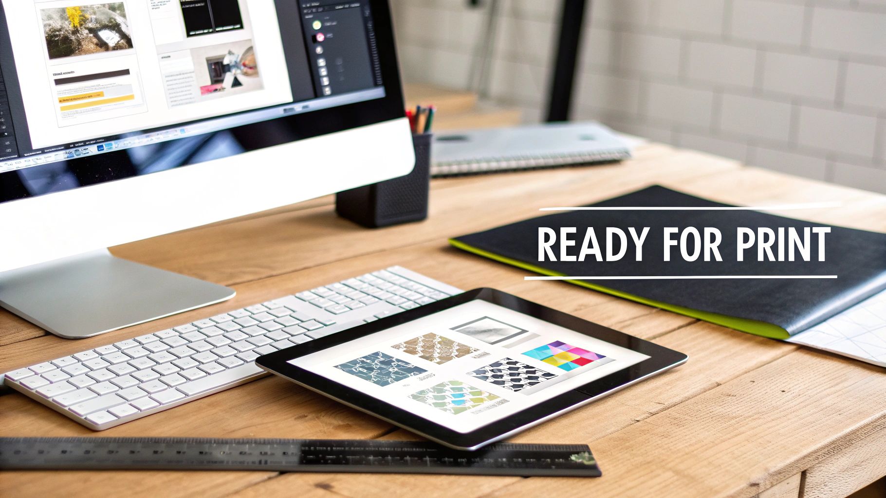
A Practical Guide to Custom Heat Transfer Designs
Custom heat transfer designs are your ticket to turning everyday apparel and products into something special, something with a professional, custom touch. But there's a crucial step between a great idea and a great product: creating print-ready artwork. This isn't just about making a cool graphic; it's about technically preparing that file so your vision comes to life exactly as you imagined, without any surprises.
Your Blueprint for Production-Ready Artwork
I like to think of a digital design file as the architectural blueprint for the final transfer. If the blueprint has flaws, the building will too. It's the same exact principle here. An improperly prepped file can lead to dull colors, blurry or pixelated images, or even transfers that peel right off after the first wash. That's a waste of time, materials, and money.
This guide goes beyond general design tips. We’re getting into the nitty-gritty, the non-negotiable technical steps for building artwork that works perfectly for both Direct-to-Film (DTF) and UV-DTF printing. The whole point is to give you the know-how to create files that print flawlessly on the first go, separating the amateur-hour stuff from professional, sellable products.
This push for customization is a big reason the decorated apparel market is booming. It was valued at USD 28.98 billion in 2023 and is expected to hit USD 68.17 billion by 2030, all because people want unique items that reflect their style. As reported by Grand View Research, heat transfer technology is a huge part of this growth, giving creators an accessible way to meet that demand.
The Foundation of a Great Transfer
Before you jump into your design software, there are a few core concepts you absolutely have to nail down. These are the fundamentals that will make or break the quality of your final transfer.
- Resolution and Scalability: Your design has to look sharp and clean at the size it will be printed. This is where the whole vector vs. raster debate becomes really important.
- Color Accuracy: The colors on your screen need to match the final printed colors as closely as humanly possible. This means you have to be thinking about color profiles from the very beginning.
- File Integrity: It's often the simple mistakes that cause the biggest headaches. Forgetting to make your background transparent is a classic one that can ruin an entire order.
Getting these basics right from the start is half the battle. For example, a lot of people struggle with just sizing their graphics correctly for different types of garments. We actually put together a whole guide on that, which you can check out here: Standard Graphic Sizes for T-Shirts.
A production-ready design file isn't just about looks; it's a precise set of instructions for our printers. Every single setting, from the resolution to the color space, directly tells the machine how to create a vibrant, durable, and high-quality transfer.
When you're submitting your artwork for printing, there are a few technical specs that are absolutely non-negotiable. Here's a quick cheat sheet to make sure your files are good to go.
Essential File Requirements for DTF and UV-DTF Transfers
| Specification | DTF Requirement | UV-DTF Requirement | Why It Matters |
|---|---|---|---|
| File Format | PNG or PDF (Vector) | PNG or PDF (Vector) | Ensures background transparency and preserves design integrity. |
| Color Mode | CMYK (Coated GRACoL 2006) | CMYK (Coated GRACoL 2006) | Matches our printing process for accurate color reproduction. |
| Resolution | 300 DPI | 300 DPI | Guarantees a crisp, high-quality print without pixelation. |
| Background | Transparent | Transparent | Prevents an unwanted solid box from printing around your design. |
| Minimum Line Weight | 0.018 inches (1.3pt) | 0.01 inches (0.75pt) | Ensures fine details and text adhere properly without breaking. |
| Fonts | Outlined/Expanded | Outlined/Expanded | Converts text into shapes so no font files are needed. |
Getting these settings right is the key to a smooth production process. It ensures what you designed is what you get.
Ultimately, mastering file preparation is what separates a one-off hobbyist from a professional who can consistently produce top-tier custom heat transfer designs that look amazing and last.
Prepping Your Design File for Flawless Transfers
The quality of your final transfer is decided long before our printers ever get involved. It all starts in your design software. A few key decisions at this stage can be the difference between a project you're proud of and a costly, frustrating mistake. Think of your digital file as the blueprint for your design—if it’s flawed, the final product will show it, with issues like pixelation, weird color shifts, or fuzzy edges.
Getting this prep work right is what truly separates the pros from the rest. It's all about creating a file that our printers can read perfectly, ensuring what you see on your screen is what you get on your transfer.
The Great Debate: Vector vs. Raster
One of the first calls you'll have to make is what kind of file to use. The two main players are vector and raster, and knowing when to use each is essential for creating top-notch custom heat transfer designs.
-
Vector Files (.AI, .EPS, .PDF): For most designs, these are your best friends. Vectors are built using mathematical formulas, which means you can scale them from a tiny pocket logo to a massive back piece without losing an ounce of quality. They stay perfectly crisp and sharp, no matter what.
-
Raster Files (.PNG): These are pixel-based. PNGs are fantastic for complex, photorealistic images full of gradients and subtle details. The catch? They have a fixed resolution. If you try to blow up a small raster image, it’s going to get blurry and pixelated—fast.
If you have to use a raster file like a PNG, it's absolutely critical that you build it at the final print size with a resolution of 300 DPI (dots per inch). A 300 DPI file has plenty of data for our printers to work with, resulting in a sharp, professional-looking print. Anything less, and you'll get a fuzzy, amateurish result.
Getting the Technical Details Right
Beyond the file type, a few technical specs are non-negotiable. I've seen countless easily avoidable printing errors happen simply because one of these small steps was missed.
First, let's talk about the transparent background. This is a big one. Our printers print exactly what they see in the file. If your PNG has a white box behind your art, we're going to print a white box. You must save your design with a transparent background so only your artwork makes it to the transfer.
Next up: convert all your text to outlines or shapes. This little trick turns your live, editable font into a fixed vector object. Why does that matter? If you send us a file that uses a font we don't have on our systems, our software will try to substitute it with a default font, completely wrecking your design. Outlining locks your typography in place for good.
My biggest tip for new designers: Always create a "final print" version of your file. In that version, outline all your fonts and expand all your strokes. Keep your original, fully editable file saved separately. This one habit will save you a world of headaches.
Why CMYK is the Professional Standard
Finally, let's talk color. Your monitor uses the RGB (Red, Green, Blue) color model, which creates color by mixing light. Our printers, on the other hand, run on CMYK (Cyan, Magenta, Yellow, Black), creating color by mixing physical inks. Because of this fundamental difference, some of those super-vibrant colors you see on screen just don't exist in the world of ink.
To get the most accurate colors possible and avoid any nasty surprises, you should design in a CMYK color profile from the start. This gives you a much more realistic preview of how your colors will actually look when they’re printed. If you really want to get into the weeds on color accuracy, check out our guide on how an ICC profile works. Taking this step ensures the colors you so carefully picked are the ones that end up on your final product.
Building Gang Sheets to Maximize Your Budget
If you're looking to get the absolute most out of every print run, building a gang sheet is your secret weapon. I think of it like a game of Tetris with my designs—the goal is to fit everything perfectly onto one sheet, which slashes waste and brings down the cost of each individual transfer.
Instead of ordering designs one by one, a gang sheet lets you mix and match different graphics, sizes, and even separate orders onto a single film. This is a game-changer whether you're printing a client's order with left-chest logos, full-back pieces, and sleeve hits, or just stocking up on your own bestselling designs.
The demand for this kind of custom work is booming. The global heat transfer market is expected to jump from USD 523.2 million in 2023 to USD 696.3 million by 2033. This growth is all about people wanting unique, on-demand apparel, making efficient printing methods like gang sheets more critical than ever. You can dig into these trends over at market.us.
Strategically Arranging Your Designs
The magic of a great gang sheet lies in the layout. You want to use every last inch of that film. My process is always the same: I place my biggest designs first to anchor the layout, then I fill in all the little nooks and crannies with smaller items like neck tags, pocket logos, or icons.
Don't hesitate to rotate your artwork to see what fits best. A design that creates a big, awkward gap might slide in perfectly if you spin it 90 or 180 degrees. The tighter you can nestle everything together, the more you get for your money. You can map this out in programs like Adobe Illustrator or Affinity Designer, or even a free tool like Canva before uploading your file.
This visual gives you a quick look at the prep work that needs to happen for each design before it even makes it onto your gang sheet.
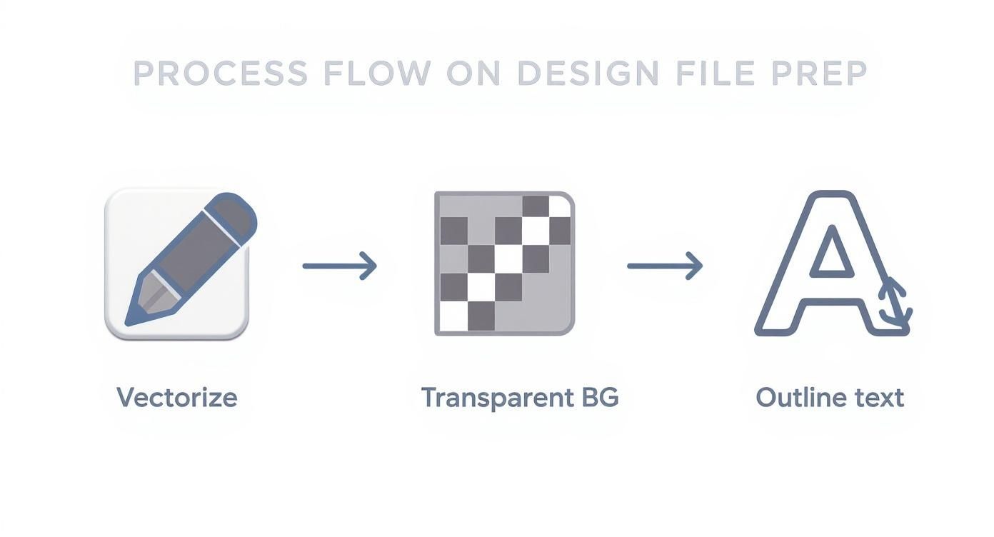
Getting these fundamentals right—vectorized art, a transparent background, and outlined text—is what ensures your final gang sheet prints flawlessly.
Mind the Gap: The Importance of Gutters
While packing designs tightly is the goal, you have to leave a little breathing room between them. We call this space a "gutter," and it’s non-negotiable. A buffer of at least 0.25 inches around each design is a solid rule of thumb.
This gap is your safety zone. It gives you enough space to cut the transfers apart with scissors or a rotary blade without nicking the design next to it. Trust me, trying to save a few millimeters by cramming things too close will eventually come back to bite you with damaged transfers and wasted money. It’s a small detail that prevents big headaches later.
A well-planned gang sheet does more than just save money on printing. It streamlines your entire workflow, allowing you to press multiple different designs from a single sheet, which is perfect for fulfilling diverse orders quickly and efficiently.
For anyone looking to master this, our online builder is designed to make this whole process a breeze. You can learn the ins and outs with our complete guide on how to build a DTF gang sheet.
Practical Gang Sheet Scenarios
To really see how powerful this is, let's walk through a few real-world situations where gang sheets are the clear winner:
-
The Small Brand Launch: A new clothing line needs 12 front-chest logos, 12 large back graphics, and 24 small sleeve hits for a hoodie release. Instead of paying for three separate setups and print runs, they can arrange all 48 designs on one large gang sheet, dramatically lowering their upfront cost.
-
The Event Organizer: Imagine you're making shirts for a family reunion. You have the main event design for the front and a bunch of unique names for the back. You can place the main graphic multiple times and then use all the leftover space to fit in every single name, all printed on one sheet.
-
The Etsy Seller: An online shop has five popular designs they sell as individual transfers. By ganging them all together, they can print a mixed inventory sheet. This way, they always have their bestsellers ready to ship without needing to place five separate, smaller orders.
When you start thinking strategically about your layout, every single transfer sheet becomes a more valuable asset for your business, saving you both time and money.
Nailing the Application and Aftercare
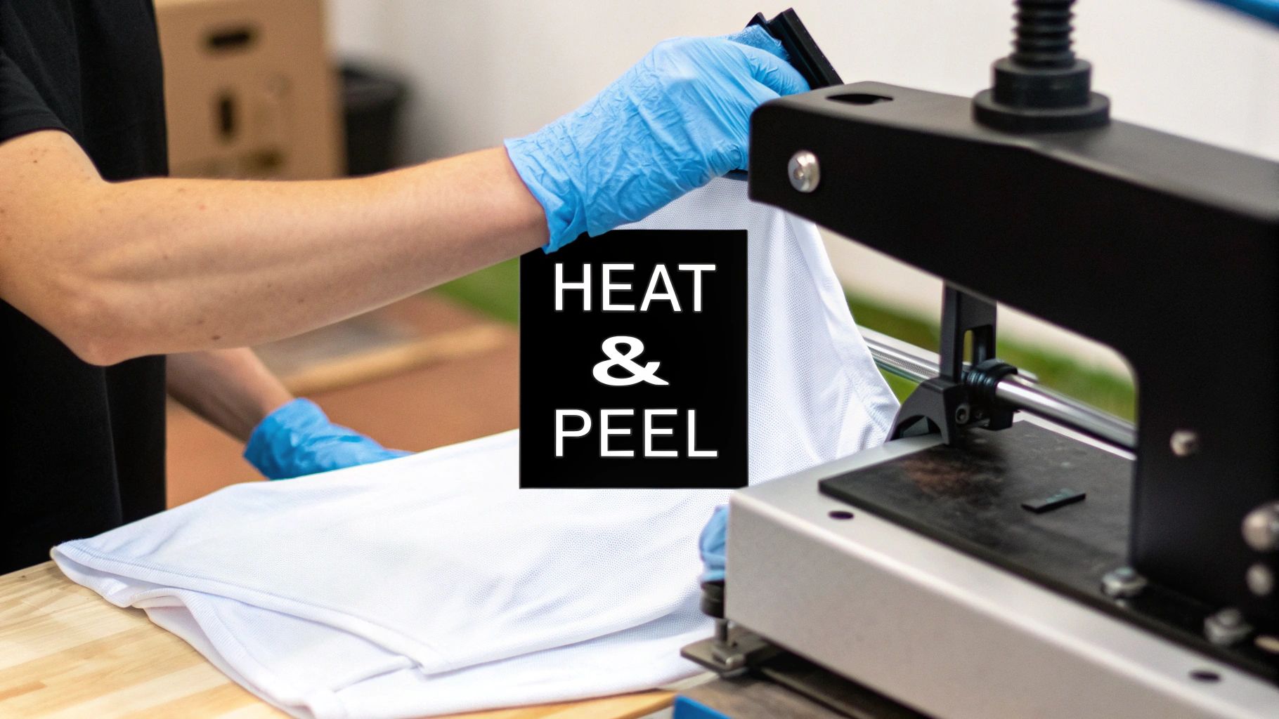
A perfectly designed and printed transfer is only half the battle. The real magic happens under the heat press, where your design becomes a permanent part of the product. This is where you lock in those vibrant colors and create a durable finish that feels like it belongs on a retail shelf.
Let's walk through the right way to apply both DTF and UV-DTF transfers. For apparel, it’s all about dialing in your heat press settings. For hard goods, a steady hand and a clean surface are what count.
Dialing in Your DTF Application
Think of applying a DTF transfer like baking—the recipe of heat, time, and pressure has to be just right for the fabric you're using. Get it wrong, and you could end up with a transfer that won’t stick, has a weird texture, or peels off after the first wash.
Cotton is pretty forgiving, but trickier materials like polyester need lower temps to prevent scorching the fabric or dye migration, which is when the shirt's color bleeds into your design. It's a frustrating but avoidable problem.
The single most important step for DTF durability is the final press. After peeling the film, covering the design with parchment paper and pressing it again for 5-10 seconds melts the adhesive right into the fabric fibers. This creates a permanent bond with a smooth, matte finish that's built to last.
To get you started, we’ve put together a chart with our go-to settings for the most common fabrics. If you're ever working with a new material, always do a quick test press on a small, hidden area first.
DTF Heat Press Settings by Fabric Type
Getting the settings right is the key to a perfect press every time. This table breaks down our recommended starting points for temperature, time, and pressure for the fabrics you'll use most often.
| Fabric Type | Temperature (°F/°C) | Press Time (Seconds) | Pressure | Peel Method |
|---|---|---|---|---|
| 100% Cotton | 300-320°F / 149-160°C | 10-15 seconds | Medium-Firm | Warm or Cold |
| 50/50 Cotton/Poly | 280-300°F / 138-149°C | 10-12 seconds | Medium | Warm or Cold |
| Polyester | 260-280°F / 127-138°C | 8-10 seconds | Medium | Warm or Cold |
| Tri-Blends | 260-280°F / 127-138°C | 8-10 seconds | Light-Medium | Warm or Cold |
You'll notice the peel method is listed as "Warm or Cold." A warm peel is when you wait about 5-10 seconds before removing the film, while a cold peel means waiting until it's completely cool to the touch. Both work great with our transfers, so it really just comes down to your personal workflow.
Mastering UV-DTF Application
Applying UV-DTF transfers to hard goods like tumblers, phone cases, and mugs is less about heat and all about precision. Think of them as high-performance, permanent stickers where a clean surface and a smooth application are everything.
- Prep the Surface: You have to start with a perfectly clean surface. Wipe the item down with isopropyl alcohol to get rid of any oils, dust, or fingerprints. A good bond starts here.
- Position and Press: Carefully peel away the white paper backing. Place your design exactly where you want it, then start pressing it down firmly from the center and smoothing your way out to the edges.
- Squeegee the Design: Grab a squeegee (or just use your thumb) and rub over the entire design with firm, even pressure. This makes sure every last bit of the adhesive gets a good grip.
- Peel the Carrier Film: Slowly peel back the clear carrier film on top. If you see any part of the design lifting up with it, just lay the film back down, rub that spot again, and then continue peeling.
Long-Term Care and Washing Instructions
How a garment is cared for after you've pressed it will determine how long your work looks amazing. Giving your customers clear, simple care instructions is a pro move that makes a huge difference.
For any apparel you decorate with our DTF transfers, these are the rules to live by:
- Wait 24 Hours: Let the adhesive fully cure for at least a day before that first wash.
- Wash Inside Out: Turning the garment inside out protects the print from rubbing against other clothes.
- Use Cold Water: Always machine wash in cold water on a gentle cycle.
- Tumble Dry Low: For the best results, tumble dry on low heat or, even better, hang it up to dry.
Following these steps will keep those custom heat transfer designs looking sharp and prevent cracking or peeling for dozens and dozens of washes.
Troubleshooting Common Transfer Problems
Sooner or later, you’ll hit a snag where a transfer just doesn’t want to play nice. It happens to everyone. But don’t sweat it—most issues with custom heat transfer designs are an easy fix once you know the signs. Think of this as your cheat sheet for figuring out what went wrong and getting your project back on track.
The most common headache by far? A DTF transfer that won't stick. You peel the film, and bits of your beautiful design get left behind. When this happens, it almost always comes down to three things: pressure, temperature, or the fabric itself.
Your heat press is trying to get that perfect combo of heat and pressure. If one element is out of whack, the whole thing fails. Uneven pressure is a classic culprit, especially on clamshell presses. Imagine you're pressing a hoodie—that bulky collar or a thick seam can easily prevent the platen from making solid, even contact, leading to a weak bond.
Diagnosing DTF Application Failures
Before you sacrifice another garment to the transfer gods, let's walk through a quick diagnostic. A little methodical troubleshooting will save you a world of frustration.
-
Look for Hidden Coatings: Some fabrics, especially performance wear, come from the factory with a waterproof or stain-resistant finish. This invisible barrier is kryptonite to DTF adhesive. A quick pre-press for 10-15 seconds can often burn this coating right off.
-
Double-Check Your Pressure: Is it really firm? Here’s a simple trick: slide a piece of paper halfway under your locked press. If you can yank it out with little effort, your pressure is too light. You should feel some serious resistance.
-
Get a True Temperature Reading: Your press might say 300°F, but is it telling the truth? An inexpensive infrared temperature gun is a game-changer. Cold spots on a platen are a surprisingly common cause of failed transfers.
Nailing these three variables will solve the vast majority of your adhesion woes. Once you have those dialed in, you can tackle more specific challenges, like the dreaded dye migration.
Battling Dye Migration on Polyester
Ever press a brilliant white design onto a red polyester shirt, only to find it has turned a disappointing shade of pink a few hours later? That's dye migration. The heat from your press basically reactivates the dye in the fabric, causing it to bleed up into your transfer ink.
The fix here is to turn down the heat and shorten your press time. For polyester, we always recommend staying in the 260-280°F range. If you still see bleeding, you might need to bring in the big guns: specialized sublimation blocker transfers. These are designed with an extra layer that stops fabric dye dead in its tracks.
When a transfer starts cracking after just a wash or two, that’s a dead giveaway of an improper cure. The adhesive never fully melted and bonded with the fabric fibers. The solution is almost always that final, crucial second press. After you peel the film, cover the design with parchment paper and press again for 5-10 seconds to lock it in for good.
Solving UV-DTF Sticking Points
UV-DTF transfers are usually pretty straightforward, but they have their own quirks. Air bubbles are probably the biggest annoyance. To avoid them, always start applying pressure from the center of the decal and smooth your way outward. A squeegee helps a ton here.
If your UV-DTF decal flat-out refuses to stick to a hard surface, the surface itself is almost certainly the problem. It has to be perfectly clean. Give it a good wipe-down with isopropyl alcohol to get rid of any oils, dust, or fingerprints. That one simple prep step is the key to getting a permanent bond.
While DTF and UV-DTF are the new kids on the block, the core principles aren't so different from older methods like heat transfer vinyl (HTV). The HTV market, a massive part of the custom apparel industry, was valued at around USD 371.4 million in 2024 and continues to climb. You can explore more data on this expanding market to see how all these technologies fit together. By mastering these troubleshooting steps, you’ll ensure your custom designs, no matter the method, look professional and last for the long haul.
Your Top Questions About Custom Transfers, Answered
Once you get the hang of designing and pressing, you'll still run into little questions along the way. It happens to everyone! Getting the right answers quickly can be the difference between a frustrating mistake and a perfect final product. We've gathered the most common questions we get right here, so you can get clear, practical advice from people who do this all day, every day.
Think of this as your personal troubleshooting guide. Let's dive into the details that can make or break your next project.
What's the Skinniest Line You Can Actually Print?
For our DTF transfers to come out looking sharp and lasting through the wash, we need a minimum line thickness of 0.018 inches. In design software like Illustrator, that translates to about 1.3 points.
This isn’t just a random number. Anything thinner than that simply can’t grab and hold enough of the white adhesive powder that we apply to the back of the ink. Without a solid layer of that adhesive, the design won't have enough "glue" to properly bond to the fabric when you press it. The result? You'll see those delicate lines or tiny text bits either fail to stick at all or, even worse, peel right off in the first wash.
Here's a pro tip: Before you even think about uploading your file, zoom way in on your design and check those skinny lines. Use the measurement tool in your software to be sure. A quick five-second check here can save you from ruining an entire batch of transfers.
Can I Just Use My Home Iron for These?
Look, for a one-off personal project, it might be tempting. But if you're making anything to sell or give away professionally, please don't use a household iron. The entire magic of a DTF transfer comes down to three things a heat press nails every time: consistent heat, even pressure, and precise timing.
A regular iron is a total failure on all three fronts. It has hot spots, so the temperature is all over the place. And there's just no way you can manually apply the firm, even pressure needed to melt that adhesive deep into the fabric's fibers. This is how you get peeling corners, spotty adhesion, and designs that crack or lift as soon as they see a washing machine. A quality heat press is genuinely the best investment you can make for creating gear that looks professional and actually lasts.
Why Do My Printed Colors Look Different Than My Screen?
Ah, the age-old battle of screen versus print. It’s a super common frustration, and the reason is pretty simple: your screen and our printer speak two different languages of color. Your monitor mixes light (RGB) to create bright, glowing colors. Our printers mix physical inks (CMYK) to create colors on a surface. Some of those vibrant, electric hues you can whip up on a screen just don't have a direct equivalent in the world of ink.
To get your printed colors as close as possible to what you see on screen, here’s what you need to do:
- Design in CMYK from the start. This is a big one. Don't build your masterpiece in RGB and then convert it at the very end. Starting your project in a CMYK color profile gives you a much more realistic preview of the final printed colors from the get-go.
- Use Pantone (PMS) codes for critical colors. If you’re matching a specific brand color, nothing beats a Pantone code. When you give us a Pantone Matching System (PMS) code, we can use it as a target to get incredibly close to that specific shade.
- When in doubt, order a small test print. If color accuracy is an absolute must for a big order, spending a few bucks on a small test is the smartest move you can make. It lets you hold the final product in your hands before you commit to a full run.
Warm Peel vs. Cold Peel: What's the Difference?
This term is all about when you peel the clear carrier film off the garment after you’ve pressed it. The right method depends entirely on the specific transfer type and the adhesive used, so always, always follow the instructions from your supplier.
- Warm Peel: This means you pop open the press and wait just a few seconds (5-10 seconds) for things to cool down a bit before peeling the film. It'll still feel warm, but not blazing hot.
- Cold Peel: This is exactly what it sounds like. You have to wait until both the shirt and the transfer film are completely cool to the touch before you even think about peeling. This can take 30 seconds or more.
The good news? Our transfers at Raccoon Transfers are designed to be flexible. They work great with either a warm or a cold peel, so you can find a rhythm that works best for your workflow. The most important thing is to be consistent. A smooth, clean peel is the signature of a perfect press.
For more general apparel and design articles, you might want to explore the YourLook blog; they cover a pretty wide range of topics that are super helpful.
Ready to see your own custom heat transfer designs come to life? At Raccoon Transfers, we make it simple to upload your art, build your gang sheet, and get vibrant, tough-as-nails transfers shipped right to you. Start your project today at https://raccoontransfers.com.