
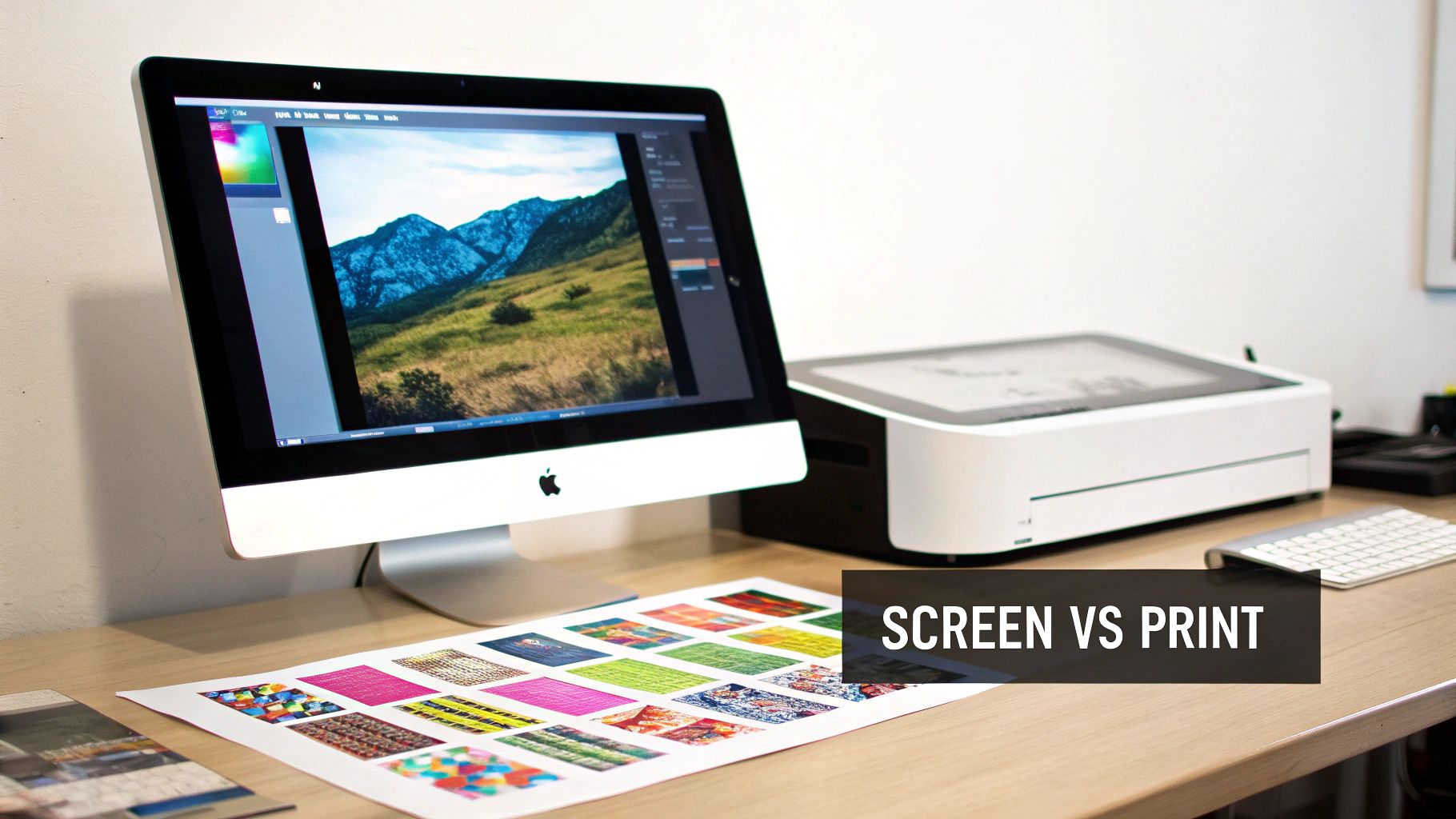
What Is ICC Profiles A Guide To Perfect Color Prints
Have you ever poured your heart into creating a vibrant, jaw-dropping design on your screen, only to have the printed version come back looking dull, muddy, and just… wrong? It’s a frustratingly common problem, and it's precisely the issue that ICC profiles are designed to fix.
Think of an ICC profile as a universal translator for color. It's a small but powerful data file that ensures the brilliant colors you see on your digital canvas are the same ones that come out of the printer.
Why Your Screen and Printer Speak Different Color Languages
The root of this classic screen-to-print frustration is actually pretty simple: your monitor and a printer create color in fundamentally different ways. Your screen uses light (an RGB or Red, Green, Blue model), while a printer uses ink (a CMYK or Cyan, Magenta, Yellow, Black model). Without a translator, they’re just guessing what the other one means.
That's where an ICC (International Color Consortium) profile comes in. It’s a standardized data set that describes how a specific device—whether it's your monitor, a scanner, or one of our professional DTF printers—sees and reproduces color.
The Role of the Color Translator
Imagine you're trying to describe a very specific shade of green to a friend. You could say "forest green," but their idea of a forest might be completely different from yours. What you need is a precise reference, like a paint swatch with a unique code.
An ICC profile works just like that swatch. It provides an exact, data-driven definition of each color, translating your monitor's "forest green" into a precise ink formula the printer understands perfectly. This translation is absolutely essential for professional DTF (Direct-to-Film) and UV-DTF printing, where getting color right is non-negotiable for brand consistency and happy customers.
By managing colors with profiles, you are giving every device in your workflow—from your design software to our printers at Raccoon Transfers—a clear, unambiguous set of instructions for handling your colors.
To make this crystal clear, here’s a quick breakdown of the core concepts.
ICC Profile Key Concepts at a Glance
| Concept | Simple Analogy | Why It Matters for Your Prints |
|---|---|---|
| Color Space | The number of crayons in a box (e.g., a small 8-pack vs. a giant 120-pack). | Different color spaces (sRGB, Adobe RGB, CMYK) contain different ranges of colors. Choosing the right one ensures your colors can actually be printed. |
| Color Gamut | The specific colors a single device can show or print. | Your monitor has a different, often larger, gamut than a printer. The profile helps map colors from one to the other accurately. |
| Device Characterization | A device's unique "accent" or way of speaking color. | No two devices are identical. A profile defines your monitor's or our printer's specific color capabilities. |
| Color Management | The act of using profiles as a "translator" between devices. | This is the process that ensures the color you see on screen is the color we print, preventing nasty surprises. |
Understanding these concepts gives you direct control over your final product.
What This Means for Your Designs
Instead of crossing your fingers and hoping for the best, you can take charge of your color workflow. Properly using ICC profiles helps you:
- Achieve Predictable Color: No more guessing games. You get the same, reliable results every time you order.
- Prevent Costly Reprints: Spot and fix potential color problems on your screen before they turn into a box of unusable transfers.
- Maintain Brand Integrity: Your brand’s signature red will be your red, not a close-enough version.
By mastering these small but mighty files, you can send your designs to print with the confidence that what you designed is exactly what you’ll get.
Understanding Digital Color Spaces and Gamuts
Before we can really get a handle on ICC profiles, we first need to talk about the fundamental "languages" they translate. In the digital world, there are really two main languages for color: one for screens and one for printers. Honestly, most color matching headaches come from not understanding this core difference.
Think of a color space like a box of crayons. Some boxes are pretty small, with just the basic colors. Others are massive, with every shade you can imagine. Different devices—your monitor, your phone, your printer—all work with different-sized crayon boxes.
The first language is RGB (Red, Green, Blue). This is an additive color model, and it's what all digital displays use, from your computer monitor to your smartphone. It starts with a black screen and adds light from tiny red, green, and blue pixels to create the entire spectrum. Crank all three up to full blast, and you get pure white.
The Language of Ink: CMYK
The second language is CMYK (Cyan, Magenta, Yellow, and Key/Black). This is a subtractive color model, and it's the language of printing. Here, you start with a white surface (like paper or our transfer film) and subtract brightness by adding layers of ink. The more ink you lay down, the darker the color gets. That's why black (K) is in the mix—to get those deep, rich dark tones. You can dive deeper into how this process works in our guide to digital printing in the textile industry.
This fundamental difference—adding light versus subtracting it with ink—is precisely why a direct, unmanaged color translation is almost guaranteed to look wrong. The two systems just don't speak the same language.
Visualizing the Color Gamut
Okay, so you've got your box of crayons (the color space). The specific range of colors that one particular device can actually create from that box is called its gamut. And here's the kicker: no two devices have the exact same gamut.
Your fancy design monitor, for example, probably has a very large RGB gamut. It can display incredibly vibrant, almost neon greens and electric blues. It’s like working with a deluxe 120-crayon set.
But here’s the reality check: a CMYK printer’s gamut is almost always smaller. It’s working with a more limited set of crayons, which means it simply cannot physically mix inks to reproduce some of those super-bright, luminous colors your screen creates with light.
This is the classic "out-of-gamut" problem, and it's where most frustrating color shifts come from. When your design file calls for a color that the printer's gamut can't produce, the system is forced to find the next closest match it can make. The result? Often a duller or slightly different color than what you saw on screen. This is the exact problem an ICC profile is designed to solve—by intelligently mapping colors from the larger screen gamut to the printer's gamut.
How ICC Profiles Keep Your Colors Consistent
So, how does an ICC profile actually pull off this magic trick of making colors match everywhere? It all comes down to creating a precise, mathematical description of a device's color abilities.
Think of it as a unique fingerprint. Your monitor has one, your scanner has one, and our printers at Raccoon Transfers have their own. Just like no two fingerprints are identical, no two devices interpret color in exactly the same way. The ICC profile is what captures that unique "accent."
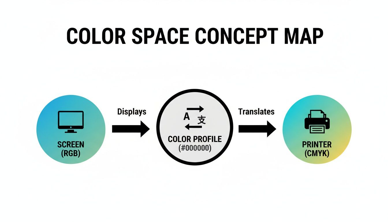
Essentially, each profile maps a device's specific color values (its native RGB or CMYK numbers) to a universal, device-independent reference color space. This reference space is the key—it acts as a neutral go-between, a common language that all your devices can understand. This ensures nothing gets lost in translation.
The Role of the Color Management Engine
Tucked away inside your design software—whether it's Adobe Photoshop or Illustrator—is a powerful engine called a Color Management Module (CMM). Its entire job is to be the master translator, using the information from all these different ICC profiles to keep your colors accurate from screen to print.
The CMM reads the "fingerprint" of your monitor (the source profile) and the "fingerprint" of our printer (the destination profile). It then intelligently translates the color data from your screen's language into the printer's language, making sure the final transfer looks as close as possible to what you designed.
This is a great way to visualize how the ICC profile acts as that crucial translator between the colors your screen can show and the colors a printer can actually create with ink.
It’s this process that ensures the vibrant RGB colors in your design are mapped correctly to the CMYK values our printers use.
The Neutral Go-Between
How does the CMM perform this translation without messing up the colors? It uses a standardized reference space called a Profile Connection Space (PCS), most often one known as CIELAB. This is that neutral territory I mentioned, where colors from different devices can meet up and be compared on a level playing field.
The process is surprisingly straightforward:
- First, the CMM looks at the RGB values in your design file. Using your monitor's ICC profile, it translates them into the universal CIELAB color space.
- Then, it takes those CIELAB values and, using our printer's ICC profile, converts them into the specific CMYK values the printer needs to mix the inks perfectly.
This two-step translation through a neutral reference space is the secret sauce for predictable, consistent color. It bypasses the often chaotic results of trying to convert colors directly from one device's limited range to another.
This clever system wasn't just a happy accident. Back in 1993, the digital world was in the middle of a color crisis—what you saw was rarely what you got. In response, Apple and seven other tech giants formed the International Color Consortium (ICC). By 1994, they had introduced this game-changing profile-PCS-profile model, and it's been the foundation of modern color management ever since.
Ultimately, getting a handle on what is an ICC profile is the single best thing you can do to control your creative output. It’s the tool that bridges the gap between the light on your screen and the ink on a transfer, preserving your artistic vision from start to finish.
Putting Color Profiles to Work in Your Design Software
Knowing the theory is one thing, but making it happen inside your design software is where the magic really lies. Programs like Adobe Photoshop and Illustrator have some serious color management power under the hood. Taking a moment to get your settings right is the single best thing you can do to get predictable, awesome-looking colors on your DTF transfers.
Your first stop should always be your software's color settings panel. Think of this as the command center for how your program sees and handles color. For the most consistent results when printing with us at Raccoon Transfers, we can't stress this enough: set your RGB Working Space to sRGB IEC61966-2.1. This profile gives you the best compatibility and keeps your colors in a range our printers can nail every time.
This dialog box is ground zero for color management. It lets you define the "language" your software will use for RGB, CMYK, and Grayscale images. Getting this right from the start means your software is playing by a consistent set of rules.
Assign vs. Convert: A Crucial Difference
Dig into your software's menus and you'll find two options that sound almost the same but do completely different things: "Assign Profile" and "Convert to Profile." Getting this wrong is probably the #1 cause of color-related headaches.
- Assign Profile: This is like changing the label on a can of paint. The color inside doesn't change, but you're telling the software to interpret the existing color numbers according to a new set of rules. You'd use this if you open a file that has no profile attached and you need to tell the software what it should have been.
- Convert to Profile: This is a much more hands-on process. It actually changes the RGB or CMYK numbers in your file. The goal is to keep the color looking the same as it moves from one color space to another. The software intelligently remaps the colors to get the closest possible match.
When you prepare a file for us, you almost always want to Convert to Profile. If your design is in a different space (like Adobe RGB), converting it to sRGB ensures the visual appearance is preserved as accurately as possible.
See the Future with Soft Proofing
One of the most valuable—and most overlooked—features in pro design software is soft proofing. It's basically a crystal ball for your prints. It uses a specific printer's ICC profile to simulate on your screen what your design will look like when it’s printed with real ink on a real transfer.
This lets you spot problems before they happen. You can see which of those super-bright screen colors are "out-of-gamut" (meaning, impossible for a CMYK printer to replicate) and adjust them before you send the file off.
Here’s the quick-and-dirty workflow in Adobe Photoshop:
-
Get Set Up: Head to
View > Proof Setup > Custom. - Pick the Profile: From the "Device to Simulate" menu, you'd choose the ICC profile for the specific printer you're targeting.
-
Flip the Switch: Now you can turn the preview on and off by going to
View > Proof Colors(or hitting the keyboard shortcut Ctrl+Y on Windows / Cmd+Y on Mac).
With the proof enabled, you get a much better idea of how the final transfer will look. It's a simple, proactive check that helps manage expectations and catch color shifts early, saving you the frustration of a print run that doesn't match your vision.
Getting Your Files Ready for Raccoon Transfers
If you want stunning, color-accurate DTF and UV-DTF transfers, how you prepare your files is the most important step you'll take. Honestly, it makes all the difference. Following our guidelines ensures that the design you see on your screen is exactly what you'll be pressing, taking the guesswork out of the process and delivering those vibrant results you're after.

The foundation of our entire color workflow is one specific ICC profile: sRGB IEC61966-2.1. We need all artwork to be submitted in this exact color space. It's true that other profiles like Adobe RGB can display a wider range of colors, but sRGB is the universal standard for the web. This makes it the most predictable and consistent choice across the countless monitors and software setups our customers use.
By having everyone standardize on sRGB, we eliminate a huge variable in the printing puzzle. It creates a common language that allows our advanced printing tech to perfectly interpret the color data in your gang sheets, giving you the best possible fidelity.
Your Print-Ready Checklist
Before you hit that upload button, take a moment to run through this simple checklist. Nailing these details from the get-go is the secret to a smooth, successful print run.
- ICC Profile: Your document’s working color space must be set to sRGB IEC61966-2.1. No exceptions!
- Resolution: Always create your artwork at 300 DPI (dots per inch). This guarantees sharp, crisp details and avoids any frustrating pixelation.
- File Format: We work with high-quality raster files like PNG and TIFF, as well as vector formats including AI, EPS, and PDF.
- Embed Profile: This is a big one. When you save your final file, you must embed the ICC profile. This simple checkbox packages the color "instructions" right into your artwork.
This level of precision didn't happen overnight. The history of color standardization, from the first ICC profiles in 1994 to the major update with ICCv4 in 2001, reflects a long-standing commitment to getting color right. By the early 2000s, over 90% of professional design software had integrated ICC support. This was a game-changer, slashing color error rates in commercial printing from around 15-20% down to under 2%. For you, this legacy means the files you send us will produce transfers with incredible consistency, from your monitor to your heat press. You can read more about the history of ICC profiles from the International Color Consortium if you're curious.
The Critical Step of Embedding Your Profile
Forgetting to embed the ICC profile is a common pitfall, and it’s one that can cause some seriously unexpected color shifts. Without that embedded profile, our printing software is left to guess which color space you intended to use. It has to make an assumption, and that assumption might not match what you were looking at on your screen.
Think of embedding the profile as attaching a clear instruction manual to your file. It tells our system exactly how to read the color values, removing all ambiguity and ensuring the final transfer is a perfect match to your design.
By following these steps, you're setting your project up for success. To really dial in your results, you can also check out our guide on choosing the best paper for heat transfer. At the end of the day, proper file prep is the key to unlocking the full potential of professional DTF printing.
Common Questions About ICC Profiles
Even after you get the hang of color management, some questions always seem to pop up. Let's walk through the most common ones I hear, so you can design with more confidence and know what to do when things look off.
Do I Really Need to Worry About ICC Profiles?
Short answer: yes, absolutely. For a quick, non-critical design, you might get lucky and have the print turn out just fine. But when you're dealing with specific brand colors, detailed photos, or any client work, ignoring ICC profiles is a huge gamble.
Without a profile, you’re just letting the software guess what your colors are supposed to look like. That's how a vibrant, electric blue on your screen can easily become a dull, slightly purplish shade on the final transfer. For professional, repeatable results, using the right profile isn't just a good idea—it’s essential. It's the only way to reliably bridge the gap between what you see and what you get.
What Is the Difference Between sRGB and Adobe RGB?
Think of it like this: sRGB is the standard 24-pack of crayons that every device in the world knows how to use. Adobe RGB is the fancy 64-pack with all the extra shades, especially in the green and cyan ranges.
While that bigger box of crayons sounds great, it can cause problems. Adobe RGB is fantastic for professional photographers who need that massive color range for editing, but it's not always the best choice for a printing workflow like ours. sRGB is the universal language of the web and most digital devices. To get the most predictable and consistent results when you print with us, we strongly recommend designing and saving all your files in the sRGB color space.
By sticking with sRGB, you're setting a consistent, reliable starting point. This gives the colors you approve on your screen the best possible chance of being perfectly matched by our printers, no matter what kind of monitor you're using.
Why Does My Print Still Look Different From My Screen?
This is the classic frustration, and a few different things could be going on. Even if your profile management is flawless, a disconnect between your screen and the final print can still happen.
Let's break down the usual suspects:
- Monitor Calibration: Is your monitor actually showing you true colors? Most uncalibrated screens aren't; they're showing you their own unique version. Professional designers use hardware calibration tools to make sure their display is a neutral, accurate reference point.
- Embedded Profile: Did you remember to properly embed the sRGB profile when you saved your final artwork? If you forgot, our system has to guess which colors you intended to use.
- Light vs. Ink: This is a big one. A screen glows with RGB light, which will always look more vibrant than CMYK ink on a physical surface. They are fundamentally different mediums. Using the soft proofing feature in your design software will give you a much more realistic preview of how the colors will look once printed.
What Happens if My File Has No ICC Profile?
A design file without an embedded ICC profile is called "untagged." This is a risky move because it forces our printing software to guess what color space you created the artwork in.
Our system will usually default to assuming the file is sRGB, but that's not a guarantee. Leaving it up to chance like this is a recipe for unexpected and disappointing color shifts in your final transfers.
To eliminate all doubt, always assign the sRGB profile to your document from the very beginning. Most importantly, make sure you embed that profile when you save the final, print-ready file. This simple step attaches the color "instruction manual" directly to your artwork, telling our printers exactly how to read your color data for a perfect print.
Ready to see your perfectly color-managed designs come to life? At Raccoon Transfers, we make it easy to turn your vibrant digital files into stunning, professional-quality DTF and UV-DTF transfers. Upload your art and get started today.